Technology
How Many Music Streams Does it Take to Earn a Dollar?
How Many Music Streams Does it Take to Earn a Dollar?
A decade ago, the music industry was headed for a protracted fade-out.
The disruptive effects of peer-to-peer file sharing had slashed music revenues in half, casting serious doubts over the future of the industry.
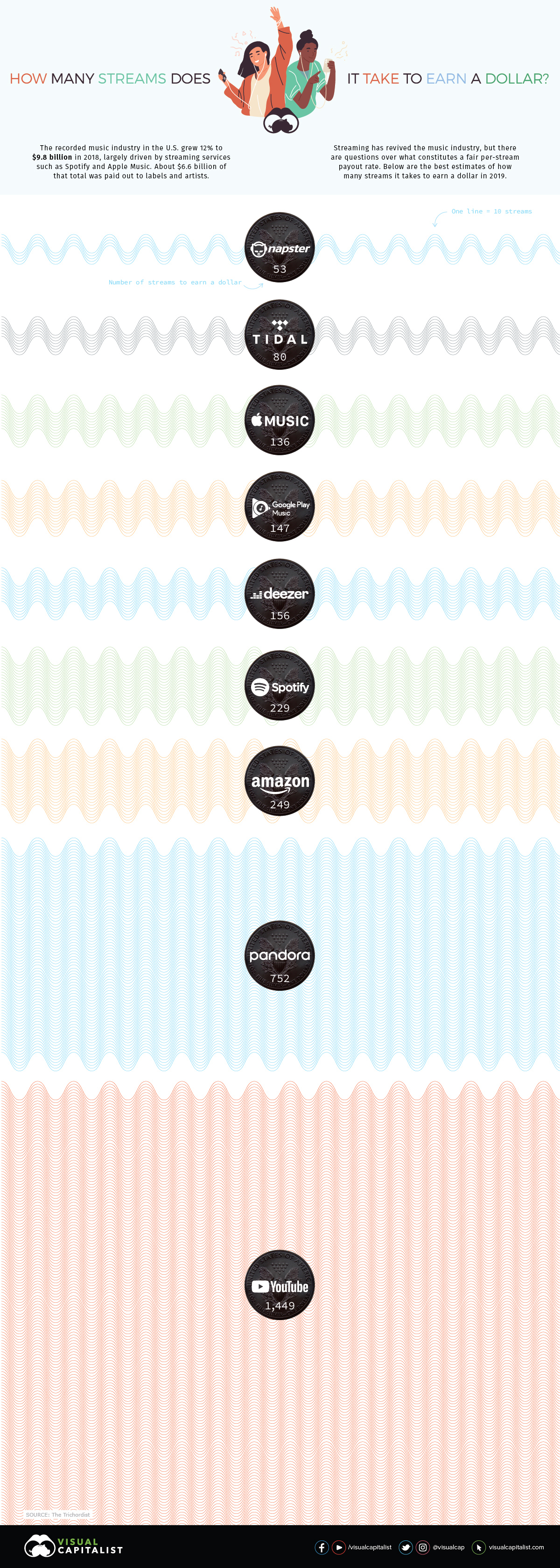
Ringtones provided a brief earnings bump, but it was the growing popularity of premium streaming services that proved to be the savior of record labels and artists. For the first time since the mid-90s, the music industry saw back-to-back years of growth, and revenues grew a brisk 12% in 2018 – nearly reaching $10 billion. In short, people showed they were still willing to pay for music.
Although most forecasts show streaming services like Spotify and Apple Music contributing an increasingly large share of revenue going forward, recent data from The Trichordist reveals that these services pay out wildly different rates per stream.
Note: Due to the lack of publicly available data, calculating payouts from streaming services is not an exact science. This data set is based on revenue from an indie label with a ~150 album catalogue generating over 115 million streams.
Full Stream Ahead
One would expect streaming services to have fairly similar payout rates every time a track is played, but this is not the case. In reality, the streaming rates of major players in the market – which have very similar catalogs – are all over the map. Below is a full breakdown of how many streams it takes to earn a dollar on various platforms:
| Streaming service | Avg. payout per stream | # of streams to earn one dollar | # of streams to earn minimum wage* |
|---|---|---|---|
| Napster | $0.019 | 53 | 77,474 |
| Tidal | $0.0125 | 80 | 117,760 |
| Apple Music | $0.00735 | 136 | 200,272 |
| Google Play Music | $0.00676 | 147 | 217,751 |
| Deezer | $0.0064 | 156 | 230,000 |
| Spotify | $0.00437 | 229 | 336,842 |
| Amazon | $0.00402 | 249 | 366,169 |
| Pandora** | $0.00133 | 752 | 1,106,767 |
| YouTube | $0.00069 | 1,449 | 2,133,333 |
*U.S. monthly minimum wage of $1,472 **Premium tier
Napster, once public enemy number one in the music business, has some of the most generous streaming rates in the industry. On the downside, the brand currently has a market share of less than 1%, so getting a high volume of plays on an album isn’t likely to happen for most artists.
On the flip side of the equation, YouTube has the highest number of plays per song, but the lowest payout per stream by far. It takes almost 1,500 plays to earn a single dollar on the Google-owned video platform.
Spotify, which is now the biggest player in the streaming market, is on the mid-to-low end of the compensation spectrum.
The Payment Pipeline
How do companies like Spotify calculate the amount paid out to license holders? Here’s a look at their payout process:
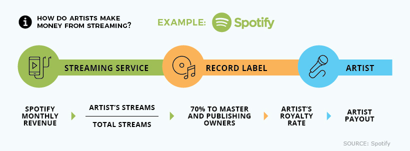
As this chart reveals, dollars earned from streaming still don’t tell the full story of how much artists receive at the end of the line. This amount is influenced by whether or not the performer has a record deal, and if other contributors have a stake in the recorded work.
The Pressure is Heating Up
When Spotify was a scrappy startup providing a much needed revenue stream to the music industry, labels were temporarily willing to accept lower streaming rates.
But now that Spotify is a public company, and tech giants like Apple and Amazon are in the picture, a growing chorus of industry players will likely dial up the pressure to increase compensation rates.


Brands
How Tech Logos Have Evolved Over Time
From complete overhauls to more subtle tweaks, these tech logos have had quite a journey. Featuring: Google, Apple, and more.


How Tech Logos Have Evolved Over Time
This was originally posted on our Voronoi app. Download the app for free on iOS or Android and discover incredible data-driven charts from a variety of trusted sources.
One would be hard-pressed to find a company that has never changed its logo. Granted, some brands—like Rolex, IBM, and Coca-Cola—tend to just have more minimalistic updates. But other companies undergo an entire identity change, thus necessitating a full overhaul.
In this graphic, we visualized the evolution of prominent tech companies’ logos over time. All of these brands ranked highly in a Q1 2024 YouGov study of America’s most famous tech brands. The logo changes are sourced from 1000logos.net.
How Many Times Has Google Changed Its Logo?
Google and Facebook share a 98% fame rating according to YouGov. But while Facebook’s rise was captured in The Social Network (2010), Google’s history tends to be a little less lionized in popular culture.
For example, Google was initially called “Backrub” because it analyzed “back links” to understand how important a website was. Since its founding, Google has undergone eight logo changes, finally settling on its current one in 2015.
| Company | Number of Logo Changes |
|---|---|
| 8 | |
| HP | 8 |
| Amazon | 6 |
| Microsoft | 6 |
| Samsung | 6 |
| Apple | 5* |
Note: *Includes color changes. Source: 1000Logos.net
Another fun origin story is Microsoft, which started off as Traf-O-Data, a traffic counter reading company that generated reports for traffic engineers. By 1975, the company was renamed. But it wasn’t until 2012 that Microsoft put the iconic Windows logo—still the most popular desktop operating system—alongside its name.
And then there’s Samsung, which started as a grocery trading store in 1938. Its pivot to electronics started in the 1970s with black and white television sets. For 55 years, the company kept some form of stars from its first logo, until 1993, when the iconic encircled blue Samsung logo debuted.
Finally, Apple’s first logo in 1976 featured Isaac Newton reading under a tree—moments before an apple fell on his head. Two years later, the iconic bitten apple logo would be designed at Steve Jobs’ behest, and it would take another two decades for it to go monochrome.

-

 Markets1 week ago
Ranked: The Largest U.S. Corporations by Number of Employees
-

 Green3 weeks ago
Ranked: Top Countries by Total Forest Loss Since 2001
-

 Money2 weeks ago
Where Does One U.S. Tax Dollar Go?
-

 Automotive2 weeks ago
Almost Every EV Stock is Down After Q1 2024
-

 AI2 weeks ago
The Stock Performance of U.S. Chipmakers So Far in 2024
-

 Markets2 weeks ago
Charted: Big Four Market Share by S&P 500 Audits
-

 Real Estate2 weeks ago
Ranked: The Most Valuable Housing Markets in America
-

 Money2 weeks ago
Which States Have the Highest Minimum Wage in America?