Markets
How Every Asset Class, Currency, and Sector Performed in 2019
Another year is in the books, and for investors 2019 was quite the turnaround story.
Despite an early backdrop of heightened volatility, escalating trade tensions, Brexit uncertainty, and calls for a recession, the year progressed in an unexpectedly pleasant fashion. The Fed used its limited arsenal to provide additional stimulus, and global markets soaked it up to extend the decade-long bull run.
By the end of 2019, every major asset class was in the black — and the S&P 500 surged to finish with its best annual return since 2013.
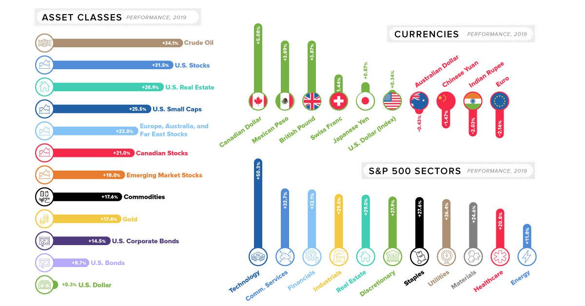
Markets Roundup for 2019
Let’s take a look at major asset classes in 2019, to see how they fared:
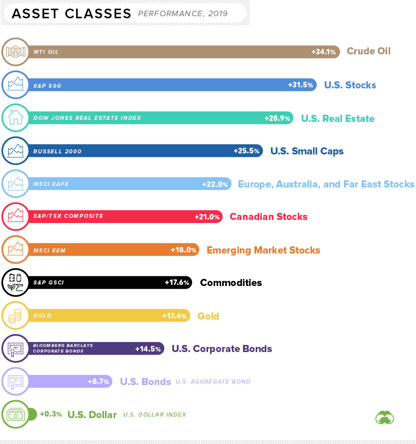
Note: all indices here (i.e. S&P 500, Russell 2000, etc.) are using total returns, with dividends re-invested.
The first thing you’ll notice when looking at the above data is that every major asset class had a positive return for the year. The only real difference lies in the magnitude of that positive return.
Even though stocks experienced some of the best gains on the year, the winning asset may be a surprising one: crude oil.
The oil price (WTI) started the year at about $46/bbl and it closed the year at over $61/bbl, good for a 34% gain. And with escalating tensions between the U.S. and Iran, energy prices could be shooting even higher in 2020.
Performance by S&P 500 Sector
Strangely enough, rising oil prices did not do enough to buoy energy stocks — the poorest performing S&P 500 sector.
Although oil was up on the year, natural gas actually fell in price by about 26% in 2019. This effectively cancels out the gains made by oil, putting energy producers at the bottom of the list:
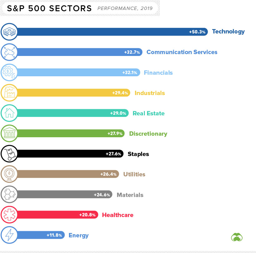
Not surprisingly, technology stocks excelled in 2019.
Tech was led by a big bounceback from Apple, a big winner that gained more than 80% over the course of the year. Other strong sectors in the benchmark U.S. index included communication services and financials.
The Currency Game
Now let’s look how currencies moved in 2019.
Below movements are all against the U.S. dollar, with the exception of the U.S. dollar itself, which is measured against a basket of currencies (U.S. Dollar Index):
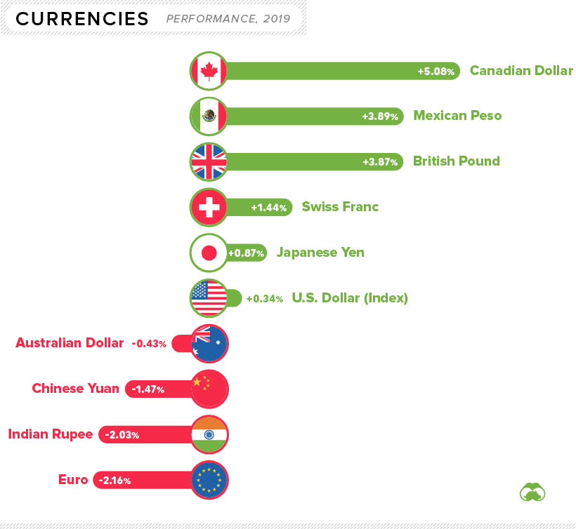
The biggest currency mover on the year was the Canadian dollar, which jumped over 5% partially thanks to rising oil prices. Meanwhile, the biggest decrease went to the euro, which fell over 2% against the U.S. dollar.
It’s also worthwhile to note that Bitcoin had a particularly strong rebound in 2019, rising over 90% against the U.S. dollar.
Winners and Losers
Finally, we’ve put together a more arbitrary list of winners and losers for the year, incorporating all of the above and more.
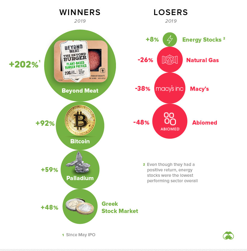
Both the Greek and Russian stock markets had banner years, each returning close to 50% in dollar terms. Faux meat brands also captured investors’ imaginations, with Beyond Meat leading the charge. Palladium was a standout commodity, gaining 59% on the year.
We’ve chosen energy stocks as a loser, since they were the poorest performing sector on the S&P 500. Meanwhile, Macy’s and Abiomed were two of the worst large cap stocks to own in 2019.


Markets
U.S. Debt Interest Payments Reach $1 Trillion
U.S. debt interest payments have surged past the $1 trillion dollar mark, amid high interest rates and an ever-expanding debt burden.


U.S. Debt Interest Payments Reach $1 Trillion
This was originally posted on our Voronoi app. Download the app for free on iOS or Android and discover incredible data-driven charts from a variety of trusted sources.
The cost of paying for America’s national debt crossed the $1 trillion dollar mark in 2023, driven by high interest rates and a record $34 trillion mountain of debt.
Over the last decade, U.S. debt interest payments have more than doubled amid vast government spending during the pandemic crisis. As debt payments continue to soar, the Congressional Budget Office (CBO) reported that debt servicing costs surpassed defense spending for the first time ever this year.
This graphic shows the sharp rise in U.S. debt payments, based on data from the Federal Reserve.
A $1 Trillion Interest Bill, and Growing
Below, we show how U.S. debt interest payments have risen at a faster pace than at another time in modern history:
| Date | Interest Payments | U.S. National Debt |
|---|---|---|
| 2023 | $1.0T | $34.0T |
| 2022 | $830B | $31.4T |
| 2021 | $612B | $29.6T |
| 2020 | $518B | $27.7T |
| 2019 | $564B | $23.2T |
| 2018 | $571B | $22.0T |
| 2017 | $493B | $20.5T |
| 2016 | $460B | $20.0T |
| 2015 | $435B | $18.9T |
| 2014 | $442B | $18.1T |
| 2013 | $425B | $17.2T |
| 2012 | $417B | $16.4T |
| 2011 | $433B | $15.2T |
| 2010 | $400B | $14.0T |
| 2009 | $354B | $12.3T |
| 2008 | $380B | $10.7T |
| 2007 | $414B | $9.2T |
| 2006 | $387B | $8.7T |
| 2005 | $355B | $8.2T |
| 2004 | $318B | $7.6T |
| 2003 | $294B | $7.0T |
| 2002 | $298B | $6.4T |
| 2001 | $318B | $5.9T |
| 2000 | $353B | $5.7T |
| 1999 | $353B | $5.8T |
| 1998 | $360B | $5.6T |
| 1997 | $368B | $5.5T |
| 1996 | $362B | $5.3T |
| 1995 | $357B | $5.0T |
| 1994 | $334B | $4.8T |
| 1993 | $311B | $4.5T |
| 1992 | $306B | $4.2T |
| 1991 | $308B | $3.8T |
| 1990 | $298B | $3.4T |
| 1989 | $275B | $3.0T |
| 1988 | $254B | $2.7T |
| 1987 | $240B | $2.4T |
| 1986 | $225B | $2.2T |
| 1985 | $219B | $1.9T |
| 1984 | $205B | $1.7T |
| 1983 | $176B | $1.4T |
| 1982 | $157B | $1.2T |
| 1981 | $142B | $1.0T |
| 1980 | $113B | $930.2B |
| 1979 | $96B | $845.1B |
| 1978 | $84B | $789.2B |
| 1977 | $69B | $718.9B |
| 1976 | $61B | $653.5B |
| 1975 | $55B | $576.6B |
| 1974 | $50B | $492.7B |
| 1973 | $45B | $469.1B |
| 1972 | $39B | $448.5B |
| 1971 | $36B | $424.1B |
| 1970 | $35B | $389.2B |
| 1969 | $30B | $368.2B |
| 1968 | $25B | $358.0B |
| 1967 | $23B | $344.7B |
| 1966 | $21B | $329.3B |
Interest payments represent seasonally adjusted annual rate at the end of Q4.
At current rates, the U.S. national debt is growing by a remarkable $1 trillion about every 100 days, equal to roughly $3.6 trillion per year.
As the national debt has ballooned, debt payments even exceeded Medicaid outlays in 2023—one of the government’s largest expenditures. On average, the U.S. spent more than $2 billion per day on interest costs last year. Going further, the U.S. government is projected to spend a historic $12.4 trillion on interest payments over the next decade, averaging about $37,100 per American.
Exacerbating matters is that the U.S. is running a steep deficit, which stood at $1.1 trillion for the first six months of fiscal 2024. This has accelerated due to the 43% increase in debt servicing costs along with a $31 billion dollar increase in defense spending from a year earlier. Additionally, a $30 billion increase in funding for the Federal Deposit Insurance Corporation in light of the regional banking crisis last year was a major contributor to the deficit increase.
Overall, the CBO forecasts that roughly 75% of the federal deficit’s increase will be due to interest costs by 2034.

-

 Markets2 weeks ago
Visualizing America’s Shortage of Affordable Homes
-

 Technology1 week ago
Ranked: Semiconductor Companies by Industry Revenue Share
-

 Money1 week ago
Which States Have the Highest Minimum Wage in America?
-

 Real Estate1 week ago
Ranked: The Most Valuable Housing Markets in America
-

 Business1 week ago
Charted: Big Four Market Share by S&P 500 Audits
-

 AI1 week ago
The Stock Performance of U.S. Chipmakers So Far in 2024
-

 Misc2 weeks ago
Almost Every EV Stock is Down After Q1 2024
-

 Money2 weeks ago
Where Does One U.S. Tax Dollar Go?