Personal Finance
Chart: How Our Cities Impact the Future Incomes of Children
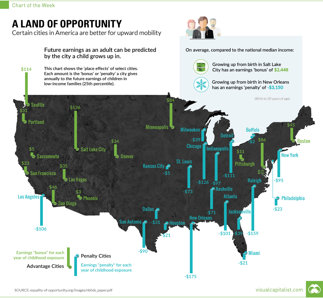
How Our Cities Impact the Future Incomes of Children
Certain cities in America are better for upward mobility
The Chart of the Week is a weekly Visual Capitalist feature on Fridays.
In the long-standing psychology debate on nature versus nurture, the question is whether it is our genes or our experiences that hold the keys to our future.
The short answer to this question, according to many of today’s scientists and psychologists, is that nature and nurture are always working together. In other words, genes do what they do depending on their context, and nature and nurture work to influence each other constantly.
In other words, our family experiences, households, and neighborhoods can set the stage for how our genes react. And on a macro level, looking at cities can tell us a lot about how our environments can help to influence future outcomes.
A Tale of Two City Types
Today’s chart pulls out some of the most compelling data from a 2015 report on intergenerational mobility.
The report studies five million families that have moved between counties in the United States, ultimately showing that there is a “childhood exposure effect” in cities that helps to predict future income levels as adults. Put another way, some cities are better than others in helping kids move “up the ladder” by accessing opportunities that later affect income. On balance, other places provide a tougher environment that makes it harder.
In this case, it should be noted that our above chart specifically deals with the city “bonuses” or “penalties”, expressed as an annual dollar amount for every year exposed to a city’s environment, on the future earnings of children in low-income families (25th percentile).
Digging into City Data
On an individual level, a person can of course succeed or fail regardless of their family or neighborhood. This happens all the time, and there are countless examples of rags-to-riches stories.
The concern highlighted by this study is that, on the whole, there is a significant disparity between cities as far as predicting future income goes. Growing up for an entire childhood in New Orleans or Los Angeles, on average, means that future income will be lower than the national median. In Salt Lake City or Boston, it’s likely to be higher than the national median.
The “bonuses” and “penalties” add up. For example, spending an entire childhood in New Orleans is estimated to lower future income to -$3,150 below the national median.
Cities in the Northeast seem to have the most mixed bag of “place effects”. New York, Philadelphia, and Buffalo have negative effects, while Boston and Washington, D.C. are both positive.
Meanwhile, the Southeast, Midwest, and Southwest all see a similar negative effect through major cities. Minneapolis and Pittsburgh are exceptions to this rule.
Finally, cities in the West appear to mostly have positive effects, with the exception of Los Angeles and Fresno (not on map).


Personal Finance
Chart: The Declining Value of the U.S. Federal Minimum Wage
This graphic compares the nominal vs. inflation-adjusted value of the U.S. minimum wage, from 1940 to 2023.
The Declining Value of the U.S. Federal Minimum Wage
This was originally posted on our Voronoi app. Download the app for free on iOS or Android and discover incredible data-driven charts from a variety of trusted sources.
This graphic illustrates the history of the U.S. federal minimum wage using data compiled by Statista, in both nominal and real (inflation-adjusted) terms. The federal minimum wage was raised to $7.25 per hour in July 2009, where it has remained ever since.
Nominal vs. Real Value
The data we used to create this graphic can be found in the table below.
| Year | Nominal value ($/hour) | Real value ($/hour) |
|---|---|---|
| 1940 | 0.3 | 6.5 |
| 1945 | 0.4 | 6.82 |
| 1950 | 0.75 | 9.64 |
| 1955 | 0.75 | 8.52 |
| 1960 | 1 | 10.28 |
| 1965 | 1.25 | 12.08 |
| 1970 | 1.6 | 12.61 |
| 1975 | 2.1 | 12.04 |
| 1980 | 3.1 | 11.61 |
| 1985 | 3.35 | 9.51 |
| 1990 | 3.8 | 8.94 |
| 1995 | 4.25 | 8.49 |
| 2000 | 5.15 | 9.12 |
| 2005 | 5.15 | 8.03 |
| 2010 | 7.25 | 10.09 |
| 2015 | 7.25 | 9.3 |
| 2018 | 7.25 | 8.78 |
| 2019 | 7.25 | 8.61 |
| 2020 | 7.25 | 8.58 |
| 2021 | 7.25 | 8.24 |
| 2022 | 7.25 | 7.61 |
| 2023 | 7.25 | 7.25 |
What our graphic shows is how inflation has eroded the real value of the U.S. minimum wage over time, despite nominal increases.
For instance, consider the year 1960, when the federal minimum wage was $1 per hour. After accounting for inflation, this would be worth around $10.28 today!
The two lines converge at 2023 because the nominal and real value are identical in present day terms.
Many States Have Their Own Minimum Wage
According to the National Conference of State Legislatures (NCSL), 30 states and Washington, D.C. have implemented a minimum wage that is higher than $7.25.
The following states have adopted the federal minimum: Georgia, Idaho, Indiana, Iowa, Kansas, Kentucky, New Hampshire, North Carolina, North Dakota, Oklahoma, Pennsylvania, Texas, Utah, Wisconsin, and Wyoming.
Meanwhile, the states of Alabama, Louisiana, Mississippi, South Carolina, and Tennessee have no wage minimums, but have to follow the federal minimum.
How Does the U.S. Minimum Wage Rank Globally?
If you found this topic interesting, check out Mapped: Minimum Wage Around the World to see which countries have the highest minimum wage in monthly terms, as of January 2023.

-

 Mining2 weeks ago
Charted: The Value Gap Between the Gold Price and Gold Miners
-

 Real Estate1 week ago
Ranked: The Most Valuable Housing Markets in America
-

 Business1 week ago
Charted: Big Four Market Share by S&P 500 Audits
-

 AI1 week ago
The Stock Performance of U.S. Chipmakers So Far in 2024
-

 Misc1 week ago
Almost Every EV Stock is Down After Q1 2024
-

 Money2 weeks ago
Where Does One U.S. Tax Dollar Go?
-

 Green2 weeks ago
Ranked: Top Countries by Total Forest Loss Since 2001
-

 Real Estate2 weeks ago
Visualizing America’s Shortage of Affordable Homes