Money
How Americans Make and Spend Their Money, by Age Group
If you’re like most people, your income and spending changes significantly as you get older.
In the most common career trajectory, earlier years coincide with a lower salary as skills and experience grow. Then, peak earning years are achieved in late adulthood, and eventually retirement comes onto the horizon.
Is this typical earnings arc supported by data?
Income and Spending, by Age
The data visualizations in today’s post come to us from Engaging Data and they use Sankey diagrams to display data from the Bureau of Labor Statistics (BLS) showing differences in how various age groups in America earn and spend their money.
The four charts below will show household data based on the age of the primary resident:
- Less than 25 years old (Very early career)
- Between 25-34 years old (Early career)
- Between 45-54 years old (Peak earning and spending)
- More than 75 years old (Retirement)
Let’s take a look at the collection of data, to see how it shakes out.
Less than 25 Years Old – $31,102 in spending (94.6%% of total income)
These contain an average of 1.9 people (1.3 income earners, 0.3 children, and 0.0 seniors)
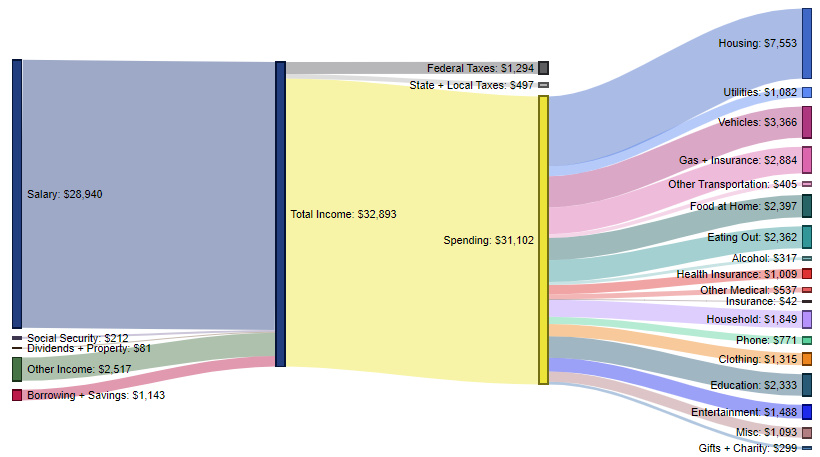
For the average household with a primary resident under 25 years old, total income is $32,893.
The biggest expense is housing (24.3% of spending), followed by vehicles (10.8%), gas and insurance (9.3%), food at home (7.7%), and dining out (7.6%). For this younger cohort, education is also a significant expense at $2,333 per year (7.5% of spending).
Between 25-34 Years – $48,928 in spending (70.8% of total income)
These contain an average of 2.8 people (1.5 income earners, 1.0 children, and 0.0 seniors)
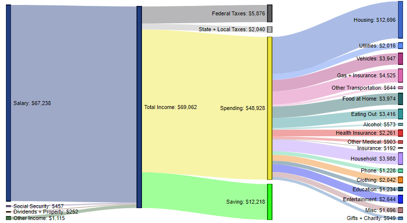
In this age range, earning potential starts to rapidly expand with experience – and households make double that of the previous category (Under 25 years old).
Housing remains the biggest expense (25.9% of spending), followed by gas and insurance (9.2%), household expenses (8.2%), food at home (8.1%), and then vehicles (8.1%).
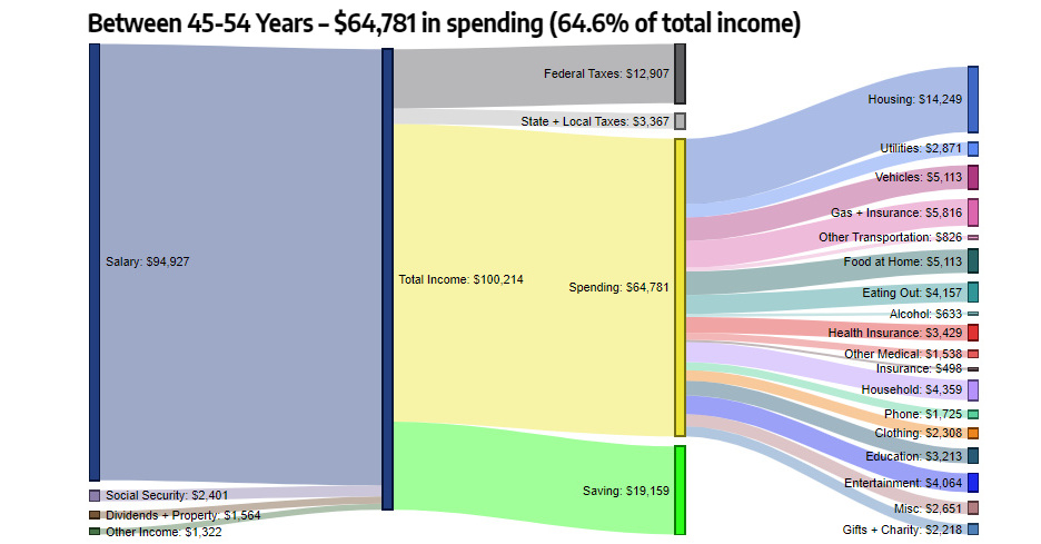
Between 45-54 Years – $64,781 in spending (64.6% of total income)
These contain an average of 2.8 people (1.7 income earners, 0.7 children, and 0.1 seniors)
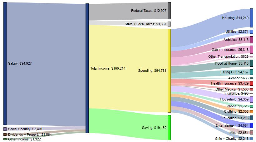
This age range is notable because it has both the highest income and the highest spending. It also represents a time of peak savings, with the average household stashing away $19,159 per year.
Expenses are similar to the previous category. Housing is the biggest expense (22.0%), followed by gas and insurance (9.0%), food at home (7.9%), vehicles (7.9%), and household expenses (6.7%).
Over 75 Years Old – $40,211 in spending (95.6% of total income)
These contain an average of 2.6 people (0.2 income earners, 0.0 children, and 1.4 seniors)
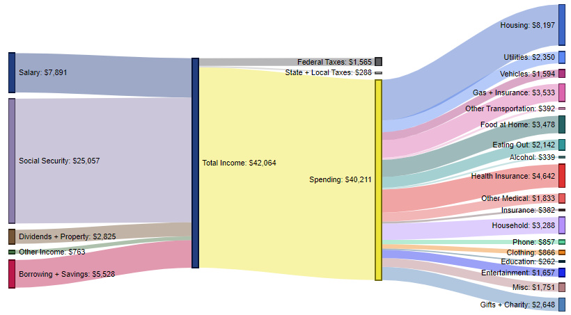
Not surprisingly, here we see salary contributing just $7,891 per year to total income, with social security supplementing income with $25,057 per year.
For this older segment, health insurance (8.2%) jumps up to become the second most important expense. Meanwhile, driving and housing both drop in their respective allocations.
The Typical Earning Arc?
The data confirms that conventional wisdom around the typical earning trajectory for Americans seems pretty accurate.
For more breakdowns, check out how Americans spend their money based on income levels or education levels.
Did you find any surprising anomalies in the numbers?


Money
How Debt-to-GDP Ratios Have Changed Since 2000
See how much the debt-to-GDP ratios of advanced economies have grown (or shrank) since the year 2000.


How Debt-to-GDP Ratios Have Changed Since 2000
This was originally posted on our Voronoi app. Download the app for free on Apple or Android and discover incredible data-driven charts from a variety of trusted sources.
Government debt levels have grown in most parts of the world since the 2008 financial crisis, and even more so after the COVID-19 pandemic.
To gain perspective on this long-term trend, we’ve visualized the debt-to-GDP ratios of advanced economies, as of 2000 and 2024 (estimated). All figures were sourced from the IMF’s World Economic Outlook.
Data and Highlights
The data we used to create this graphic is listed in the table below. “Government gross debt” consists of all liabilities that require payment(s) of interest and/or principal in the future.
| Country | 2000 (%) | 2024 (%) | Change (pp) |
|---|---|---|---|
| 🇯🇵 Japan | 135.6 | 251.9 | +116.3 |
| 🇸🇬 Singapore | 82.3 | 168.3 | +86.0 |
| 🇺🇸 United States | 55.6 | 126.9 | +71.3 |
| 🇬🇧 United Kingdom | 36.6 | 105.9 | +69.3 |
| 🇬🇷 Greece | 104.9 | 160.2 | +55.3 |
| 🇫🇷 France | 58.9 | 110.5 | +51.6 |
| 🇵🇹 Portugal | 54.2 | 104.0 | +49.8 |
| 🇪🇸 Spain | 57.8 | 104.7 | +46.9 |
| 🇸🇮 Slovenia | 25.9 | 66.5 | +40.6 |
| 🇫🇮 Finland | 42.4 | 76.5 | +34.1 |
| 🇭🇷 Croatia | 35.4 | 61.8 | +26.4 |
| 🇨🇦 Canada | 80.4 | 103.3 | +22.9 |
| 🇨🇾 Cyprus | 56.0 | 70.9 | +14.9 |
| 🇦🇹 Austria | 65.7 | 74.0 | +8.3 |
| 🇸🇰 Slovak Republic | 50.5 | 56.5 | +6.0 |
| 🇩🇪 Germany | 59.3 | 64.0 | +4.7 |
| 🇧🇪 Belgium | 109.6 | 106.8 | -2.8 |
| 🇮🇱 Israel | 77.4 | 56.8 | -20.6 |
| 🇮🇸 Iceland | 75.8 | 54.6 | -21.2 |
The debt-to-GDP ratio indicates how much a country owes compared to the size of its economy, reflecting its ability to manage and repay debts. Percentage point (pp) changes shown above indicate the increase or decrease of these ratios.
Countries with the Biggest Increases
Japan (+116 pp), Singapore (+86 pp), and the U.S. (+71 pp) have grown their debt as a percentage of GDP the most since the year 2000.
All three of these countries have stable, well-developed economies, so it’s unlikely that any of them will default on their growing debts. With that said, higher government debt leads to increased interest payments, which in turn can diminish available funds for future government budgets.
This is a rising issue in the U.S., where annual interest payments on the national debt have surpassed $1 trillion for the first time ever.
Only 3 Countries Saw Declines
Among this list of advanced economies, Belgium (-2.8 pp), Iceland (-21.2 pp), and Israel (-20.6 pp) were the only countries that decreased their debt-to-GDP ratio since the year 2000.
According to Fitch Ratings, Iceland’s debt ratio has decreased due to strong GDP growth and the use of its cash deposits to pay down upcoming maturities.
See More Debt Graphics from Visual Capitalist
Curious to see which countries have the most government debt in dollars? Check out this graphic that breaks down $97 trillion in debt as of 2023.

-

 Travel1 week ago
Airline Incidents: How Do Boeing and Airbus Compare?
-

 Markets2 weeks ago
Visualizing America’s Shortage of Affordable Homes
-

 Green2 weeks ago
Ranked: Top Countries by Total Forest Loss Since 2001
-

 Money2 weeks ago
Where Does One U.S. Tax Dollar Go?
-

 Misc2 weeks ago
Almost Every EV Stock is Down After Q1 2024
-

 AI2 weeks ago
The Stock Performance of U.S. Chipmakers So Far in 2024
-

 Markets2 weeks ago
Charted: Big Four Market Share by S&P 500 Audits
-

 Real Estate2 weeks ago
Ranked: The Most Valuable Housing Markets in America