Markets
Visualizing the Global Share of U.S. Stock Markets


Visualizing the Global Share of U.S. Stock Markets
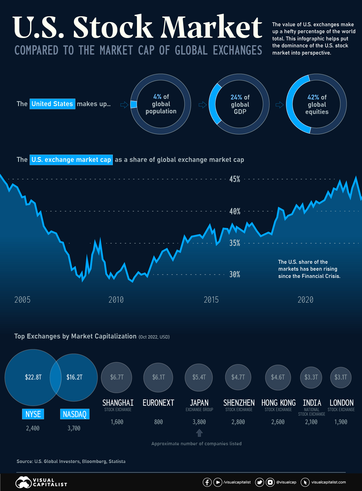
One of the most potent symbols of American financial dominance is the combined market capitalization of the country’s two biggest stock exchanges—the New York Stock Exchange (NYSE) and NASDAQ.
These two major listing hubs dwarf all other exchanges around the world. In fact, the NYSE on its own is larger than the Shanghai, Shenzhen, Japan, and Euronext exchanges put together.
| Rank | Exchange | Market Cap (Oct '22) | Location | Approx. # of companies |
|---|---|---|---|---|
| #1 | NYSE | $22.8T | United States 🇺🇸 | 2,400 |
| #2 | NASDAQ | $16.2T | United States 🇺🇸 | 3,700 |
| #3 | Shanghai Stock Exchange | $6.7T | China 🇨🇳 | 1,600 |
| #4 | EuroNext | $6.1T | Europe 🇪🇺 | 800 |
| #5 | Japan Exchange Group | $5.4T | Japan 🇯🇵 | 3,800 |
| #6 | Shenzhen Stock Exchange | $4.7T | China 🇨🇳 | 2,800 |
| #7 | Hong Kong Stock Exchange | $4.6T | Hong Kong SAR 🇭🇰 | 2,600 |
| #8 | National Stock Exchange of India | $3.3T | India 🇮🇳 | 2,100 |
| #9 | London Stock Exchange | $3.1T | UK 🇬🇧 | 1,900 |
| #10 | Toronto Stock Exchange | $2.7T | Canada 🇨🇦 | 1,500 |
One of the key reasons for this dominance is the sheer size of the U.S. economy. With a GDP of over $25 trillion, the U.S. economy is the largest in the world, and American exchanges are home to some of the world’s largest and most valuable companies, including tech giants like Apple, Amazon, and Microsoft.
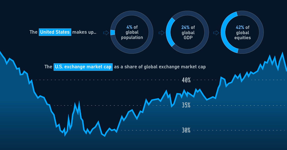
As of January 2023, the value of stocks listed on U.S. exchanges made up 42% of the global total. How does this total stack up, historically?
The U.S. Share Over Time
For much of the 1970s, the U.S. made up more than half of global stock market value. Over the course of the 1980s, the U.S. share of the global total began to dip, driven in part by the asset price bubble in Japan.
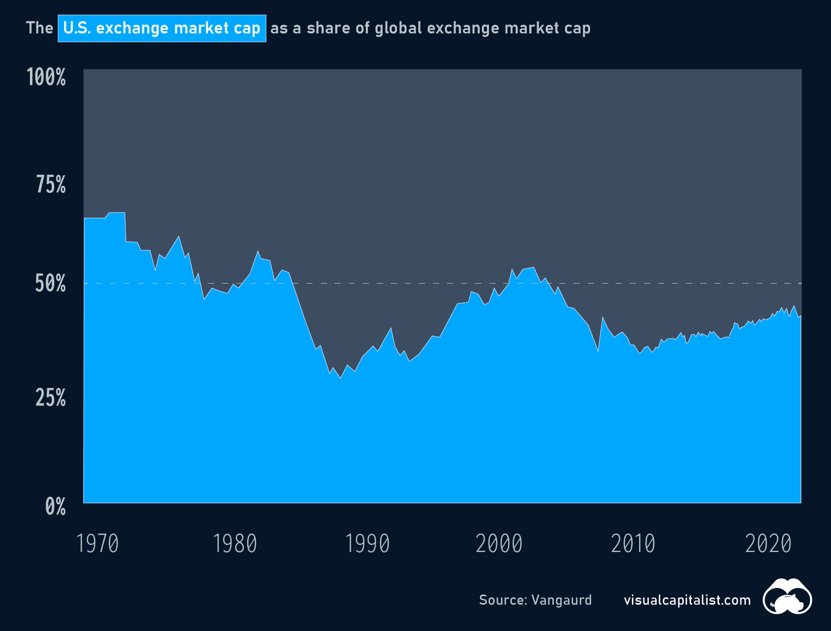
More recently, the U.S. slice of the equities pie bottomed out temporarily around the time of the Financial Crisis, but has been steadily rising ever since.
Will U.S. Exchanges Ever Be Surpassed?
U.S. stock exchanges have several advantages that make them attractive to investors, including strong regulatory oversight, a stable political and economic environment, and a diverse pool of well-known companies to invest in. The U.S. stock exchanges also have a long history of innovation and technological advancement, which has helped to maintain their position as leading global exchanges.
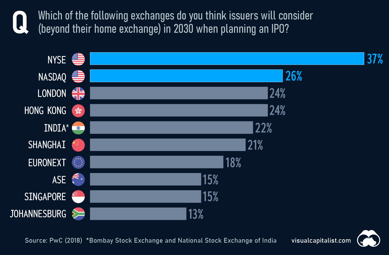
In 2018, PwC surveyed hundreds of capital market participants on the future of stock exchanges. Respondents felt that, by 2030, many of today’s top exchanges would remain popular choices for companies looking to go public.
Despite obvious advantages, U.S. exchanges do face plenty of competition, especially in emerging markets like China and India. The Shanghai Stock Exchange, for example, has seen significant growth in recent years and is now the world’s third-largest exchange by market capitalization.
Even as other markets continue to grow, U.S. exchanges are likely to remain a preferred destination for investors around the world for years to come.


Markets
U.S. Debt Interest Payments Reach $1 Trillion
U.S. debt interest payments have surged past the $1 trillion dollar mark, amid high interest rates and an ever-expanding debt burden.


U.S. Debt Interest Payments Reach $1 Trillion
This was originally posted on our Voronoi app. Download the app for free on iOS or Android and discover incredible data-driven charts from a variety of trusted sources.
The cost of paying for America’s national debt crossed the $1 trillion dollar mark in 2023, driven by high interest rates and a record $34 trillion mountain of debt.
Over the last decade, U.S. debt interest payments have more than doubled amid vast government spending during the pandemic crisis. As debt payments continue to soar, the Congressional Budget Office (CBO) reported that debt servicing costs surpassed defense spending for the first time ever this year.
This graphic shows the sharp rise in U.S. debt payments, based on data from the Federal Reserve.
A $1 Trillion Interest Bill, and Growing
Below, we show how U.S. debt interest payments have risen at a faster pace than at another time in modern history:
| Date | Interest Payments | U.S. National Debt |
|---|---|---|
| 2023 | $1.0T | $34.0T |
| 2022 | $830B | $31.4T |
| 2021 | $612B | $29.6T |
| 2020 | $518B | $27.7T |
| 2019 | $564B | $23.2T |
| 2018 | $571B | $22.0T |
| 2017 | $493B | $20.5T |
| 2016 | $460B | $20.0T |
| 2015 | $435B | $18.9T |
| 2014 | $442B | $18.1T |
| 2013 | $425B | $17.2T |
| 2012 | $417B | $16.4T |
| 2011 | $433B | $15.2T |
| 2010 | $400B | $14.0T |
| 2009 | $354B | $12.3T |
| 2008 | $380B | $10.7T |
| 2007 | $414B | $9.2T |
| 2006 | $387B | $8.7T |
| 2005 | $355B | $8.2T |
| 2004 | $318B | $7.6T |
| 2003 | $294B | $7.0T |
| 2002 | $298B | $6.4T |
| 2001 | $318B | $5.9T |
| 2000 | $353B | $5.7T |
| 1999 | $353B | $5.8T |
| 1998 | $360B | $5.6T |
| 1997 | $368B | $5.5T |
| 1996 | $362B | $5.3T |
| 1995 | $357B | $5.0T |
| 1994 | $334B | $4.8T |
| 1993 | $311B | $4.5T |
| 1992 | $306B | $4.2T |
| 1991 | $308B | $3.8T |
| 1990 | $298B | $3.4T |
| 1989 | $275B | $3.0T |
| 1988 | $254B | $2.7T |
| 1987 | $240B | $2.4T |
| 1986 | $225B | $2.2T |
| 1985 | $219B | $1.9T |
| 1984 | $205B | $1.7T |
| 1983 | $176B | $1.4T |
| 1982 | $157B | $1.2T |
| 1981 | $142B | $1.0T |
| 1980 | $113B | $930.2B |
| 1979 | $96B | $845.1B |
| 1978 | $84B | $789.2B |
| 1977 | $69B | $718.9B |
| 1976 | $61B | $653.5B |
| 1975 | $55B | $576.6B |
| 1974 | $50B | $492.7B |
| 1973 | $45B | $469.1B |
| 1972 | $39B | $448.5B |
| 1971 | $36B | $424.1B |
| 1970 | $35B | $389.2B |
| 1969 | $30B | $368.2B |
| 1968 | $25B | $358.0B |
| 1967 | $23B | $344.7B |
| 1966 | $21B | $329.3B |
Interest payments represent seasonally adjusted annual rate at the end of Q4.
At current rates, the U.S. national debt is growing by a remarkable $1 trillion about every 100 days, equal to roughly $3.6 trillion per year.
As the national debt has ballooned, debt payments even exceeded Medicaid outlays in 2023—one of the government’s largest expenditures. On average, the U.S. spent more than $2 billion per day on interest costs last year. Going further, the U.S. government is projected to spend a historic $12.4 trillion on interest payments over the next decade, averaging about $37,100 per American.
Exacerbating matters is that the U.S. is running a steep deficit, which stood at $1.1 trillion for the first six months of fiscal 2024. This has accelerated due to the 43% increase in debt servicing costs along with a $31 billion dollar increase in defense spending from a year earlier. Additionally, a $30 billion increase in funding for the Federal Deposit Insurance Corporation in light of the regional banking crisis last year was a major contributor to the deficit increase.
Overall, the CBO forecasts that roughly 75% of the federal deficit’s increase will be due to interest costs by 2034.

-

 Green2 weeks ago
Ranked: Top Countries by Total Forest Loss Since 2001
-

 Travel1 week ago
Ranked: The World’s Top Flight Routes, by Revenue
-

 Technology1 week ago
Ranked: Semiconductor Companies by Industry Revenue Share
-

 Money2 weeks ago
Which States Have the Highest Minimum Wage in America?
-

 Real Estate2 weeks ago
Ranked: The Most Valuable Housing Markets in America
-

 Markets2 weeks ago
Charted: Big Four Market Share by S&P 500 Audits
-

 AI2 weeks ago
The Stock Performance of U.S. Chipmakers So Far in 2024
-

 Misc2 weeks ago
Almost Every EV Stock is Down After Q1 2024