Markets
These Global Cities Show the Highest Real Estate Bubble Risk


These Global Cities Show the Highest Real Estate Bubble Risk
Housing bubbles are a tricky phenomenon. As a market gathers steam and prices increase, it remains a matter of debate whether that market is overvalued and flooded with speculation, or it’s simply experiencing robust demand.
Of course, once a bubble bursts, it’s all obvious in hindsight.
One common red flag is when prices decouple from local incomes and rents. As well, imbalances in the real economy, such as excessive construction activity and lending can signal a bubble in the making.
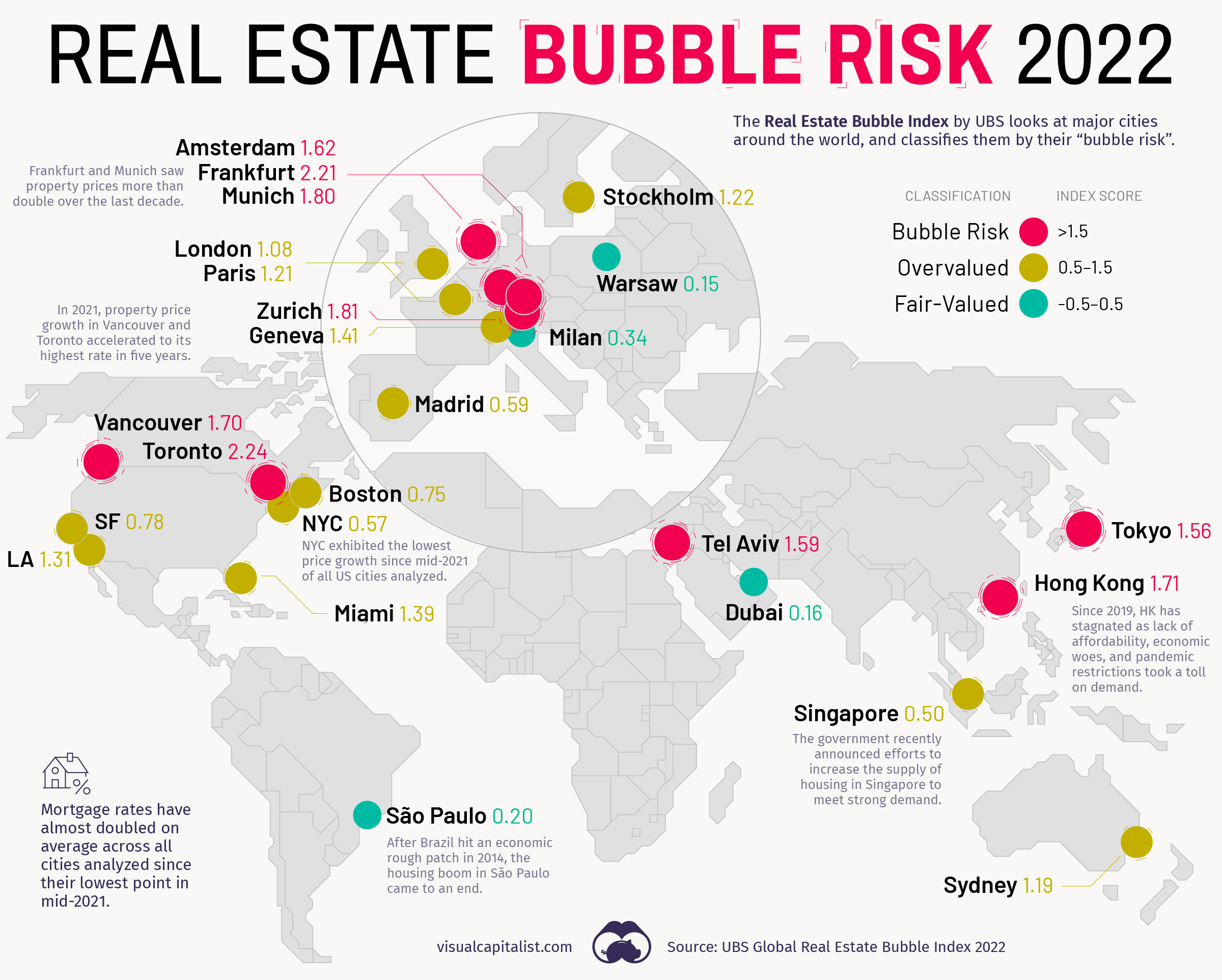
The map above, based on data from the Real Estate Bubble Index by UBS, examines 25 global cities, scoring them based on their bubble risk.
Overinflated Markets
In the 2022 edition of the Real Estate Bubble Index, nine of the cities covered were classified as having extreme bubble risk (1.5 or higher score).
| Rank | Risk Category | City | Bubble Index Score |
|---|---|---|---|
| #1 | 🔴 | 🇨🇦 Toronto | 2.24 |
| #2 | 🔴 | 🇩🇪 Frankfurt | 2.21 |
| #3 | 🔴 | 🇨🇭 Zurich | 1.81 |
| #4 | 🔴 | 🇩🇪 Munich | 1.80 |
| #5 | 🔴 | 🇭🇰 Hong Kong | 1.71 |
| #6 | 🔴 | 🇨🇦 Vancouver | 1.70 |
| #7 | 🔴 | 🇳🇱 Amsterdam | 1.62 |
| #8 | 🔴 | 🇮🇱 Tel Aviv | 1.59 |
| #9 | 🔴 | 🇯🇵 Tokyo | 1.56 |
| #10 | 🟠 | 🇺🇸 Miami | 1.39 |
| #11 | 🟠 | 🇺🇸 Los Angeles | 1.31 |
| #12 | 🟠 | 🇸🇪 Stockholm | 1.22 |
| #13 | 🟠 | 🇫🇷 Paris | 1.21 |
| #14 | 🟠 | 🇦🇺 Sydney | 1.19 |
| #15 | 🟠 | 🇨🇭 Geneva | 1.14 |
| #16 | 🟠 | 🇬🇧 London | 1.08 |
| #17 | 🟠 | 🇺🇸 San Francisco | 0.78 |
| #18 | 🟠 | 🇺🇸 Boston | 0.75 |
| #19 | 🟠 | 🇪🇸 Madrid | 0.59 |
| #20 | 🟠 | 🇺🇸 New York | 0.57 |
| #21 | 🟠 | 🇸🇬 Singapore | 0.50 |
| #22 | 🟢 | 🇮🇹 Milan | 0.34 |
| #23 | 🟢 | 🇧🇷 Sao Paulo | 0.20 |
| #24 | 🟢 | 🇦🇪 Dubai | 0.16 |
| #25 | 🟢 | 🇵🇱 Warsaw | 0.15 |
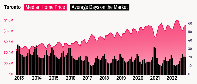
Canada’s largest city finds itself at the top of a ranking no city wants to end up on. Toronto’s home prices have been rising steadily for years now, and many, including UBS, believe that the city is now firmly in bubble territory.
Vancouver also finds itself in a similar position. Both Canadian cities have a high quality of life and have thriving tech industries.
Notably, none of the U.S. cities analyzed find themselves in the most extreme bubble risk category. The closest scoring U.S. city was Miami, which sits firmly in overvalued territory (0.5-1.5 range) with a score of 1.39.
Examining the Trends
In recent years, low interest rates helped push home prices and incomes further apart.
For cities in the bubble risk zone, prices have climbed by an average of 60% in inflation-adjusted terms over the past decade, while rents and real incomes increased by just 12%. And, while COVID-19 briefly put a dent in urban demand, rents in the cities analyzed rose at around the same pace as pre-pandemic times.
As a result, all but three of the cities saw positive price growth over the past year from a nominal price perspective:
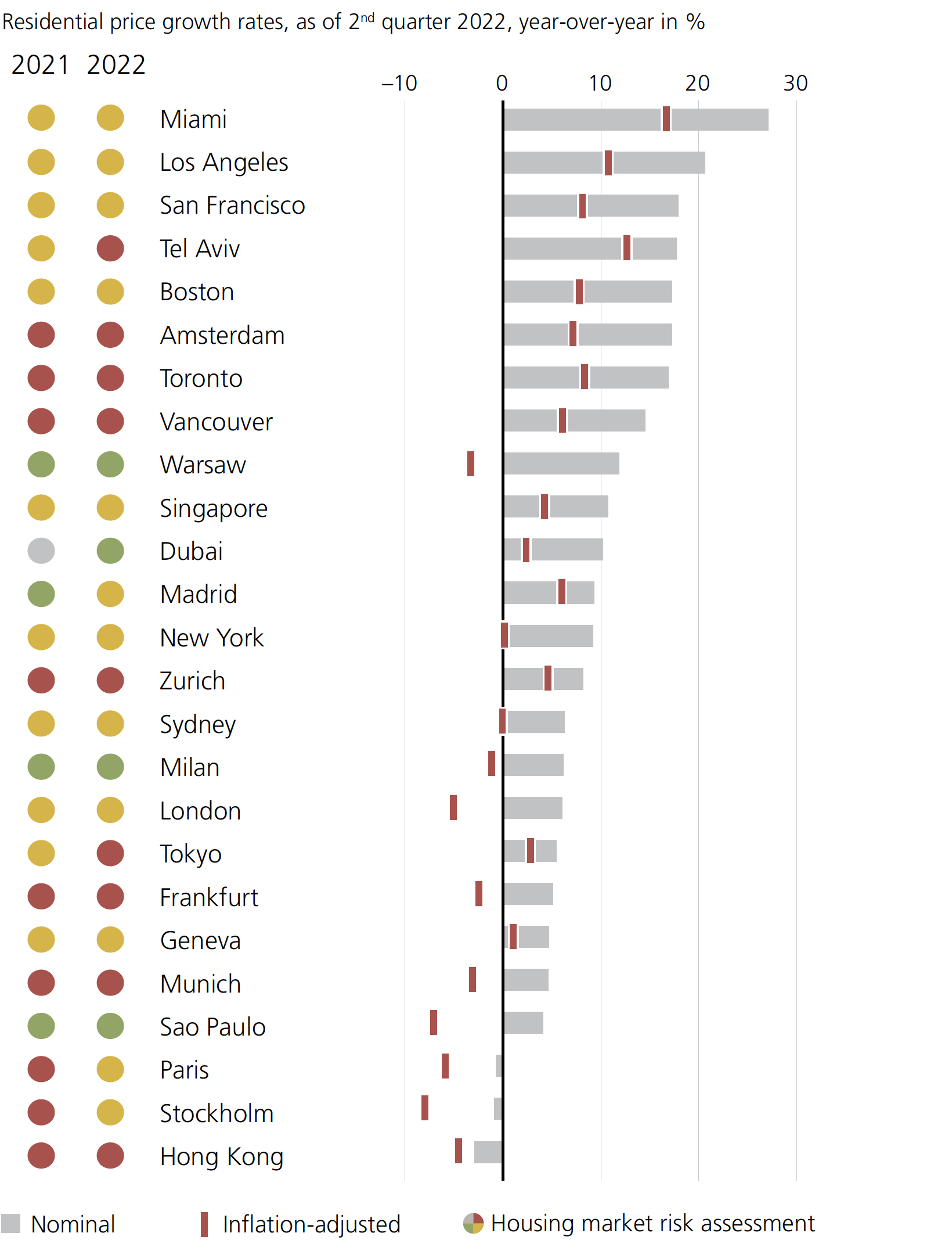
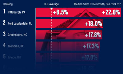
U.S. cities occupy a number of spots at the top of this chart. Miami, in particular, is seeing strong internal migration patterns, as well as renewed interest from foreign investors.
Hong Kong experienced the biggest one-year nominal drop of all the cities analyzed. The report notes that since around 2019 Hong Kong “has broadly stagnated as the lack of affordability, economic woes, and pandemic restrictions all took a major toll on demand.”
Prices can’t rise forever. According to UBS, most cities with high valuations, price corrections have already begun, or could be right around the corner.


Markets
U.S. Debt Interest Payments Reach $1 Trillion
U.S. debt interest payments have surged past the $1 trillion dollar mark, amid high interest rates and an ever-expanding debt burden.


U.S. Debt Interest Payments Reach $1 Trillion
This was originally posted on our Voronoi app. Download the app for free on iOS or Android and discover incredible data-driven charts from a variety of trusted sources.
The cost of paying for America’s national debt crossed the $1 trillion dollar mark in 2023, driven by high interest rates and a record $34 trillion mountain of debt.
Over the last decade, U.S. debt interest payments have more than doubled amid vast government spending during the pandemic crisis. As debt payments continue to soar, the Congressional Budget Office (CBO) reported that debt servicing costs surpassed defense spending for the first time ever this year.
This graphic shows the sharp rise in U.S. debt payments, based on data from the Federal Reserve.
A $1 Trillion Interest Bill, and Growing
Below, we show how U.S. debt interest payments have risen at a faster pace than at another time in modern history:
| Date | Interest Payments | U.S. National Debt |
|---|---|---|
| 2023 | $1.0T | $34.0T |
| 2022 | $830B | $31.4T |
| 2021 | $612B | $29.6T |
| 2020 | $518B | $27.7T |
| 2019 | $564B | $23.2T |
| 2018 | $571B | $22.0T |
| 2017 | $493B | $20.5T |
| 2016 | $460B | $20.0T |
| 2015 | $435B | $18.9T |
| 2014 | $442B | $18.1T |
| 2013 | $425B | $17.2T |
| 2012 | $417B | $16.4T |
| 2011 | $433B | $15.2T |
| 2010 | $400B | $14.0T |
| 2009 | $354B | $12.3T |
| 2008 | $380B | $10.7T |
| 2007 | $414B | $9.2T |
| 2006 | $387B | $8.7T |
| 2005 | $355B | $8.2T |
| 2004 | $318B | $7.6T |
| 2003 | $294B | $7.0T |
| 2002 | $298B | $6.4T |
| 2001 | $318B | $5.9T |
| 2000 | $353B | $5.7T |
| 1999 | $353B | $5.8T |
| 1998 | $360B | $5.6T |
| 1997 | $368B | $5.5T |
| 1996 | $362B | $5.3T |
| 1995 | $357B | $5.0T |
| 1994 | $334B | $4.8T |
| 1993 | $311B | $4.5T |
| 1992 | $306B | $4.2T |
| 1991 | $308B | $3.8T |
| 1990 | $298B | $3.4T |
| 1989 | $275B | $3.0T |
| 1988 | $254B | $2.7T |
| 1987 | $240B | $2.4T |
| 1986 | $225B | $2.2T |
| 1985 | $219B | $1.9T |
| 1984 | $205B | $1.7T |
| 1983 | $176B | $1.4T |
| 1982 | $157B | $1.2T |
| 1981 | $142B | $1.0T |
| 1980 | $113B | $930.2B |
| 1979 | $96B | $845.1B |
| 1978 | $84B | $789.2B |
| 1977 | $69B | $718.9B |
| 1976 | $61B | $653.5B |
| 1975 | $55B | $576.6B |
| 1974 | $50B | $492.7B |
| 1973 | $45B | $469.1B |
| 1972 | $39B | $448.5B |
| 1971 | $36B | $424.1B |
| 1970 | $35B | $389.2B |
| 1969 | $30B | $368.2B |
| 1968 | $25B | $358.0B |
| 1967 | $23B | $344.7B |
| 1966 | $21B | $329.3B |
Interest payments represent seasonally adjusted annual rate at the end of Q4.
At current rates, the U.S. national debt is growing by a remarkable $1 trillion about every 100 days, equal to roughly $3.6 trillion per year.
As the national debt has ballooned, debt payments even exceeded Medicaid outlays in 2023—one of the government’s largest expenditures. On average, the U.S. spent more than $2 billion per day on interest costs last year. Going further, the U.S. government is projected to spend a historic $12.4 trillion on interest payments over the next decade, averaging about $37,100 per American.
Exacerbating matters is that the U.S. is running a steep deficit, which stood at $1.1 trillion for the first six months of fiscal 2024. This has accelerated due to the 43% increase in debt servicing costs along with a $31 billion dollar increase in defense spending from a year earlier. Additionally, a $30 billion increase in funding for the Federal Deposit Insurance Corporation in light of the regional banking crisis last year was a major contributor to the deficit increase.
Overall, the CBO forecasts that roughly 75% of the federal deficit’s increase will be due to interest costs by 2034.

-

 Real Estate2 weeks ago
Visualizing America’s Shortage of Affordable Homes
-

 Technology1 week ago
Ranked: Semiconductor Companies by Industry Revenue Share
-

 Money1 week ago
Which States Have the Highest Minimum Wage in America?
-

 Real Estate1 week ago
Ranked: The Most Valuable Housing Markets in America
-

 Markets2 weeks ago
Charted: Big Four Market Share by S&P 500 Audits
-

 AI2 weeks ago
The Stock Performance of U.S. Chipmakers So Far in 2024
-

 Automotive2 weeks ago
Almost Every EV Stock is Down After Q1 2024
-

 Money2 weeks ago
Where Does One U.S. Tax Dollar Go?