Markets
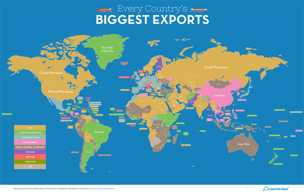
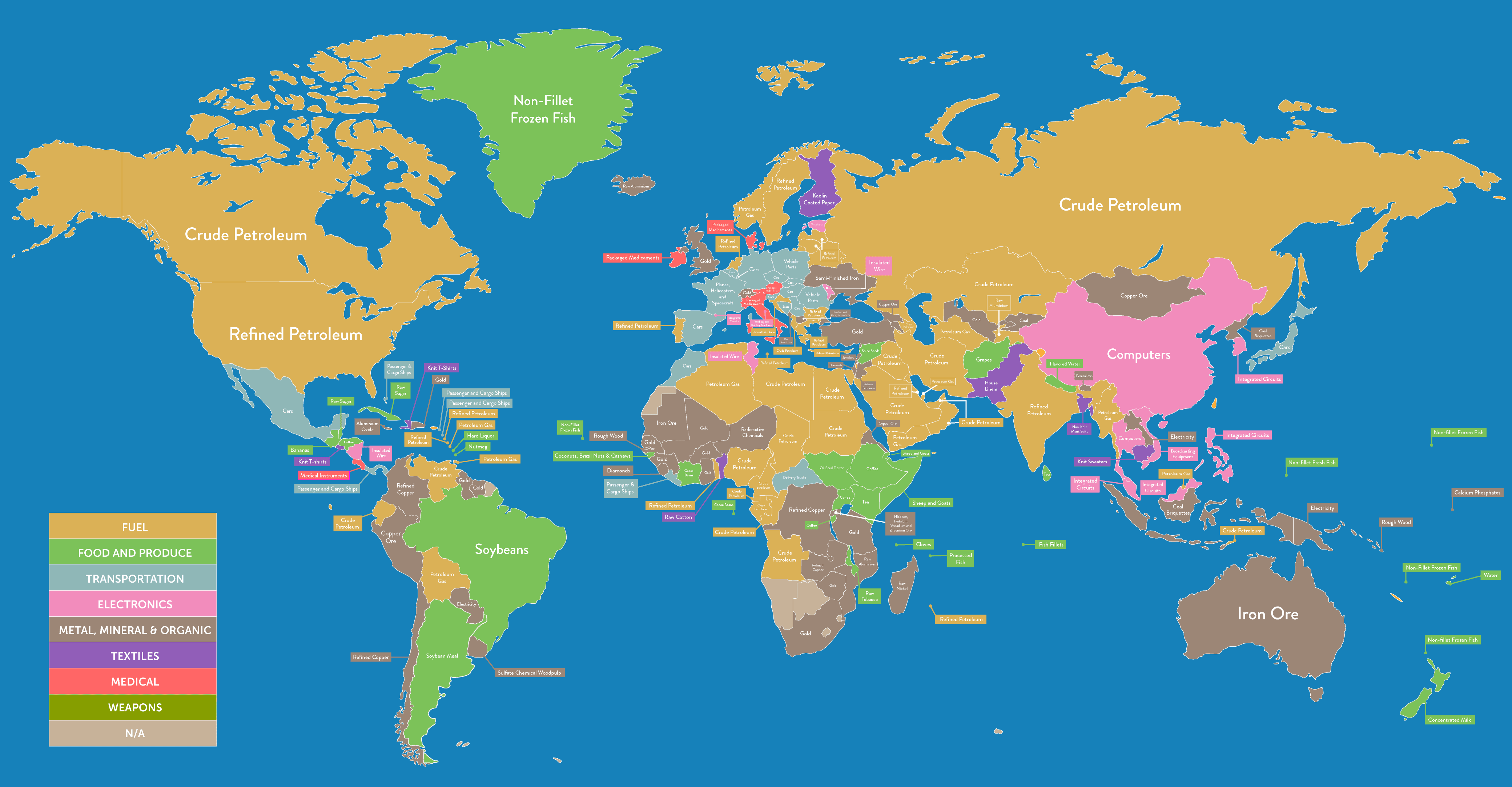
Mapping the Top Export of Every Country
View a high resolution version of this graphic
Mapping the Top Export of Every Country
View the high resolution version of today’s graphic by clicking here.
In a global market with (mostly) free trade, it’s common to see economies that are very specialized, each producing specific goods based on the competitive advantages, incentives, and resources they have available.
Whether those inputs are inexpensive labor, ample amounts of natural resources, or a surplus in engineering talent, countries can use these advantages to manufacture and sell goods on the international market at a higher level of quality or a better price than competitors.
Simplifying World Trade
Today’s infographic comes to us from VoucherCloud, and it helps us get a sense of this specialization by looking at the top export of every country in the world. It’s a simple but telling way to see what countries are “good” at producing.
To start, here is a breakdown of countries, based on top export category:
| Top Export (Category) | # of countries | % of countries |
|---|---|---|
| Fuel | 53 | 28.3% |
| Metal, Mineral and Organic | 50 | 26.7% |
| Food and Produce | 35 | 18.7% |
| Transportation | 24 | 12.8% |
| Electronics | 14 | 7.5% |
| Textiles | 6 | 3.2% |
| Medical | 5 | 2.7% |
| Weapons | 0 | 0.0% |
Note: Dataset is from the Observatory of Economic Complexity (2015)
At a high level, it’s clear that the vast majority of exports are derived from natural resources.
Fuels, metals, minerals, and organics make up over half of all top exports. Meanwhile, food and produce, which includes commodities like sugar, coffee, fish, and soybeans, also could be classified this way as well – and they make up a further 18.7% of top exports.
A Dive Into Regions
Viewing specific regions based on this concept can also provide some insight, as well.
It gives a sense of how developed the economies are in a certain area – and it also shows what resources are plentiful and in demand from those regions.
Middle East
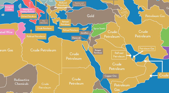
In case you weren’t aware, oil is a pretty big deal in the Middle East. There are a few exceptions: Israel’s top export is diamonds, Jordan’s is fertilizers, and Lebanon specializes in jewelry. The most recent data for war-torn Syria shows spice seeds at the top export.
Europe
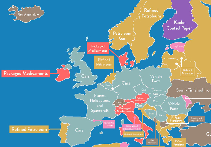
Meanwhile, Europe is home to many developed economies that are focused on value-added goods, with many being in the transportation sector. Cars are a top export for nine countries here, and vehicle parts are a top export for other places, like Poland or Romania, as well.
Interestingly, France stands out here with its top exports being aerospace-related.
Asia
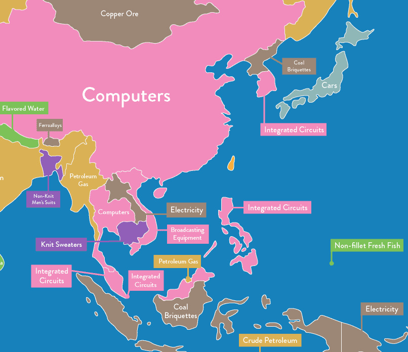
Looking at Asia also provides some interesting contrasts.
South Korea specializes in integrated circuits, while their northern neighbors sell coal briquettes (mostly to China) as a top export. It may also be surprising to see economies like Thailand and Vietnam having top exports such as computers and broadcasting equipment.
At the same time, who knew that Nepal had such a bustling flavored water industry?


Markets
U.S. Debt Interest Payments Reach $1 Trillion
U.S. debt interest payments have surged past the $1 trillion dollar mark, amid high interest rates and an ever-expanding debt burden.


U.S. Debt Interest Payments Reach $1 Trillion
This was originally posted on our Voronoi app. Download the app for free on iOS or Android and discover incredible data-driven charts from a variety of trusted sources.
The cost of paying for America’s national debt crossed the $1 trillion dollar mark in 2023, driven by high interest rates and a record $34 trillion mountain of debt.
Over the last decade, U.S. debt interest payments have more than doubled amid vast government spending during the pandemic crisis. As debt payments continue to soar, the Congressional Budget Office (CBO) reported that debt servicing costs surpassed defense spending for the first time ever this year.
This graphic shows the sharp rise in U.S. debt payments, based on data from the Federal Reserve.
A $1 Trillion Interest Bill, and Growing
Below, we show how U.S. debt interest payments have risen at a faster pace than at another time in modern history:
| Date | Interest Payments | U.S. National Debt |
|---|---|---|
| 2023 | $1.0T | $34.0T |
| 2022 | $830B | $31.4T |
| 2021 | $612B | $29.6T |
| 2020 | $518B | $27.7T |
| 2019 | $564B | $23.2T |
| 2018 | $571B | $22.0T |
| 2017 | $493B | $20.5T |
| 2016 | $460B | $20.0T |
| 2015 | $435B | $18.9T |
| 2014 | $442B | $18.1T |
| 2013 | $425B | $17.2T |
| 2012 | $417B | $16.4T |
| 2011 | $433B | $15.2T |
| 2010 | $400B | $14.0T |
| 2009 | $354B | $12.3T |
| 2008 | $380B | $10.7T |
| 2007 | $414B | $9.2T |
| 2006 | $387B | $8.7T |
| 2005 | $355B | $8.2T |
| 2004 | $318B | $7.6T |
| 2003 | $294B | $7.0T |
| 2002 | $298B | $6.4T |
| 2001 | $318B | $5.9T |
| 2000 | $353B | $5.7T |
| 1999 | $353B | $5.8T |
| 1998 | $360B | $5.6T |
| 1997 | $368B | $5.5T |
| 1996 | $362B | $5.3T |
| 1995 | $357B | $5.0T |
| 1994 | $334B | $4.8T |
| 1993 | $311B | $4.5T |
| 1992 | $306B | $4.2T |
| 1991 | $308B | $3.8T |
| 1990 | $298B | $3.4T |
| 1989 | $275B | $3.0T |
| 1988 | $254B | $2.7T |
| 1987 | $240B | $2.4T |
| 1986 | $225B | $2.2T |
| 1985 | $219B | $1.9T |
| 1984 | $205B | $1.7T |
| 1983 | $176B | $1.4T |
| 1982 | $157B | $1.2T |
| 1981 | $142B | $1.0T |
| 1980 | $113B | $930.2B |
| 1979 | $96B | $845.1B |
| 1978 | $84B | $789.2B |
| 1977 | $69B | $718.9B |
| 1976 | $61B | $653.5B |
| 1975 | $55B | $576.6B |
| 1974 | $50B | $492.7B |
| 1973 | $45B | $469.1B |
| 1972 | $39B | $448.5B |
| 1971 | $36B | $424.1B |
| 1970 | $35B | $389.2B |
| 1969 | $30B | $368.2B |
| 1968 | $25B | $358.0B |
| 1967 | $23B | $344.7B |
| 1966 | $21B | $329.3B |
Interest payments represent seasonally adjusted annual rate at the end of Q4.
At current rates, the U.S. national debt is growing by a remarkable $1 trillion about every 100 days, equal to roughly $3.6 trillion per year.
As the national debt has ballooned, debt payments even exceeded Medicaid outlays in 2023—one of the government’s largest expenditures. On average, the U.S. spent more than $2 billion per day on interest costs last year. Going further, the U.S. government is projected to spend a historic $12.4 trillion on interest payments over the next decade, averaging about $37,100 per American.
Exacerbating matters is that the U.S. is running a steep deficit, which stood at $1.1 trillion for the first six months of fiscal 2024. This has accelerated due to the 43% increase in debt servicing costs along with a $31 billion dollar increase in defense spending from a year earlier. Additionally, a $30 billion increase in funding for the Federal Deposit Insurance Corporation in light of the regional banking crisis last year was a major contributor to the deficit increase.
Overall, the CBO forecasts that roughly 75% of the federal deficit’s increase will be due to interest costs by 2034.

-

 Markets1 week ago
Ranked: The Largest U.S. Corporations by Number of Employees
-

 Green3 weeks ago
Ranked: Top Countries by Total Forest Loss Since 2001
-

 Money2 weeks ago
Where Does One U.S. Tax Dollar Go?
-

 Automotive2 weeks ago
Almost Every EV Stock is Down After Q1 2024
-

 AI2 weeks ago
The Stock Performance of U.S. Chipmakers So Far in 2024
-

 Markets2 weeks ago
Charted: Big Four Market Share by S&P 500 Audits
-

 Real Estate2 weeks ago
Ranked: The Most Valuable Housing Markets in America
-

 Money2 weeks ago
Which States Have the Highest Minimum Wage in America?