Technology
From Amazon to Zoom: What Happens in an Internet Minute In 2021?
From Amazon to Zoom: An Internet Minute In 2021
In our everyday lives, not much may happen in a minute. But when gauging the depth of internet activity occurring all at once, it can be extraordinary. Today, around five billion internet users exist across the globe.
This annual infographic from Domo captures just how much activity is going on in any given minute, and the amount of data being generated by users. To put it mildly, there’s a lot.
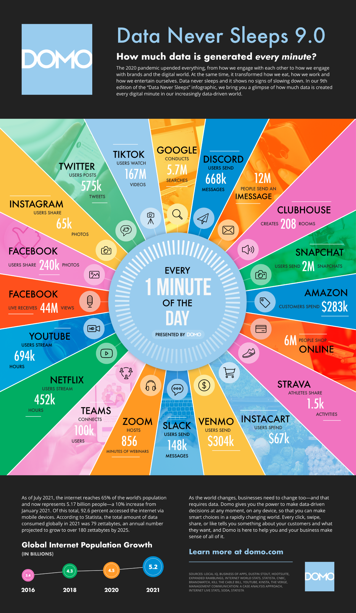
The Internet Minute
At the heart of the world’s digital activity are the everyday services and applications that have become staples in our lives. Collectively, these produce unimaginable quantities of user activity and associated data.
Here are just some of the key figures of what happens in a minute:
- Amazon customers spend $283,000
- 12 million people send an iMessage
- 6 million people shop online
- Instacart users spend $67,000
- Slack users send 148,000 messages
- Microsoft Teams connects 100,000 users
- YouTube users stream 694,000 videos
- Facebook Live receives 44 million views
- Instagram users share 65,000 photos
- Tiktok users watch 167 million videos
As these facts show, Big Tech companies have quite the influence over our lives. That influence is becoming difficult to ignore, and draws increasing media and political attention. And some see this attention as a plausible explanation for why Facebook changed their name—to dissociate from their old one in the process.
One tangible measure of this influence is the massive amount of revenue Big Tech companies bring in. To get a better sense of this, we can look at Big Tech’s revenue generating capabilities on a per-minute basis as well:
| Company | Revenue Per Minute |
|---|---|
| Amazon | $955,517 |
| Apple | $848,090 |
| Alphabet (Google) | $433,014 |
| Microsoft | $327,823 |
| $213,628 | |
| Tesla | $81,766 |
| Netflix | $50,566 |
Much of the revenue that these elite trillion-dollar stocks generate can be traced back to all the activity on their various networks and platforms.
In other words, the 5.7 million Google searches that occur every minute is the key to their $433,014 in per minute sales.
The Internet Minute Over The Years
With the amount of data and information in the digital universe effectively doubling every two years, it’s fair to say the internet minute has gone through some changes over the years. Here are just some areas that have experienced impressive growth:
- In 2016, Snapchat users 527k photos per minute, compared to 2 million in 2021
- In 2017, Twitter saw 452k Tweets per minute, compared to 575k in 2021
- In 2018, $862,823 was spent online shopping, while 2 million people were shopping per minute in 2021
- In 2019, 4.5 million videos on YouTube were being viewed every minute, while in 2021 users were streaming 694k hours
- In 2020, Netflix users streamed 404k hours per minute, growing to 452k hours in 2021
Here’s a look at the services that have been featured in the various iterations of this graphic over the years:
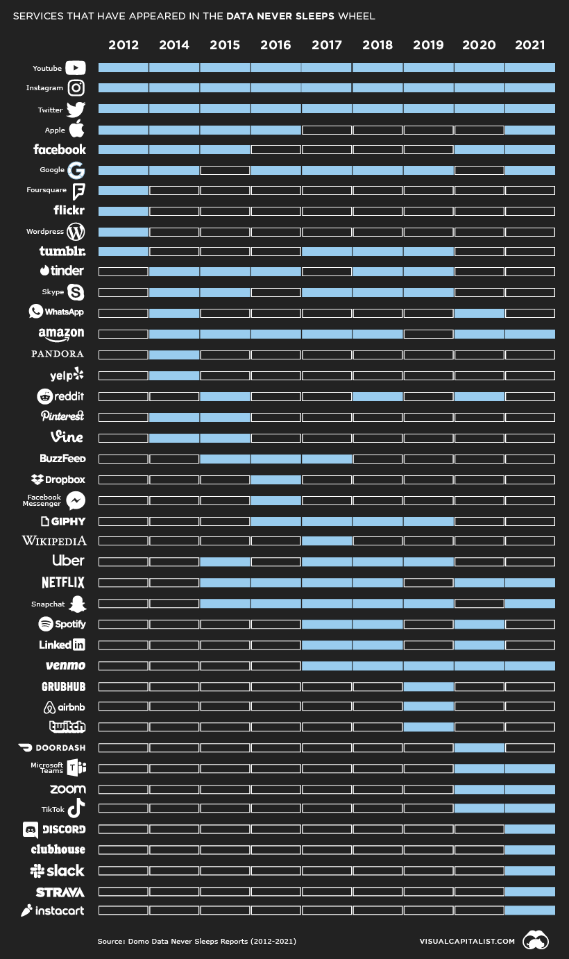
Twitter, Instagram, and Youtube are the only three brands to be featured every single year.
Internet Growth Perspectives
The Internet Minute wheel also helps to put the internet’s rapid rate of adoption into perspective. For instance, in 1993, there were only 14 million internet users across the globe. But today, there are over 14 million just in Chile.
That said, the total addressable market still has some room left. By some measures, the complete number of internet users grew by 500 million in 2021, a roughly 11% jump from 4.5 billion users in 2020. This comes out to an astonishing 950 new users on a per minute basis.
What’s more, in the long term, with the appropriate infrastructure in place, certain areas within emerging markets can experience buoyant growth in the number of connected citizens. Here’s where the next billion internet users may come from, based on the largest disconnected populations.
| Rank | Country / Territory | Unconnected People | % of Population |
|---|---|---|---|
| 1 | India | 685,591,071 | 50% |
| 2 | China | 582,063,733 | 41% |
| 3 | Pakistan | 142,347,735 | 65% |
| 4 | Nigeria | 118,059,925 | 58% |
| 5 | Bangladesh | 97,427,352 | 59% |
| 6 | Indonesia | 96,709,226 | 36% |
| 7 | Ethiopia | 92,385,728 | 81% |
| 8 | Democratic Republic of Congo | 71,823,319 | 81% |
| 9 | Brazil | 61,423,295 | 29% |
| 10 | Egypt | 46,626,170 | 46% |
With this growth trajectory in mind, we can expect future figures to become even more astonishing. But the human mind is known to be bad at interpreting large numbers, so in future editions, the internet minute figures may need to be stripped down to the internet second.


Brands
How Tech Logos Have Evolved Over Time
From complete overhauls to more subtle tweaks, these tech logos have had quite a journey. Featuring: Google, Apple, and more.


How Tech Logos Have Evolved Over Time
This was originally posted on our Voronoi app. Download the app for free on iOS or Android and discover incredible data-driven charts from a variety of trusted sources.
One would be hard-pressed to find a company that has never changed its logo. Granted, some brands—like Rolex, IBM, and Coca-Cola—tend to just have more minimalistic updates. But other companies undergo an entire identity change, thus necessitating a full overhaul.
In this graphic, we visualized the evolution of prominent tech companies’ logos over time. All of these brands ranked highly in a Q1 2024 YouGov study of America’s most famous tech brands. The logo changes are sourced from 1000logos.net.
How Many Times Has Google Changed Its Logo?
Google and Facebook share a 98% fame rating according to YouGov. But while Facebook’s rise was captured in The Social Network (2010), Google’s history tends to be a little less lionized in popular culture.
For example, Google was initially called “Backrub” because it analyzed “back links” to understand how important a website was. Since its founding, Google has undergone eight logo changes, finally settling on its current one in 2015.
| Company | Number of Logo Changes |
|---|---|
| 8 | |
| HP | 8 |
| Amazon | 6 |
| Microsoft | 6 |
| Samsung | 6 |
| Apple | 5* |
Note: *Includes color changes. Source: 1000Logos.net
Another fun origin story is Microsoft, which started off as Traf-O-Data, a traffic counter reading company that generated reports for traffic engineers. By 1975, the company was renamed. But it wasn’t until 2012 that Microsoft put the iconic Windows logo—still the most popular desktop operating system—alongside its name.
And then there’s Samsung, which started as a grocery trading store in 1938. Its pivot to electronics started in the 1970s with black and white television sets. For 55 years, the company kept some form of stars from its first logo, until 1993, when the iconic encircled blue Samsung logo debuted.
Finally, Apple’s first logo in 1976 featured Isaac Newton reading under a tree—moments before an apple fell on his head. Two years later, the iconic bitten apple logo would be designed at Steve Jobs’ behest, and it would take another two decades for it to go monochrome.

-

 Green1 week ago
Ranked: The Countries With the Most Air Pollution in 2023
-

 Automotive2 weeks ago
Almost Every EV Stock is Down After Q1 2024
-

 AI2 weeks ago
The Stock Performance of U.S. Chipmakers So Far in 2024
-

 Markets2 weeks ago
Charted: Big Four Market Share by S&P 500 Audits
-

 Real Estate2 weeks ago
Ranked: The Most Valuable Housing Markets in America
-

 Money2 weeks ago
Which States Have the Highest Minimum Wage in America?
-

 AI2 weeks ago
Ranked: Semiconductor Companies by Industry Revenue Share
-

 Travel2 weeks ago
Ranked: The World’s Top Flight Routes, by Revenue