Misc
The Elevation Span of Every Country in the World
View a high resolution version of this graphic.
The Elevation Span of Every Country in the World
View the high resolution version of today’s graphic by clicking here.
Giant countries like Canada or Russia can take their sprawling landmasses for granted, but for smaller oceanic nations, topography takes on greater importance.
In the Indian Ocean, ringed by protective barriers, lies the island city of Malé – the capital of the Maldives. Malé has a thriving tourism industry and is one of the most urbanized islands in the world, but it has one major problem: its elevation (or lack thereof).
Over 80% of the nation’s landmass is below 3.3 ft (1m), leaving it acutely vulnerable to the impacts of climate change. If sea levels continue to rise, the entire chain of islands, including the homes of half a million people, could be submerged in as soon as 30 years.
Breaking out the measuring stick
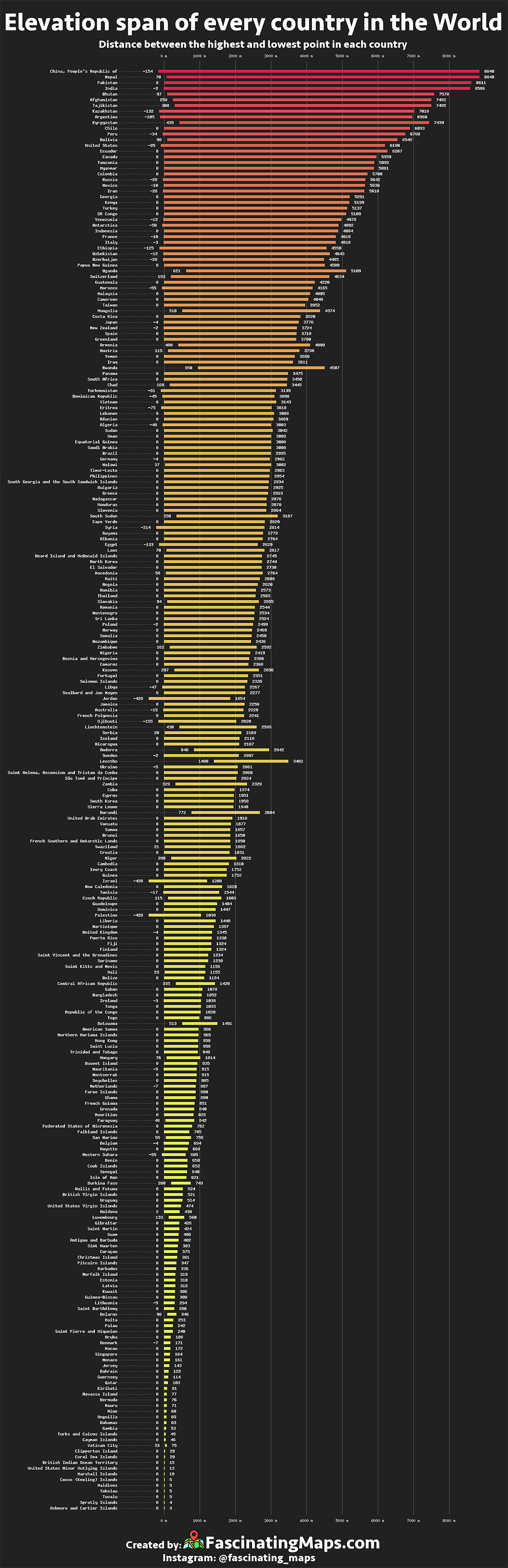
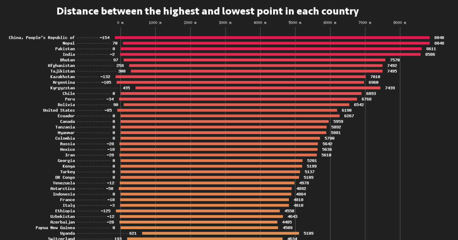
Today’s data visualization, via Fascinating Maps, is a global breakdown of every country’s elevation span, from the severe mountain peaks that dominate Bhutan’s landscape, to the sweltering Dead Sea depression that runs along the Israel–Jordan border.
By looking at the data, we see interesting patterns and unique situations emerge.
The Power of Zero: The median low-end land elevation of the world’s countries is zero. This is because shoreline typically makes up the lowest portion of a country’s terra firma. It’s easy to spot a landlocked country in the data set, as its lowest elevation is far more likely to be above sea level.
The Lowlands: In general, the smallest countries tend to have the smallest elevation spans, but some countries buck that trend. Denmark, which has a respectable 16,577 quare miles (42,933 sq. km) of land, has an elevation range of only 583 ft (178m). This means the highest point in the country is only 50m taller than its tallest building, Herlev Hospital, near Copenhagen.
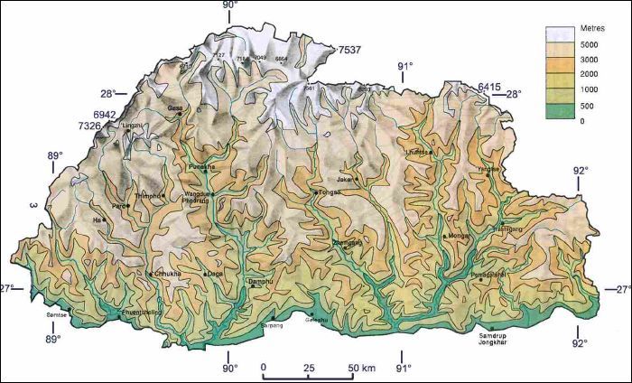
The Highlands: Three countries – Nepal, Tajikistan, and Bhutan – have an average elevation that soars above 10,000 ft (3,050m). The latter country has the highest average elevation in the world.
Bhutan Elevation Map:
Supersized Elevation Span: China has the the largest elevation span of any country on Earth. The average elevation of the country skews high, thanks in part to the Tibetan Plateau. A number of the highest permanent settlements in the world exist in this region.


Misc
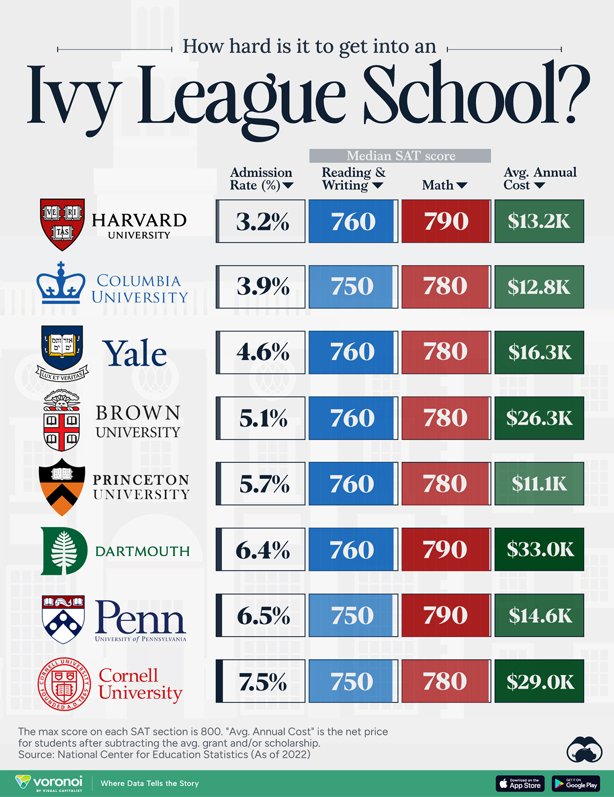
How Hard Is It to Get Into an Ivy League School?
We detail the admission rates and average annual cost for Ivy League schools, as well as the median SAT scores required to be accepted.
How Hard Is It to Get Into an Ivy League School?
This was originally posted on our Voronoi app. Download the app for free on iOS or Android and discover incredible data-driven charts from a variety of trusted sources.
Ivy League institutions are renowned worldwide for their academic excellence and long-standing traditions. But how hard is it to get into one of the top universities in the U.S.?
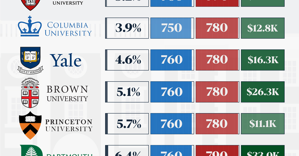
In this graphic, we detail the admission rates and average annual cost for Ivy League schools, as well as the median SAT scores required to be accepted. The data comes from the National Center for Education Statistics and was compiled by 24/7 Wall St.
Note that “average annual cost” represents the net price a student pays after subtracting the average value of grants and/or scholarships received.
Harvard is the Most Selective
The SAT is a standardized test commonly used for college admissions in the United States. It’s taken by high school juniors and seniors to assess their readiness for college-level academic work.
When comparing SAT scores, Harvard and Dartmouth are among the most challenging universities to gain admission to. The median SAT scores for their students are 760 for reading and writing and 790 for math. Still, Harvard has half the admission rate (3.2%) compared to Dartmouth (6.4%).
| School | Admission rate (%) | SAT Score: Reading & Writing | SAT Score: Math | Avg Annual Cost* |
|---|---|---|---|---|
| Harvard University | 3.2 | 760 | 790 | $13,259 |
| Columbia University | 3.9 | 750 | 780 | $12,836 |
| Yale University | 4.6 | 760 | 780 | $16,341 |
| Brown University | 5.1 | 760 | 780 | $26,308 |
| Princeton University | 5.7 | 760 | 780 | $11,080 |
| Dartmouth College | 6.4 | 760 | 790 | $33,023 |
| University of Pennsylvania | 6.5 | 750 | 790 | $14,851 |
| Cornell University | 7.5 | 750 | 780 | $29,011 |
*Costs after receiving federal financial aid.
Additionally, Dartmouth has the highest average annual cost at $33,000. Princeton has the lowest at $11,100.
While student debt has surged in the United States in recent years, hitting $1.73 trillion in 2023, the worth of obtaining a degree from any of the schools listed surpasses mere academics. This is evidenced by the substantial incomes earned by former students.
Harvard grads, for example, have the highest average starting salary in the country, at $91,700.

-

 Maps2 weeks ago
Mapped: Average Wages Across Europe
-

 Money1 week ago
Which States Have the Highest Minimum Wage in America?
-

 Real Estate1 week ago
Ranked: The Most Valuable Housing Markets in America
-

 Markets1 week ago
Charted: Big Four Market Share by S&P 500 Audits
-

 AI1 week ago
The Stock Performance of U.S. Chipmakers So Far in 2024
-

 Automotive1 week ago
Almost Every EV Stock is Down After Q1 2024
-

 Money2 weeks ago
Where Does One U.S. Tax Dollar Go?
-

 Green2 weeks ago
Ranked: Top Countries by Total Forest Loss Since 2001