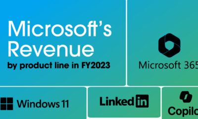
Technology
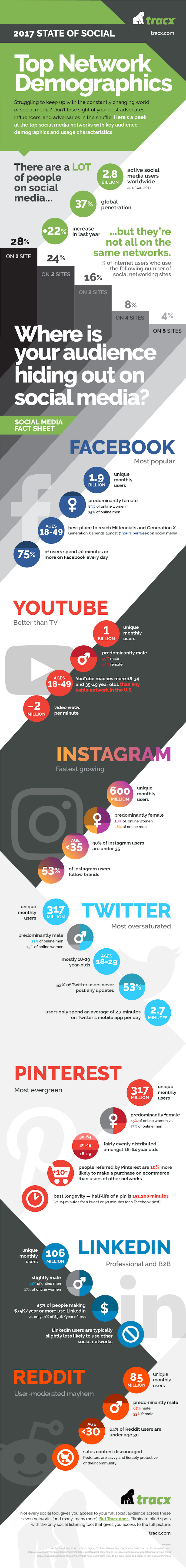
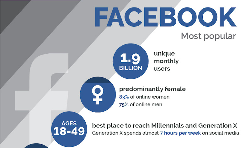
The Key Differences in Demographics for the Top 7 Social Networks
In today’s multi-platform world, the smart businesses are tailoring their messages to audiences based on a variety of factors.
Of course, there are the benefits and limitations to each platform to be considered – but even more importantly, the audience and activity on each platform can differ considerably. The demographics of Pinterest vary from those of YouTube or Facebook, and content creators need to think about these fundamental differences in order to maximize user engagement.
Breaking Down the Top Social Networks
The following infographic comes to us from Tracx, and it dives deep into the demographic differences between the top seven social networks.
We noticed that Snapchat, owned by newly-IPO’d Snap Inc., is not included in the above infographic. While the growth of the $25 billion company has been extremely impressive, by some metrics it is still closing in on some of the smaller social networks (Twitter, Pinterest).
In any case, here’s what you need to know on the fast-growing, millennial-focused network.
The Missing Social Network
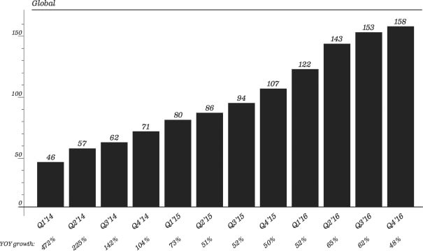
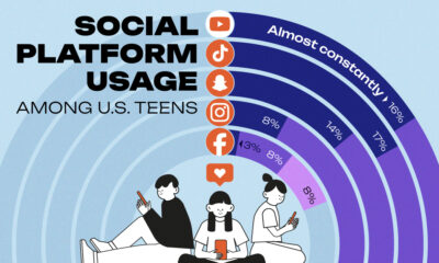
According to the most recent S-1 filing, Snapchat currently has 2.5 billion snaps created per day by an audience of 161 million Daily Active Users (DAUs) as of December 2016.
Here’s what growth looks like, on a quarterly level, for DAUs:
Some other interesting Snapchat stats?
- Users who were 25 years old or older opened Snapchat around 12 times a day and spent 20 minutes a day in the app on average.
- Users who were younger than 25 visited Snapchat more than 20 times a day and spent 30 minutes in it on average.
- Millennials account for 7 out of every 10 Snapchatters.
- Between 500,000 and 1 million Snapchat ads are seen per day.
- About 70% of Snapchatters are female.
- 30% of teens rank Snapchat as their most important social network.
Snapchat is already considered an important piece for companies looking to hit the North American millennial market. As a result, investors value the company over 2x more than Twitter, even despite Snapchat’s monetization problems.
The question is: how long can the growth continue – and when it stops, will it be a top three social network in North America overall?


Brands
How Tech Logos Have Evolved Over Time
From complete overhauls to more subtle tweaks, these tech logos have had quite a journey. Featuring: Google, Apple, and more.


How Tech Logos Have Evolved Over Time
This was originally posted on our Voronoi app. Download the app for free on iOS or Android and discover incredible data-driven charts from a variety of trusted sources.
One would be hard-pressed to find a company that has never changed its logo. Granted, some brands—like Rolex, IBM, and Coca-Cola—tend to just have more minimalistic updates. But other companies undergo an entire identity change, thus necessitating a full overhaul.
In this graphic, we visualized the evolution of prominent tech companies’ logos over time. All of these brands ranked highly in a Q1 2024 YouGov study of America’s most famous tech brands. The logo changes are sourced from 1000logos.net.
How Many Times Has Google Changed Its Logo?
Google and Facebook share a 98% fame rating according to YouGov. But while Facebook’s rise was captured in The Social Network (2010), Google’s history tends to be a little less lionized in popular culture.
For example, Google was initially called “Backrub” because it analyzed “back links” to understand how important a website was. Since its founding, Google has undergone eight logo changes, finally settling on its current one in 2015.
| Company | Number of Logo Changes |
|---|---|
| 8 | |
| HP | 8 |
| Amazon | 6 |
| Microsoft | 6 |
| Samsung | 6 |
| Apple | 5* |
Note: *Includes color changes. Source: 1000Logos.net
Another fun origin story is Microsoft, which started off as Traf-O-Data, a traffic counter reading company that generated reports for traffic engineers. By 1975, the company was renamed. But it wasn’t until 2012 that Microsoft put the iconic Windows logo—still the most popular desktop operating system—alongside its name.
And then there’s Samsung, which started as a grocery trading store in 1938. Its pivot to electronics started in the 1970s with black and white television sets. For 55 years, the company kept some form of stars from its first logo, until 1993, when the iconic encircled blue Samsung logo debuted.
Finally, Apple’s first logo in 1976 featured Isaac Newton reading under a tree—moments before an apple fell on his head. Two years later, the iconic bitten apple logo would be designed at Steve Jobs’ behest, and it would take another two decades for it to go monochrome.

-

 Green1 week ago
Ranked: The Countries With the Most Air Pollution in 2023
-

 AI2 weeks ago
The Stock Performance of U.S. Chipmakers So Far in 2024
-

 Markets2 weeks ago
Charted: Big Four Market Share by S&P 500 Audits
-

 Real Estate2 weeks ago
Ranked: The Most Valuable Housing Markets in America
-

 Money2 weeks ago
Which States Have the Highest Minimum Wage in America?
-

 AI2 weeks ago
Ranked: Semiconductor Companies by Industry Revenue Share
-

 Travel2 weeks ago
Ranked: The World’s Top Flight Routes, by Revenue
-

 Countries2 weeks ago
Population Projections: The World’s 6 Largest Countries in 2075