

Data Visualization, Maps, World Studies
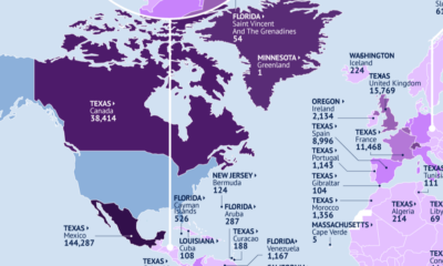

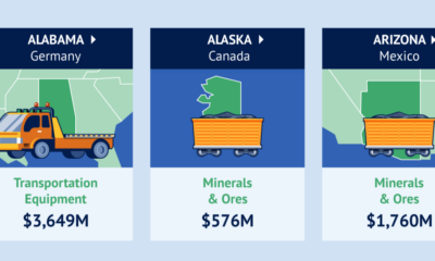
This map identifies the biggest U.S. export markets by state, showing the top partner of each country by value of goods imported.

Canada is the top destination for products from 21 states.
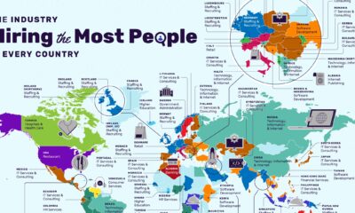

The restaurant industry has the most vacancies in the U.S., followed by non-profit organizations.
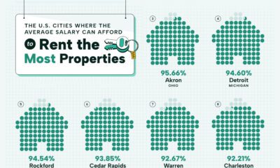

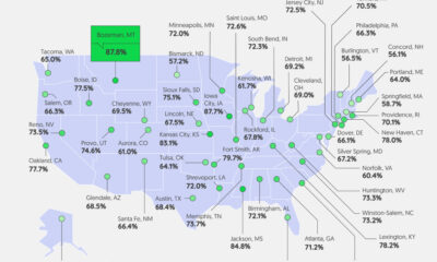
Visualizing the most affordable U.S. cities for renters by the percentage of affordable rentals available on an average salary.
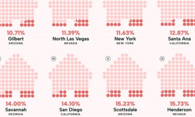

Visualizing the least affordable U.S. cities for renters by the percentage of affordable rentals available on an average salary.

Good pay can help manage first-job worries. We visualize how geography affects entry-level pay across the U.S.
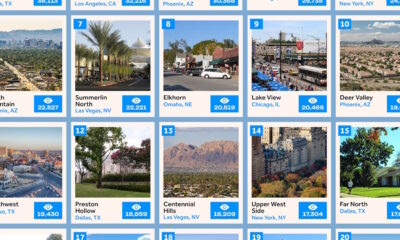

This infographic ranks the 20 most popular neighborhoods in the U.S. for homebuyers based on search interest.


When is the most dangerous time to drive on American roads? We break down the data by hour, day, month, and state.
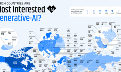

These graphics highlight interest in generative AI by country, covering interest in text, image, video, or audio generation.
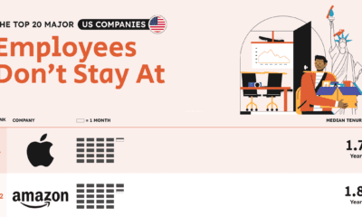

Top tech giants such as Apple, Amazon, and Meta lead the list of companies with the worst employee retention in the U.S.