Maps
Mapped: The World’s Countries Compared by 20 Key Metrics
Article/Editing:
Mapped: The World’s Countries Compared by 20 Key Metrics
Which countries have the largest populations? What about the rural versus urban population divide? And which countries have the highest Gross Domestic Product (GDP), military expenditures, or tech exports?
Instead of comparing countries by one metric, this animation and series of graphics by Anders Sundell uses 20 different categories of World Bank data to compare countries. The data was sourced in July 2022 and contains the latest available data for each country.
Below, we provide some context on eight of the 20 categories, and share some facts on the top ranking countries for each category.
Top 10 Countries Worldwide by GDP
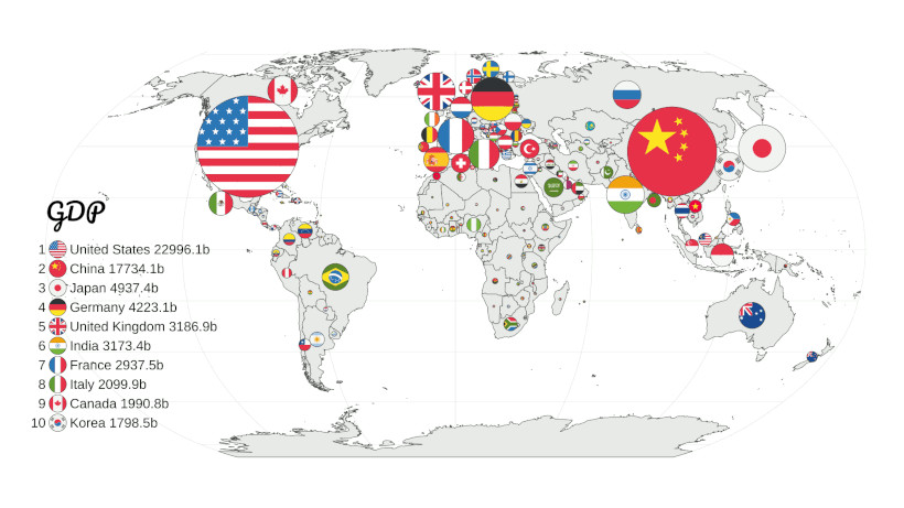
View the full-size map
With a GDP of nearly $23 trillion in 2021, the United States has the largest economic output of any country in the world. While China is currently second on the list, some projections have China’s nominal GDP surpassing America’s as early as 2030.
And even more evident on this map is the weight of economic power to Western countries and just a few Asian countries. Africa, South America, and the rest of Asia are tiny in contrast.
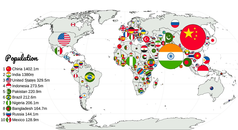
Top 10 Countries Worldwide by Population
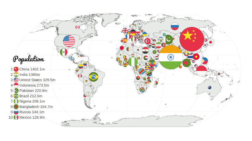
View the full-size map
China ranks first as the world’s most populated country, with a population of 1.4 billion. China has been the world’s most populated country for more than 300 years, but this could change in the near future.
According to the UN’s latest population prospects, India’s population is expected to surpass China’s as early as 2023. However, it’s still unclear what the consequences of this shift will be.
Top 10 Countries Worldwide by Population 65+
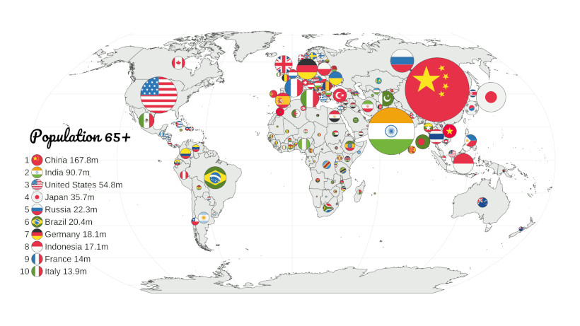
View the full-size map
While China also takes the top spot when it comes to total elderly population, it’s worth noting that Japan has a larger per capita population of people aged 65 and over.
According to the Population Reference Bureau, nearly 12% of China’s population is 65 or older, while in Japan, more than 28.2% of people are 65+.
Top 10 Countries Worldwide by Urban Population
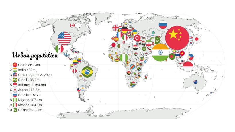
View the full-size map
Until the Industrial Revolution, most of the world’s population lived in rural areas. But by the early 1900s, urbanization started to skyrocket, and now more than half of the world’s population lives in cities.
China’s urbanization really took off as soon as the country’s economic reforms began in the late 1970s. As of 2021, China’s urban population of roughly 861 million people made up 63% of its overall population.
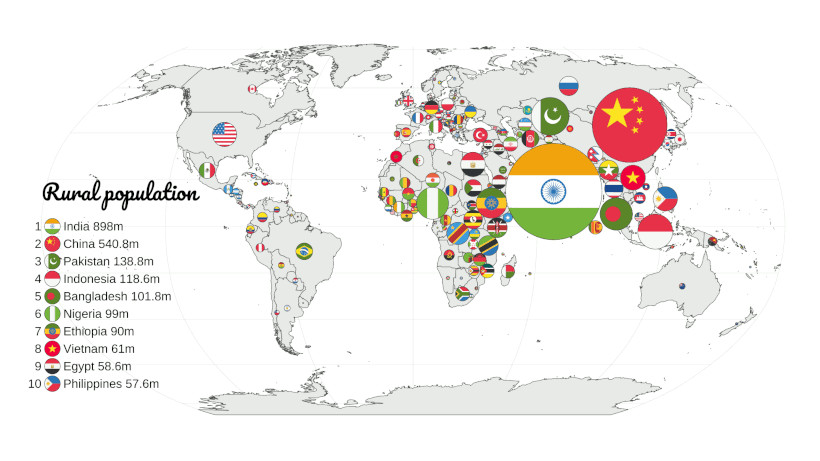
Top 10 Countries Worldwide by Rural Population
View the full-size map
Many Asian and East African countries rise to the front when it comes to rural population comparisons, but India easily has the world’s largest share with around 898 million people.
As of 2021 figures, about 65% of India’s population is rural. This is actually a significant drop compared to the 1960s, when the country’s rural population made up a whopping 82% of its overall population.
Still, that’s still significantly higher than Western countries. For instance, only 17% of the U.S. population lives in rural areas.
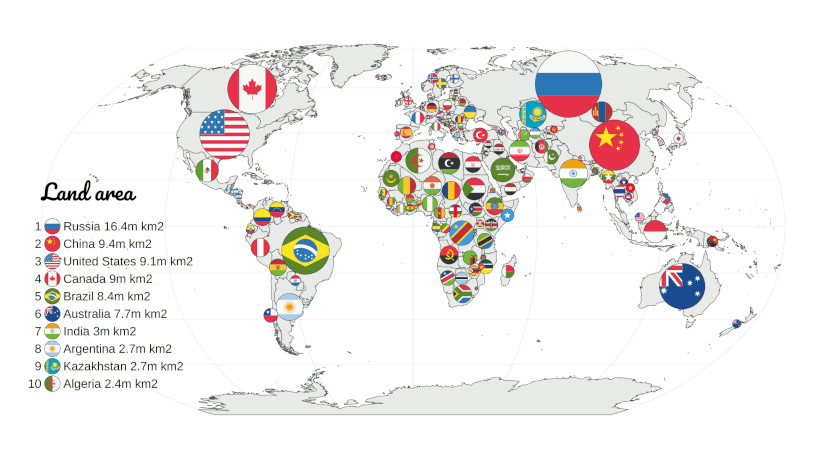
Top 10 Countries Worldwide by Land Area
View the full-size map
When it comes to comparing countries by sheer size, Russia comes first with a land area of 16.4 million square kilometers—that’s nearly 2x bigger than China, which comes second on the list.
According to National Geographic, Russia is so big, it accounts for one-tenth of all land on Earth. The country has 11 different time zones, as well as coasts on three separate oceans.
Why isn’t Canada ranked second? Though it is generally accepted as the world’s second largest country, around 8.9% of its total area is made up of water. In pure landmass, China and the U.S. have an edge.
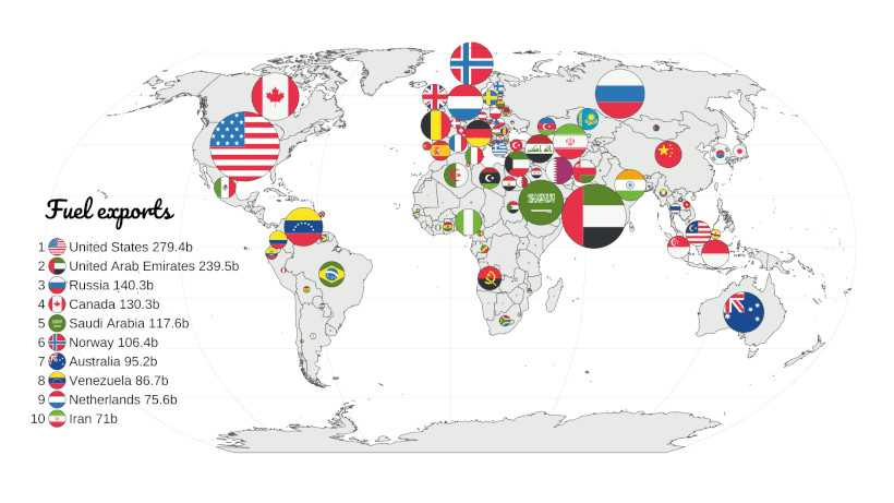
Top 10 Countries Worldwide by Fuel Exports
View the full-size map
The U.S. ranks as the world’s top fuel exporter, with the United Arab Emirates in close second.
According to the American Petroleum Institute, the oil and gas sector is responsible for about 8% of America’s total economic output, measured by GDP.
And this map also highlights the many other countries dependent on energy for GDP. This includes OPEC members like Saudi Arabia, Venezuela, and Iran, as well as well-known energy exporters like Norway and Russia.
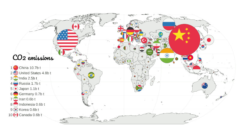
Top 10 Countries Worldwide by CO2 Emissions
View the full-size map
While China ranks first as the world’s biggest carbon emitter, it’s worth mentioning that the country is not even in the top 10 when looking at per capita carbon emissions.
That being said, China’s annual emissions of 10.7 billion tons CO₂ make up a massive share of global emissions. They are more than double the second largest emitter, the United States.
Comparing Countries by Other Metrics
This series of graphics shows 20 distinct measures of comparing countries, but they are just a few of the hundreds of possible examples.
From different economic measures like remittances, employment, and GDP to the multitude of factors that one can find in a demographic census, each comparison can yield different results and shed new lights on how countries relate to each other.
What other comparisons do you want to see on a global scale?

This article was published as a part of Visual Capitalist's Creator Program, which features data-driven visuals from some of our favorite Creators around the world.


Maps
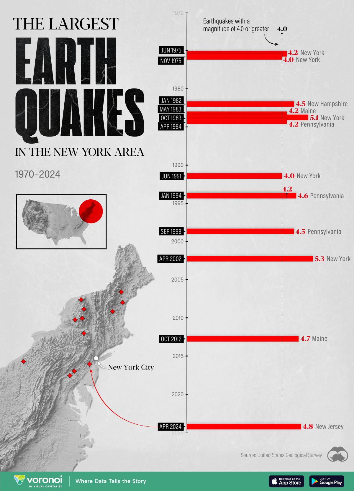
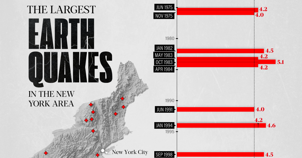
The Largest Earthquakes in the New York Area (1970-2024)
The earthquake that shook buildings across New York in April 2024 was the third-largest quake in the Northeast U.S. over the past 50 years.
The Largest Earthquakes in the New York Area
This was originally posted on our Voronoi app. Download the app for free on Apple or Android and discover incredible data-driven charts from a variety of trusted sources.
The 4.8 magnitude earthquake that shook buildings across New York on Friday, April 5th, 2024 was the third-largest quake in the U.S. Northeast area over the past 50 years.
In this map, we illustrate earthquakes with a magnitude of 4.0 or greater recorded in the Northeastern U.S. since 1970, according to the United States Geological Survey (USGS).
Shallow Quakes and Older Buildings
The earthquake that struck the U.S. Northeast in April 2024 was felt by millions of people from Washington, D.C., to north of Boston. It even caused a full ground stop at Newark Airport.
The quake, occurring just 5 km beneath the Earth’s surface, was considered shallow, which is what contributed to more intense shaking at the surface.
According to the USGS, rocks in the eastern U.S. are significantly older, denser, and harder than those on the western side, compressed by time. This makes them more efficient conduits for seismic energy. Additionally, buildings in the Northeast tend to be older and may not adhere to the latest earthquake codes.
Despite disrupting work and school life, the earthquake was considered minor, according to the Michigan Technological University magnitude scale:
| Magnitude | Earthquake Effects | Estimated Number Each Year |
|---|---|---|
| 2.5 or less | Usually not felt, but can be recorded by seismograph. | Millions |
| 2.5 to 5.4 | Often felt, but only causes minor damage. | 500,000 |
| 5.5 to 6.0 | Slight damage to buildings and other structures. | 350 |
| 6.1 to 6.9 | May cause a lot of damage in very populated areas. | 100 |
| 7.0 to 7.9 | Major earthquake. Serious damage. | 10-15 |
| 8.0 or greater | Great earthquake. Can totally destroy communities near the epicenter. | One every year or two |
The largest earthquake felt in the area over the past 50 years was a 5.3 magnitude quake that occurred in Au Sable Forks, New York, in 2002. It damaged houses and cracked roads in a remote corner of the Adirondack Mountains, but caused no injuries.
| Date | Magnitude | Location | State |
|---|---|---|---|
| April 20, 2002 | 5.3 | Au Sable Forks | New York |
| October 7, 1983 | 5.1 | Newcomb | New York |
| April 5, 2024 | 4.8 | Whitehouse Station | New Jersey |
| October 16, 2012 | 4.7 | Hollis Center | Maine |
| January 16, 1994 | 4.6 | Sinking Spring | Pennsylvania |
| January 19, 1982 | 4.5 | Sanbornton | New Hampshire |
| September 25, 1998 | 4.5 | Adamsville | Pennsylvania |
| June 9, 1975 | 4.2 | Altona | New York |
| May 29, 1983 | 4.2 | Peru | Maine |
| April 23, 1984 | 4.2 | Conestoga | Pennsylvania |
| January 16, 1994 | 4.2 | Sinking Spring | Pennsylvania |
| November 3, 1975 | 4 | Long Lake | New York |
| June 17, 1991 | 4 | Worcester | New York |
The largest earthquake in U.S. history, however, was the 1964 Good Friday quake in Alaska, measuring 9.2 magnitude and killing 131 people.

-

 Markets1 week ago
U.S. Debt Interest Payments Reach $1 Trillion
-

 Markets2 weeks ago
Ranked: The Most Valuable Housing Markets in America
-

 Money2 weeks ago
Which States Have the Highest Minimum Wage in America?
-

 AI2 weeks ago
Ranked: Semiconductor Companies by Industry Revenue Share
-

 Markets2 weeks ago
Ranked: The World’s Top Flight Routes, by Revenue
-

 Countries2 weeks ago
Population Projections: The World’s 6 Largest Countries in 2075
-

 Markets2 weeks ago
The Top 10 States by Real GDP Growth in 2023
-

 Money2 weeks ago
The Smallest Gender Wage Gaps in OECD Countries