Misc
Visualizing the Current State of the Global Gender Gap
Article/Editing:
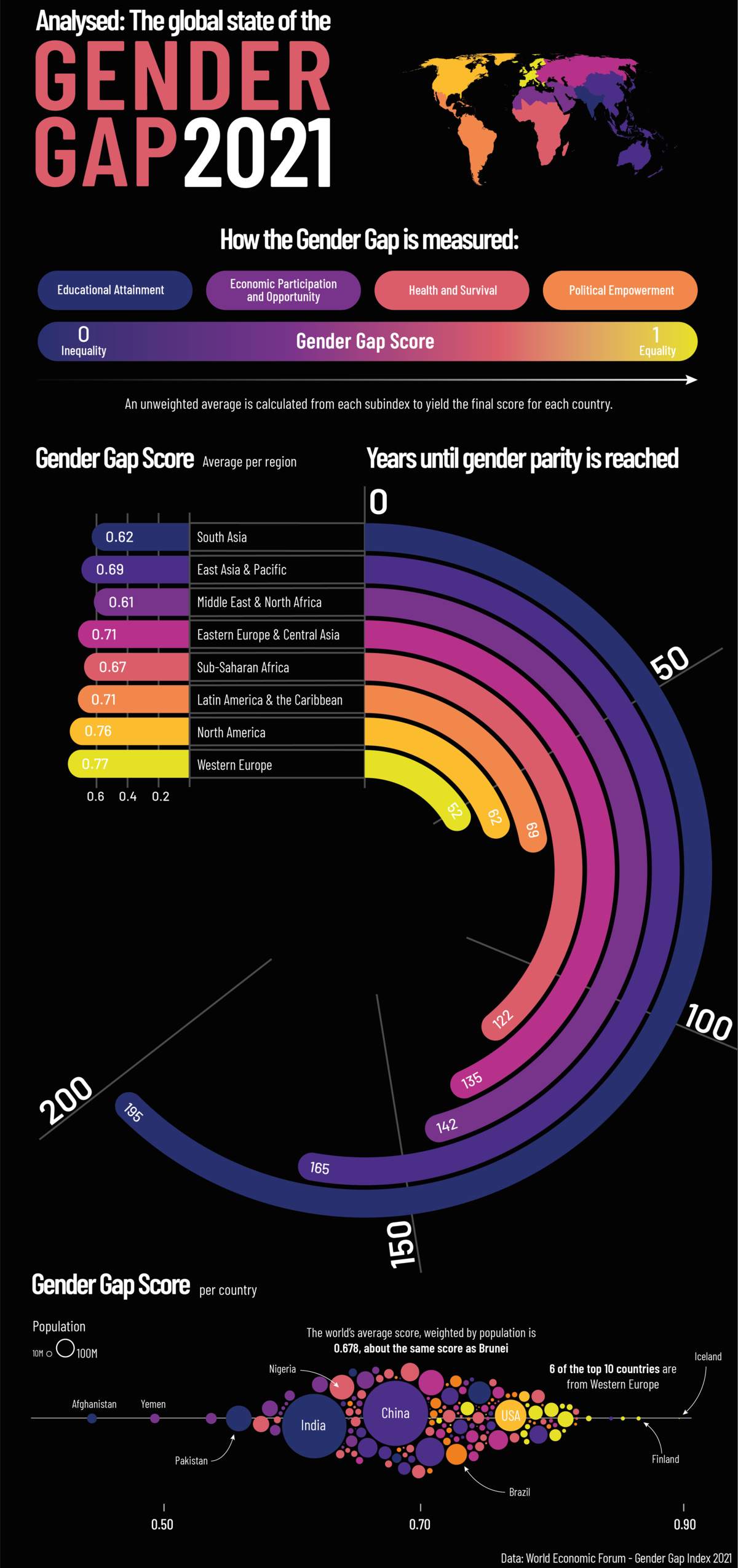
The Current State of the Global Gender Gap
As a global society, we still have a long way to go before we reach gender equality around the world.
According to the World Economic Forum’s (WEF) latest Global Gender Gap Report, it could take up to 135.6 years to close the global gender gap, based on the current rate of change.
This graphic by Sebastian Gräff gives a breakdown of gender equality worldwide, showing how long it will take before each region reaches gender parity.
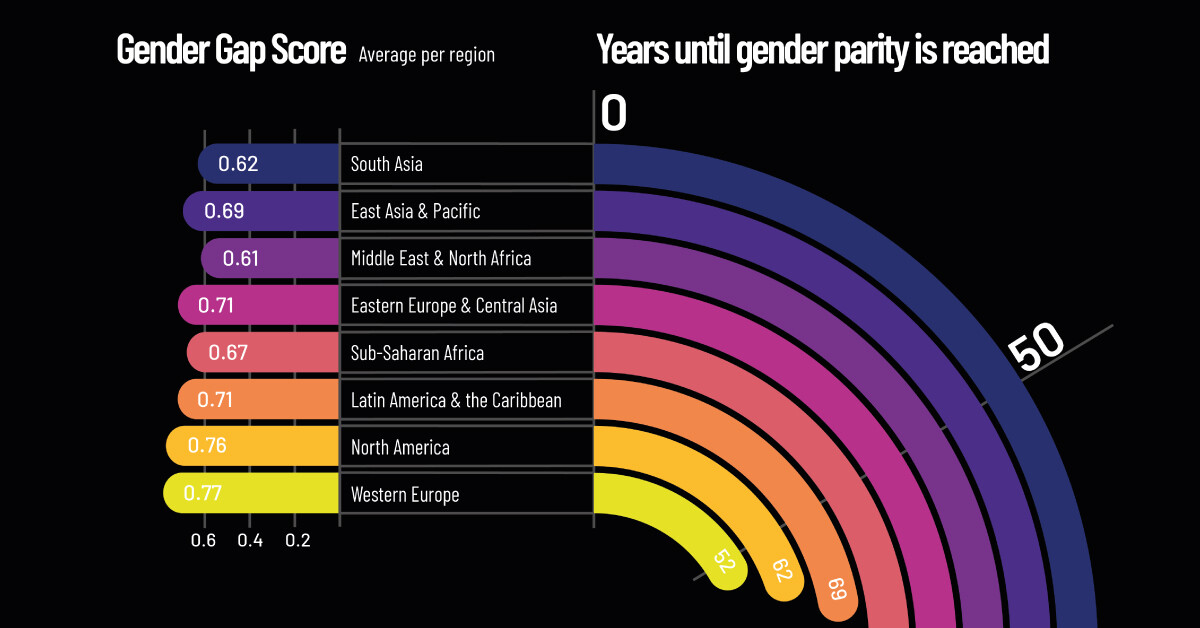
How Gender Gap is Measured
In its 15th edition, the Global Gender Gap Report analyzes gender-based discrepancies across 156 different countries. To gauge each region’s gender gap, the report digs into four key areas:
- Economic Participation and Opportunity
- Educational Attainment
- Health and Survival
- Political Empowerment
Each subindex is given its own score, then an average across the four pillars is calculated to give each country a final score between zero (exceptionally unequal) and one (completely equal).
Regional Breakdown
Out of all the regions, Western Europe has the smallest gender gap, with a score of 0.78. At this rate, the gender gap in Western Europe could be closed in approximately 52.1 years, more than 83 years faster than the global estimate.
| Rank | Region | Overall Gender Gap Index (2021) |
|---|---|---|
| 1 | Western Europe | 0.77 |
| 2 | North America | 0.76 |
| 3 | Latin America and the Caribbean | 0.71 |
| 4 | Eastern Europe and Central Asia | 0.71 |
| 5 | East Asia and the Pacific | 0.69 |
| 6 | Sub-Saharan Africa | 0.67 |
| 7 | South Asia | 0.62 |
| 8 | Middle East and North Africa | 0.61 |
| Global Average | 0.69 |
Western Europe scores particularly high in educational attainment (1.0) and health and survival (0.97). Here’s a look at the category breakdown for each region:
| Region | Economic Participation and Opportunity | Educational Attainment | Health and Survival | Political Empowerment |
|---|---|---|---|---|
| Western Europe | 0.70 | 1.00 | 0.97 | 0.44 |
| North America | 0.75 | 1.00 | 0.97 | 0.33 |
| Latin America and the Caribbean | 0.64 | 1.00 | 0.98 | 0.27 |
| Eastern Europe and Central Asia | 0.74 | 1.00 | 0.98 | 0.14 |
| East Asia and the Pacific | 0.70 | 0.98 | 0.95 | 0.14 |
| Sub-Saharan Africa | 0.66 | 0.85 | 0.97 | 0.21 |
| South Asia | 0.34 | 0.93 | 0.94 | 0.28 |
| Middle East and North Africa | 0.41 | 0.94 | 0.97 | 0.12 |
| Global Average | 0.62 | 0.96 | 0.97 | 0.22 |
But it might be surprising to see that political empowerment in Western Europe received a score of only 0.44. This is higher than the global average for political empowerment of 0.21, but still indicative of a large gender gap in this area.
Globally, political empowerment tended to receive the lowest scores in the report, as women are grossly underrepresented in politics. A study by the Council of Foreign Relations revealed that out of 195 different countries’ national cabinets, only 14 countries had at least 50% of their ministerial positions held by women.
Economic participation and opportunity is the second weakest category, with a global average score of 0.58. A good example of how this gap manifests itself is in entrepreneurship and business, where women still struggle to find investors and gain access to venture capital. Further, on average, women continue to make less money than men. According to the UN, women across the globe make approximately 77 cents for every dollar earned by men.
The Economic Benefit of Gender Equality
Research shows that empowering women in the workforce is in everyone’s best interest. Closing the gender gap in the global workforce could lead to a boost of more than $28 trillion to the global economy.
Yet across the globe, COVID-19 has created new challenges that have hindered our progress towards gender equality. This is partly because some of the sectors that have been impacted the most by COVID-19 restrictions, such as hospitality, food services, and personal care, are largely dominated by female workers.
As we continue to recover from the impact of COVID-19, world leaders will face numerous policy challenges, including how to build back better, creating more opportunities for women to thrive in the global economy.

This article was published as a part of Visual Capitalist's Creator Program, which features data-driven visuals from some of our favorite Creators around the world.


Maps
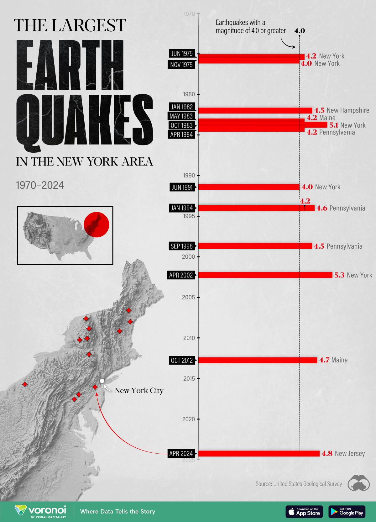
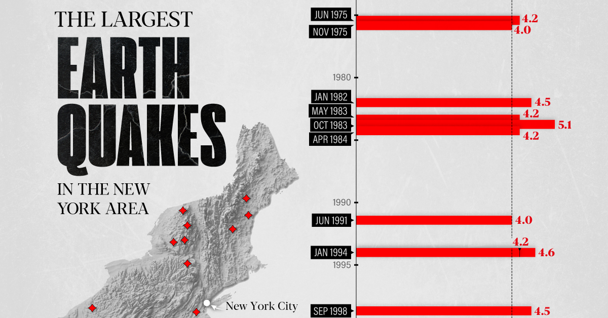
The Largest Earthquakes in the New York Area (1970-2024)
The earthquake that shook buildings across New York in April 2024 was the third-largest quake in the Northeast U.S. over the past 50 years.
The Largest Earthquakes in the New York Area
This was originally posted on our Voronoi app. Download the app for free on Apple or Android and discover incredible data-driven charts from a variety of trusted sources.
The 4.8 magnitude earthquake that shook buildings across New York on Friday, April 5th, 2024 was the third-largest quake in the U.S. Northeast area over the past 50 years.
In this map, we illustrate earthquakes with a magnitude of 4.0 or greater recorded in the Northeastern U.S. since 1970, according to the United States Geological Survey (USGS).
Shallow Quakes and Older Buildings
The earthquake that struck the U.S. Northeast in April 2024 was felt by millions of people from Washington, D.C., to north of Boston. It even caused a full ground stop at Newark Airport.
The quake, occurring just 5 km beneath the Earth’s surface, was considered shallow, which is what contributed to more intense shaking at the surface.
According to the USGS, rocks in the eastern U.S. are significantly older, denser, and harder than those on the western side, compressed by time. This makes them more efficient conduits for seismic energy. Additionally, buildings in the Northeast tend to be older and may not adhere to the latest earthquake codes.
Despite disrupting work and school life, the earthquake was considered minor, according to the Michigan Technological University magnitude scale:
| Magnitude | Earthquake Effects | Estimated Number Each Year |
|---|---|---|
| 2.5 or less | Usually not felt, but can be recorded by seismograph. | Millions |
| 2.5 to 5.4 | Often felt, but only causes minor damage. | 500,000 |
| 5.5 to 6.0 | Slight damage to buildings and other structures. | 350 |
| 6.1 to 6.9 | May cause a lot of damage in very populated areas. | 100 |
| 7.0 to 7.9 | Major earthquake. Serious damage. | 10-15 |
| 8.0 or greater | Great earthquake. Can totally destroy communities near the epicenter. | One every year or two |
The largest earthquake felt in the area over the past 50 years was a 5.3 magnitude quake that occurred in Au Sable Forks, New York, in 2002. It damaged houses and cracked roads in a remote corner of the Adirondack Mountains, but caused no injuries.
| Date | Magnitude | Location | State |
|---|---|---|---|
| April 20, 2002 | 5.3 | Au Sable Forks | New York |
| October 7, 1983 | 5.1 | Newcomb | New York |
| April 5, 2024 | 4.8 | Whitehouse Station | New Jersey |
| October 16, 2012 | 4.7 | Hollis Center | Maine |
| January 16, 1994 | 4.6 | Sinking Spring | Pennsylvania |
| January 19, 1982 | 4.5 | Sanbornton | New Hampshire |
| September 25, 1998 | 4.5 | Adamsville | Pennsylvania |
| June 9, 1975 | 4.2 | Altona | New York |
| May 29, 1983 | 4.2 | Peru | Maine |
| April 23, 1984 | 4.2 | Conestoga | Pennsylvania |
| January 16, 1994 | 4.2 | Sinking Spring | Pennsylvania |
| November 3, 1975 | 4 | Long Lake | New York |
| June 17, 1991 | 4 | Worcester | New York |
The largest earthquake in U.S. history, however, was the 1964 Good Friday quake in Alaska, measuring 9.2 magnitude and killing 131 people.

-

 Misc2 weeks ago
Tesla Is Once Again the World’s Best-Selling EV Company
-

 AI1 week ago
The Stock Performance of U.S. Chipmakers So Far in 2024
-

 Misc1 week ago
Almost Every EV Stock is Down After Q1 2024
-

 Money2 weeks ago
Where Does One U.S. Tax Dollar Go?
-

 Green2 weeks ago
Ranked: Top Countries by Total Forest Loss Since 2001
-

 Real Estate2 weeks ago
Visualizing America’s Shortage of Affordable Homes
-

 Maps2 weeks ago
Mapped: Average Wages Across Europe
-

 Mining2 weeks ago
Charted: The Value Gap Between the Gold Price and Gold Miners