Misc
Visualizing The Smoking Population of Countries
Article/Editing:
Visualizing The Smoking Population of Countries
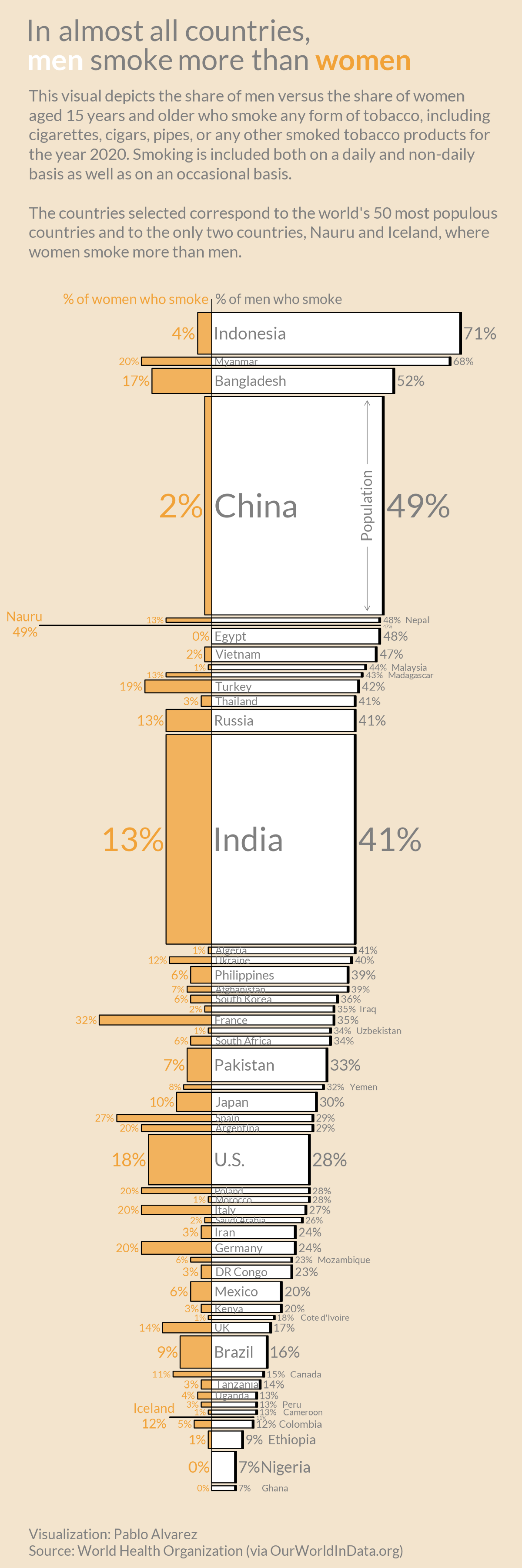
According to Our World in Data, about one-in-four adults around the world smoke tobacco—at least on an occasional basis. And in many countries, a majority of these smokers are men.
But just how big is the smoking gender gap, and which places have the biggest divide between men and women when it comes to smoking? This graphic by Pablo Alvarez visualizes the smoking population breakdown across the globe.
About the Dataset
The dataset is compiled by Our World in Data and uses the latest available figures (2020) that’ve been pulled from the World Bank. The data includes men and women aged 15 and over, and focuses on the world’s top 50 most populous countries.
It’s also worth highlighting that, for the purposes of this study, a smoker is defined as someone who smokes any form of tobacco (cigarettes, cigars, pipes, etc.) and includes people who smoke on a daily, non-daily, and occasional basis.
The Breakdown of Men versus Women Smokers
According to the figures in the dataset, countries in Asia and Africa seem to have the biggest gender gap when it comes to smoking.
For instance, 71% of Indonesian men smoke, while only 4% of Indonesian women use tobacco. And in China, nearly half of men are smokers, while only 2% of women smoke.
| Country | % of women who smoke | % of men who smoke |
|---|---|---|
| 🇮🇩 Indonesia | 4% | 71% |
| 🇲🇲 Myanmar | 20% | 68% |
| 🇧🇩 Bangladesh | 17% | 52% |
| 🇨🇳 China | 2% | 49% |
| 🇳🇷 Nauru | 49% | 47% |
| 🇳🇵Nepal | 13% | 48% |
| 🇪🇬 Egypt | 0% | 48% |
| 🇻🇳 Vietnam | 2% | 47% |
| 🇲🇾 Malaysia | 1% | 44% |
| 🇲🇬 Madagascar | 13% | 43% |
| 🇹🇷 Turkey | 19% | 42% |
| 🇹🇭 Thailand | 3% | 41% |
| 🇷🇺 Russia | 13% | 41% |
| 🇮🇳 India | 13% | 41% |
| 🇩🇿 Algeria | 1% | 41% |
| 🇺🇦 Ukraine | 12% | 40% |
| 🇵🇭 Philippines | 6% | 39% |
| 🇦🇫 Afghanistan | 7% | 39% |
| 🇰🇷 South Korea | 6% | 36% |
| 🇮🇶 Iraq | 2% | 35% |
| 🇫🇷 France | 32% | 35% |
| 🇿🇦 South Africa | 6% | 34% |
| 🇵🇰 Pakistan | 7% | 33% |
| 🇾🇪 Yemen | 8% | 32% |
| 🇯🇵 Japan | 10% | 30% |
| 🇪🇸 Spain | 27% | 29% |
| 🇦🇷Argentina | 20% | 29% |
| 🇺🇸 U.S. | 18% | 28% |
| 🇵🇱 Poland | 20% | 28% |
| 🇲🇦 Morocco | 1% | 28% |
| 🇮🇹 Italy | 20% | 27% |
| 🇸🇦 Saudi Arabia | 2% | 26% |
| 🇮🇷 Iran | 3% | 24% |
| 🇩🇪 Germany | 20% | 24% |
| 🇲🇿 Mozambique | 6% | 23% |
| 🇨🇩 DR Congo | 3% | 23% |
| 🇲🇽 Mexico | 6% | 20% |
| 🇰🇪 Kenya | 3% | 20% |
| 🇨🇮 Cote d'Ivoire | 1% | 18% |
| 🇬🇧 UK | 14% | 17% |
| 🇧🇷 Brazil | 9% | 16% |
| 🇨🇦 Canada | 11% | 15% |
| 🇹🇿 Tanzania | 3% | 14% |
| 🇺🇬 Uganda | 4% | 13% |
| 🇵🇪 Peru | 3% | 13% |
| 🇨🇲 Cameroon | 1% | 13% |
| 🇮🇸 Iceland | 12% | 11% |
| 🇨🇴 Colombia | 5% | 12% |
| 🇪🇹 Ethiopia | 1% | 9% |
| 🇳🇬 Nigeria | 0% | 7% |
| 🇬🇭 Ghana | 0% | 7% |
In fact, nearly all the countries included in the study have more male smokers than women—However, there are a few outliers.
For example, in the small Micronesian island of Nauru, a slightly higher percentage of women smoke than men. And in Iceland, there’s a similar trend—12% of women smoke compared to 11% of men.
Despite these few anomalies, the general consensus is that men tend to smoke more than women. And according to Our World in Data, this male-bias can be seen in health statistics. For instance, research by the World Health Organization has found that men are more likely to die from lung cancer.
The Knock-on Effects of Smoking
As many people are now aware of, smoking can lead to major health problems. In fact, it’s estimated that about 15% of deaths around the world are linked to smoking—Either directly, or from second-hand smoke.
Over the last two decades, knowledge around the dangers of smoking has become more widespread, and changes to legislation has forced cigarette companies to put health warnings on their packaging.
And as discourse around smoking and its health-risks has started to circulate more rapidly, the number of smokers worldwide has started to decrease. Here’s a chart showing the drop in smokers in select countries, from 2000 to 2020:
Will the smoking population continue to drop in the next few decades, or have we reached a plateau?

This article was published as a part of Visual Capitalist's Creator Program, which features data-driven visuals from some of our favorite Creators around the world.


Maps
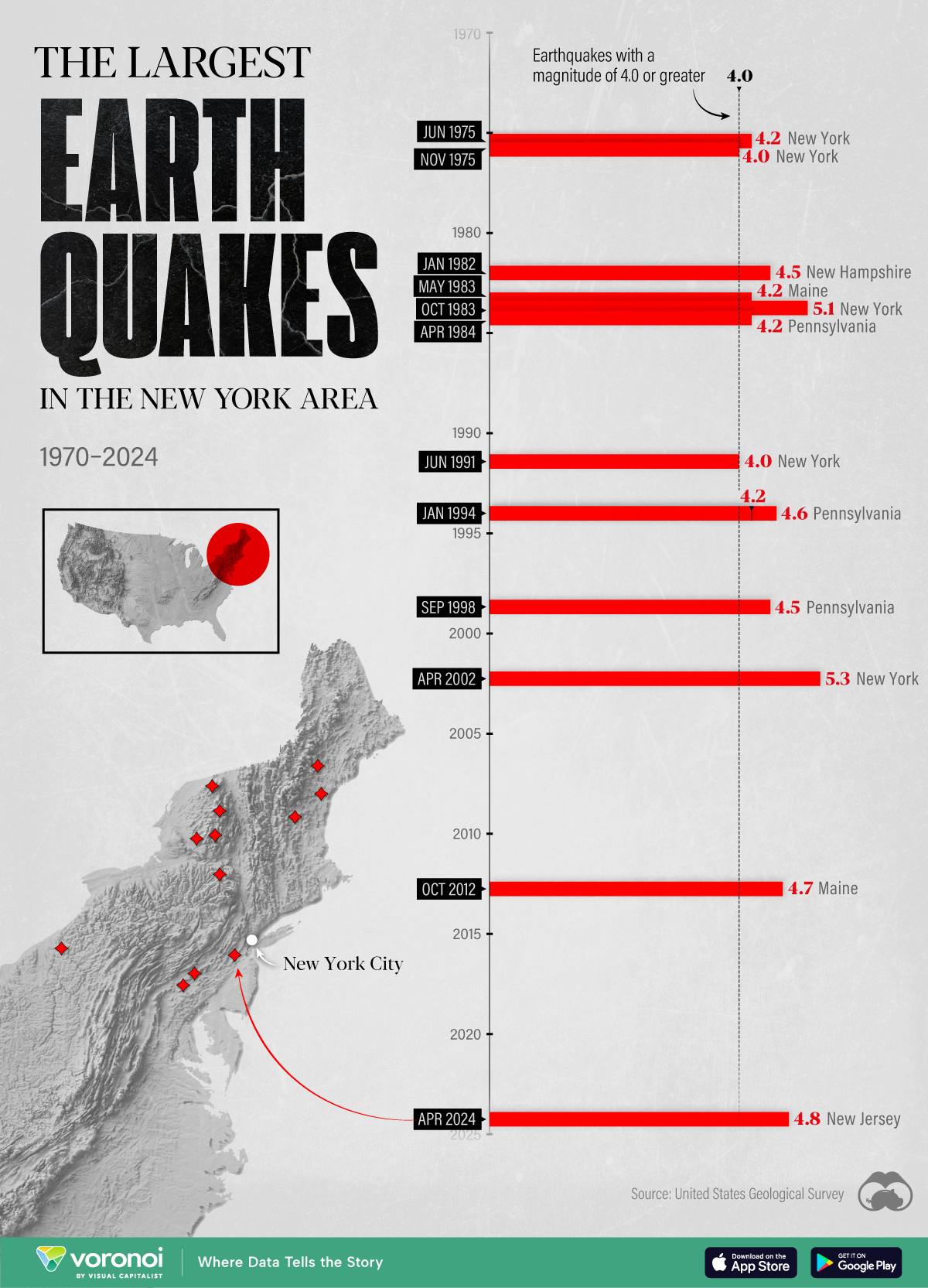
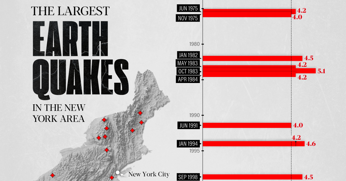
The Largest Earthquakes in the New York Area (1970-2024)
The earthquake that shook buildings across New York in April 2024 was the third-largest quake in the Northeast U.S. over the past 50 years.
The Largest Earthquakes in the New York Area
This was originally posted on our Voronoi app. Download the app for free on Apple or Android and discover incredible data-driven charts from a variety of trusted sources.
The 4.8 magnitude earthquake that shook buildings across New York on Friday, April 5th, 2024 was the third-largest quake in the U.S. Northeast area over the past 50 years.
In this map, we illustrate earthquakes with a magnitude of 4.0 or greater recorded in the Northeastern U.S. since 1970, according to the United States Geological Survey (USGS).
Shallow Quakes and Older Buildings
The earthquake that struck the U.S. Northeast in April 2024 was felt by millions of people from Washington, D.C., to north of Boston. It even caused a full ground stop at Newark Airport.
The quake, occurring just 5 km beneath the Earth’s surface, was considered shallow, which is what contributed to more intense shaking at the surface.
According to the USGS, rocks in the eastern U.S. are significantly older, denser, and harder than those on the western side, compressed by time. This makes them more efficient conduits for seismic energy. Additionally, buildings in the Northeast tend to be older and may not adhere to the latest earthquake codes.
Despite disrupting work and school life, the earthquake was considered minor, according to the Michigan Technological University magnitude scale:
| Magnitude | Earthquake Effects | Estimated Number Each Year |
|---|---|---|
| 2.5 or less | Usually not felt, but can be recorded by seismograph. | Millions |
| 2.5 to 5.4 | Often felt, but only causes minor damage. | 500,000 |
| 5.5 to 6.0 | Slight damage to buildings and other structures. | 350 |
| 6.1 to 6.9 | May cause a lot of damage in very populated areas. | 100 |
| 7.0 to 7.9 | Major earthquake. Serious damage. | 10-15 |
| 8.0 or greater | Great earthquake. Can totally destroy communities near the epicenter. | One every year or two |
The largest earthquake felt in the area over the past 50 years was a 5.3 magnitude quake that occurred in Au Sable Forks, New York, in 2002. It damaged houses and cracked roads in a remote corner of the Adirondack Mountains, but caused no injuries.
| Date | Magnitude | Location | State |
|---|---|---|---|
| April 20, 2002 | 5.3 | Au Sable Forks | New York |
| October 7, 1983 | 5.1 | Newcomb | New York |
| April 5, 2024 | 4.8 | Whitehouse Station | New Jersey |
| October 16, 2012 | 4.7 | Hollis Center | Maine |
| January 16, 1994 | 4.6 | Sinking Spring | Pennsylvania |
| January 19, 1982 | 4.5 | Sanbornton | New Hampshire |
| September 25, 1998 | 4.5 | Adamsville | Pennsylvania |
| June 9, 1975 | 4.2 | Altona | New York |
| May 29, 1983 | 4.2 | Peru | Maine |
| April 23, 1984 | 4.2 | Conestoga | Pennsylvania |
| January 16, 1994 | 4.2 | Sinking Spring | Pennsylvania |
| November 3, 1975 | 4 | Long Lake | New York |
| June 17, 1991 | 4 | Worcester | New York |
The largest earthquake in U.S. history, however, was the 1964 Good Friday quake in Alaska, measuring 9.2 magnitude and killing 131 people.

-
 Money2 weeks ago
Visualizing the Growth of $100, by Asset Class (1970-2023)
-

 Money1 week ago
Where Does One U.S. Tax Dollar Go?
-

 Green2 weeks ago
Ranked: Top Countries by Total Forest Loss Since 2001
-

 Real Estate2 weeks ago
Visualizing America’s Shortage of Affordable Homes
-

 Maps2 weeks ago
Mapped: Average Wages Across Europe
-

 Mining2 weeks ago
Charted: The Value Gap Between the Gold Price and Gold Miners
-

 Demographics2 weeks ago
Visualizing the Size of the Global Senior Population
-

 Automotive2 weeks ago
Tesla Is Once Again the World’s Best-Selling EV Company