Misc
Visualizing The Smoking Population of Countries
Article/Editing:
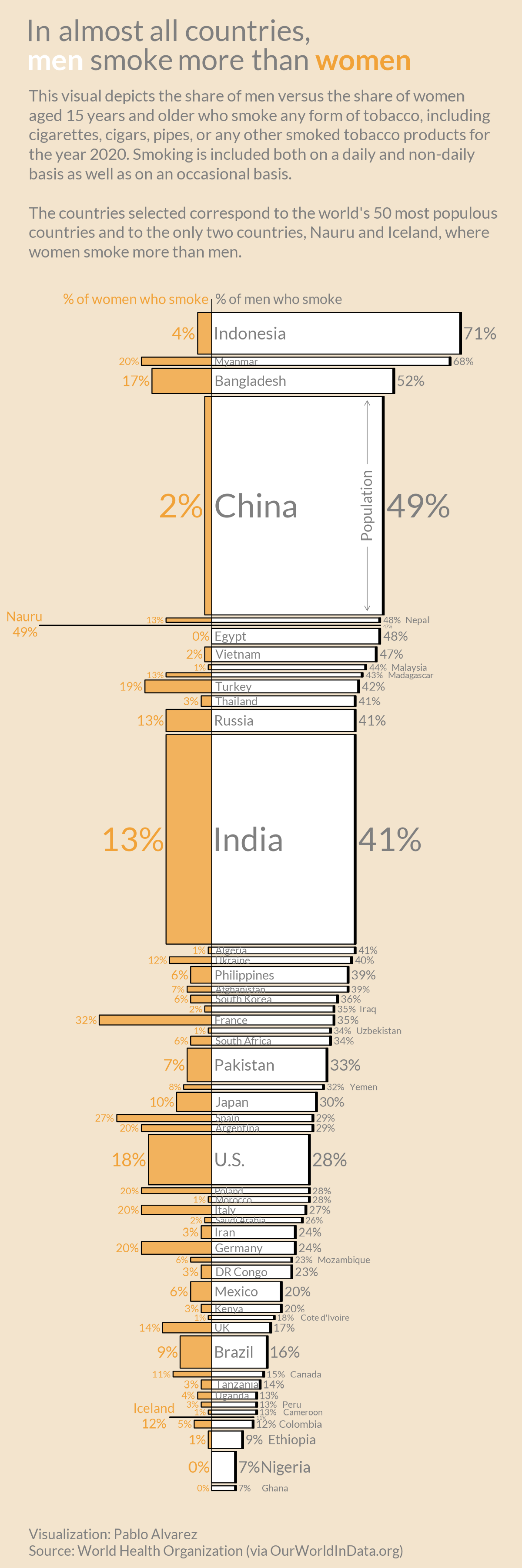
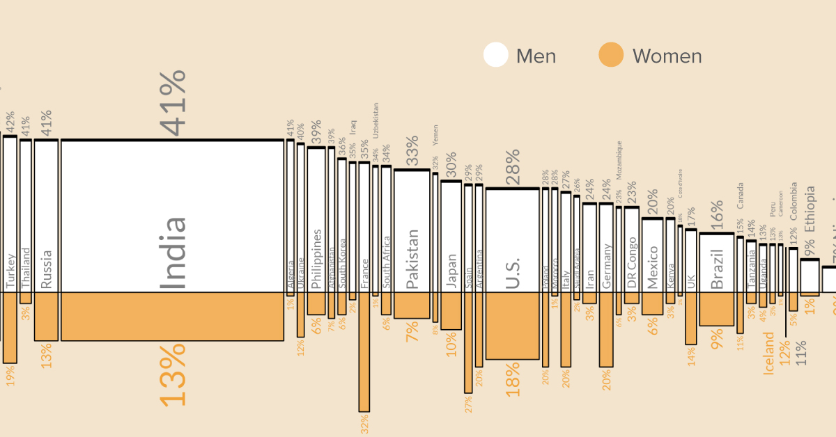
Visualizing The Smoking Population of Countries
According to Our World in Data, about one-in-four adults around the world smoke tobacco—at least on an occasional basis. And in many countries, a majority of these smokers are men.
But just how big is the smoking gender gap, and which places have the biggest divide between men and women when it comes to smoking? This graphic by Pablo Alvarez visualizes the smoking population breakdown across the globe.
About the Dataset
The dataset is compiled by Our World in Data and uses the latest available figures (2020) that’ve been pulled from the World Bank. The data includes men and women aged 15 and over, and focuses on the world’s top 50 most populous countries.
It’s also worth highlighting that, for the purposes of this study, a smoker is defined as someone who smokes any form of tobacco (cigarettes, cigars, pipes, etc.) and includes people who smoke on a daily, non-daily, and occasional basis.
The Breakdown of Men versus Women Smokers
According to the figures in the dataset, countries in Asia and Africa seem to have the biggest gender gap when it comes to smoking.
For instance, 71% of Indonesian men smoke, while only 4% of Indonesian women use tobacco. And in China, nearly half of men are smokers, while only 2% of women smoke.
| Country | % of women who smoke | % of men who smoke |
|---|---|---|
| 🇮🇩 Indonesia | 4% | 71% |
| 🇲🇲 Myanmar | 20% | 68% |
| 🇧🇩 Bangladesh | 17% | 52% |
| 🇨🇳 China | 2% | 49% |
| 🇳🇷 Nauru | 49% | 47% |
| 🇳🇵Nepal | 13% | 48% |
| 🇪🇬 Egypt | 0% | 48% |
| 🇻🇳 Vietnam | 2% | 47% |
| 🇲🇾 Malaysia | 1% | 44% |
| 🇲🇬 Madagascar | 13% | 43% |
| 🇹🇷 Turkey | 19% | 42% |
| 🇹🇭 Thailand | 3% | 41% |
| 🇷🇺 Russia | 13% | 41% |
| 🇮🇳 India | 13% | 41% |
| 🇩🇿 Algeria | 1% | 41% |
| 🇺🇦 Ukraine | 12% | 40% |
| 🇵🇭 Philippines | 6% | 39% |
| 🇦🇫 Afghanistan | 7% | 39% |
| 🇰🇷 South Korea | 6% | 36% |
| 🇮🇶 Iraq | 2% | 35% |
| 🇫🇷 France | 32% | 35% |
| 🇿🇦 South Africa | 6% | 34% |
| 🇵🇰 Pakistan | 7% | 33% |
| 🇾🇪 Yemen | 8% | 32% |
| 🇯🇵 Japan | 10% | 30% |
| 🇪🇸 Spain | 27% | 29% |
| 🇦🇷Argentina | 20% | 29% |
| 🇺🇸 U.S. | 18% | 28% |
| 🇵🇱 Poland | 20% | 28% |
| 🇲🇦 Morocco | 1% | 28% |
| 🇮🇹 Italy | 20% | 27% |
| 🇸🇦 Saudi Arabia | 2% | 26% |
| 🇮🇷 Iran | 3% | 24% |
| 🇩🇪 Germany | 20% | 24% |
| 🇲🇿 Mozambique | 6% | 23% |
| 🇨🇩 DR Congo | 3% | 23% |
| 🇲🇽 Mexico | 6% | 20% |
| 🇰🇪 Kenya | 3% | 20% |
| 🇨🇮 Cote d'Ivoire | 1% | 18% |
| 🇬🇧 UK | 14% | 17% |
| 🇧🇷 Brazil | 9% | 16% |
| 🇨🇦 Canada | 11% | 15% |
| 🇹🇿 Tanzania | 3% | 14% |
| 🇺🇬 Uganda | 4% | 13% |
| 🇵🇪 Peru | 3% | 13% |
| 🇨🇲 Cameroon | 1% | 13% |
| 🇮🇸 Iceland | 12% | 11% |
| 🇨🇴 Colombia | 5% | 12% |
| 🇪🇹 Ethiopia | 1% | 9% |
| 🇳🇬 Nigeria | 0% | 7% |
| 🇬🇭 Ghana | 0% | 7% |
In fact, nearly all the countries included in the study have more male smokers than women—However, there are a few outliers.
For example, in the small Micronesian island of Nauru, a slightly higher percentage of women smoke than men. And in Iceland, there’s a similar trend—12% of women smoke compared to 11% of men.
Despite these few anomalies, the general consensus is that men tend to smoke more than women. And according to Our World in Data, this male-bias can be seen in health statistics. For instance, research by the World Health Organization has found that men are more likely to die from lung cancer.
The Knock-on Effects of Smoking
As many people are now aware of, smoking can lead to major health problems. In fact, it’s estimated that about 15% of deaths around the world are linked to smoking—Either directly, or from second-hand smoke.
Over the last two decades, knowledge around the dangers of smoking has become more widespread, and changes to legislation has forced cigarette companies to put health warnings on their packaging.
And as discourse around smoking and its health-risks has started to circulate more rapidly, the number of smokers worldwide has started to decrease. Here’s a chart showing the drop in smokers in select countries, from 2000 to 2020:
Will the smoking population continue to drop in the next few decades, or have we reached a plateau?

This article was published as a part of Visual Capitalist's Creator Program, which features data-driven visuals from some of our favorite Creators around the world.


VC+
VC+: Get Our Key Takeaways From the IMF’s World Economic Outlook
A sneak preview of the exclusive VC+ Special Dispatch—your shortcut to understanding IMF’s World Economic Outlook report.

Have you read IMF’s latest World Economic Outlook yet? At a daunting 202 pages, we don’t blame you if it’s still on your to-do list.
But don’t worry, you don’t need to read the whole April release, because we’ve already done the hard work for you.
To save you time and effort, the Visual Capitalist team has compiled a visual analysis of everything you need to know from the report—and our upcoming VC+ Special Dispatch will be available exclusively to VC+ members on Thursday, April 25th.
If you’re not already subscribed to VC+, make sure you sign up now to receive the full analysis of the IMF report, and more (we release similar deep dives every week).
For now, here’s what VC+ members can expect to receive.
Your Shortcut to Understanding IMF’s World Economic Outlook
With long and short-term growth prospects declining for many countries around the world, this Special Dispatch offers a visual analysis of the key figures and takeaways from the IMF’s report including:
- The global decline in economic growth forecasts
- Real GDP growth and inflation forecasts for major nations in 2024
- When interest rate cuts will happen and interest rate forecasts
- How debt-to-GDP ratios have changed since 2000
- And much more!

Get the Full Breakdown in the Next VC+ Special Dispatch
VC+ members will receive the full Special Dispatch on Thursday, April 25th.
Make sure you join VC+ now to receive exclusive charts and the full analysis of key takeaways from IMF’s World Economic Outlook.
Don’t miss out. Become a VC+ member today.
What You Get When You Become a VC+ Member
VC+ is Visual Capitalist’s premium subscription. As a member, you’ll get the following:
- Special Dispatches: Deep dive visual briefings on crucial reports and global trends
- Markets This Month: A snappy summary of the state of the markets and what to look out for
- The Trendline: Weekly curation of the best visualizations from across the globe
- Global Forecast Series: Our flagship annual report that covers everything you need to know related to the economy, markets, geopolitics, and the latest tech trends
- VC+ Archive: Hundreds of previously released VC+ briefings and reports that you’ve been missing out on, all in one dedicated hub
You can get all of the above, and more, by joining VC+ today.

-

 Markets1 week ago
U.S. Debt Interest Payments Reach $1 Trillion
-

 Business2 weeks ago
Charted: Big Four Market Share by S&P 500 Audits
-

 Markets2 weeks ago
Ranked: The Most Valuable Housing Markets in America
-

 Money2 weeks ago
Which States Have the Highest Minimum Wage in America?
-

 AI2 weeks ago
Ranked: Semiconductor Companies by Industry Revenue Share
-

 Markets2 weeks ago
Ranked: The World’s Top Flight Routes, by Revenue
-

 Demographics2 weeks ago
Population Projections: The World’s 6 Largest Countries in 2075
-

 Markets2 weeks ago
The Top 10 States by Real GDP Growth in 2023