Markets
Visualizing (and Understanding) an Inverted Yield Curve
Article/Editing:
Visualizing (and Understanding) an Inverted Yield Curve
For a few months in 2019, the yield curve inverted and warned of a potential recession.
Towards the end of 2021, it happened again. And throughout 2022, the inverted yield curve has looked more and more extreme. So what does an inverted yield curve look like, and what does it signal about an economy?
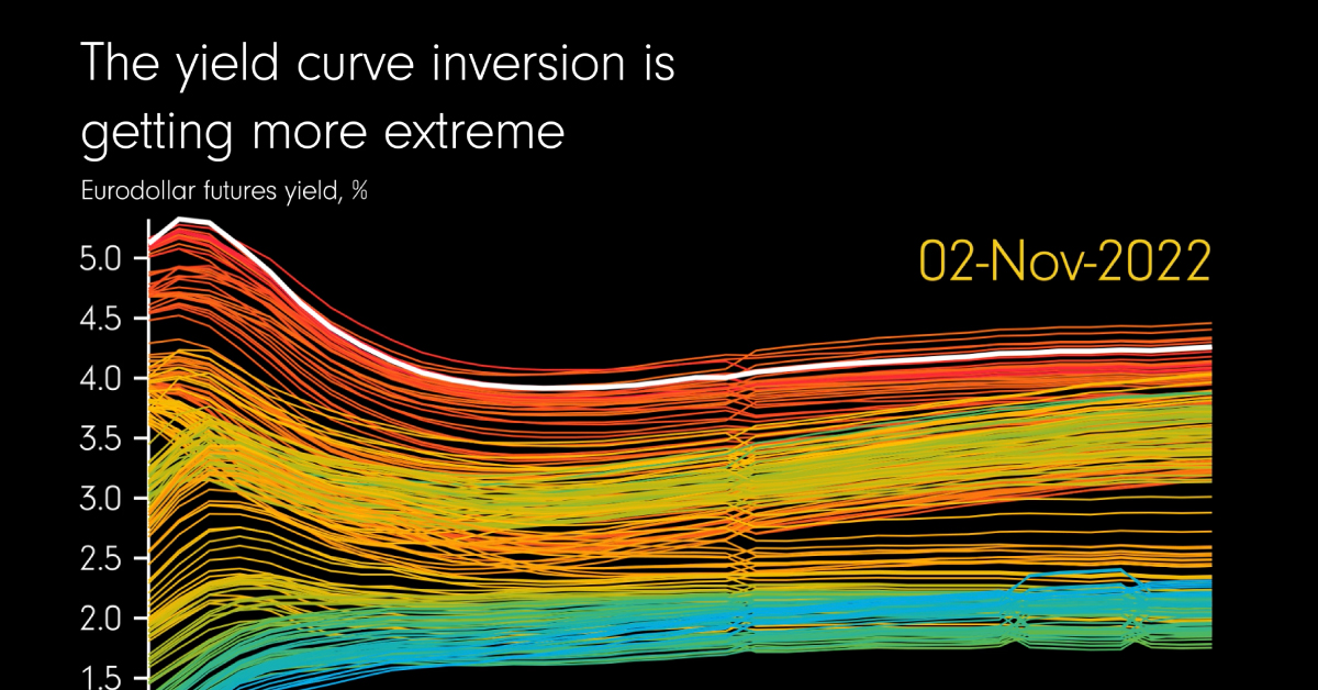
The above visualization from James Eagle shows the yield curve from November 2021-2022 using eurodollar futures yields—which serve as an indicator for the direction of the yield curve.
What Denotes an Inverted Yield Curve?
Generally speaking, the yield curve is a line chart that plots interest rates for bonds that have equal credit quality, but different maturity dates.
In normal economic conditions, investors are rewarded with higher interest rates for holding bonds over longer time periods, resulting in an upward sloping yield curve. This is because these longer returns factor in the risk of inflation or default over time.
So when interest rates on long-term bonds fall lower than those of short-term bonds, it results in an inverted yield curve.
The worrying trend is that an inverted yield curve in key government securities such as U.S. Treasuries can often foreshadow a recession. For every recession since 1960, an inverted yield curve took place roughly a year before, with just one exception in the mid-1960s.
This is because the yield curve has steep implications for financial markets. If the market predicts economic turbulence, and that interest rates will fall in the long term, investors flock to buy longer-dated bonds.
Eurodollars: A Hedging Tool
Let’s now look at eurodollar futures, as seen in the above visual.
Eurodollars are not to be confused with euros, the currency in the European Union. Instead, they are U.S. dollars held in term deposits outside of the United States. Originally it applied to accounts specifically in Europe, hence the “euro” prefix.
The video above charts eurodollar futures, which allow banks and companies to secure interest rates today for USD funds they plan to lend or borrow at a future date. In short, the yields on these futures can tell us how banks and companies around the world feel about interest rates—and economic strength.
How The Yield Curve’s Inversion Has Gotten More Extreme
The animation above clearly shows how the yield curve hasn’t just inverted, it has become more severe:
| Date | Yield Curve | Example Eurodollar Futures Yield |
|---|---|---|
| Jan-Feb 2022 | Upward Sloping | Mar 2023: 1.3% Mar 2024: 2.0% |
| Mar-Aug 2022 | Flat | Mar 2023: 2.5% Mar 2024: 2.5% |
| Sep-Nov 2022 | Downward Sloping | Mar 2023: 5.0% Mar 2024: 4.0% |
As the above examples show, yields on March 2023 eurodollar futures contracts have continued to rise over the course of the year—from 1.3% to 5.0% by November.
Meanwhile, March 2024 eurodollar futures yields over the same time period began higher than their 2023 counterparts but eventually became eclipsed.
And more immediately, December 2022 eurodollar futures yields in November were much higher than 2024 yields. Not only does this indicate investor pessimism, it suggests that the market expects interest rates to fall by 2024 and for inflation to decline.
The Flip Side
On the other hand, market expectations of looser monetary policy in the future could miss the mark.
“I suspect the market is getting a little ahead of itself in terms of pricing in cuts… Central banks have still been talking about holding rates at higher levels for longer.”
– Andrew Ticehurst, rates strategist for Nomura Inc.
As 2023 unfolds, investors will be watching closely to see if the inverted yield curve indeed serves as a recession harbinger, and the wider consequences of this potential outcome.

This article was published as a part of Visual Capitalist's Creator Program, which features data-driven visuals from some of our favorite Creators around the world.


Markets
U.S. Debt Interest Payments Reach $1 Trillion
U.S. debt interest payments have surged past the $1 trillion dollar mark, amid high interest rates and an ever-expanding debt burden.


U.S. Debt Interest Payments Reach $1 Trillion
This was originally posted on our Voronoi app. Download the app for free on iOS or Android and discover incredible data-driven charts from a variety of trusted sources.
The cost of paying for America’s national debt crossed the $1 trillion dollar mark in 2023, driven by high interest rates and a record $34 trillion mountain of debt.
Over the last decade, U.S. debt interest payments have more than doubled amid vast government spending during the pandemic crisis. As debt payments continue to soar, the Congressional Budget Office (CBO) reported that debt servicing costs surpassed defense spending for the first time ever this year.
This graphic shows the sharp rise in U.S. debt payments, based on data from the Federal Reserve.
A $1 Trillion Interest Bill, and Growing
Below, we show how U.S. debt interest payments have risen at a faster pace than at another time in modern history:
| Date | Interest Payments | U.S. National Debt |
|---|---|---|
| 2023 | $1.0T | $34.0T |
| 2022 | $830B | $31.4T |
| 2021 | $612B | $29.6T |
| 2020 | $518B | $27.7T |
| 2019 | $564B | $23.2T |
| 2018 | $571B | $22.0T |
| 2017 | $493B | $20.5T |
| 2016 | $460B | $20.0T |
| 2015 | $435B | $18.9T |
| 2014 | $442B | $18.1T |
| 2013 | $425B | $17.2T |
| 2012 | $417B | $16.4T |
| 2011 | $433B | $15.2T |
| 2010 | $400B | $14.0T |
| 2009 | $354B | $12.3T |
| 2008 | $380B | $10.7T |
| 2007 | $414B | $9.2T |
| 2006 | $387B | $8.7T |
| 2005 | $355B | $8.2T |
| 2004 | $318B | $7.6T |
| 2003 | $294B | $7.0T |
| 2002 | $298B | $6.4T |
| 2001 | $318B | $5.9T |
| 2000 | $353B | $5.7T |
| 1999 | $353B | $5.8T |
| 1998 | $360B | $5.6T |
| 1997 | $368B | $5.5T |
| 1996 | $362B | $5.3T |
| 1995 | $357B | $5.0T |
| 1994 | $334B | $4.8T |
| 1993 | $311B | $4.5T |
| 1992 | $306B | $4.2T |
| 1991 | $308B | $3.8T |
| 1990 | $298B | $3.4T |
| 1989 | $275B | $3.0T |
| 1988 | $254B | $2.7T |
| 1987 | $240B | $2.4T |
| 1986 | $225B | $2.2T |
| 1985 | $219B | $1.9T |
| 1984 | $205B | $1.7T |
| 1983 | $176B | $1.4T |
| 1982 | $157B | $1.2T |
| 1981 | $142B | $1.0T |
| 1980 | $113B | $930.2B |
| 1979 | $96B | $845.1B |
| 1978 | $84B | $789.2B |
| 1977 | $69B | $718.9B |
| 1976 | $61B | $653.5B |
| 1975 | $55B | $576.6B |
| 1974 | $50B | $492.7B |
| 1973 | $45B | $469.1B |
| 1972 | $39B | $448.5B |
| 1971 | $36B | $424.1B |
| 1970 | $35B | $389.2B |
| 1969 | $30B | $368.2B |
| 1968 | $25B | $358.0B |
| 1967 | $23B | $344.7B |
| 1966 | $21B | $329.3B |
Interest payments represent seasonally adjusted annual rate at the end of Q4.
At current rates, the U.S. national debt is growing by a remarkable $1 trillion about every 100 days, equal to roughly $3.6 trillion per year.
As the national debt has ballooned, debt payments even exceeded Medicaid outlays in 2023—one of the government’s largest expenditures. On average, the U.S. spent more than $2 billion per day on interest costs last year. Going further, the U.S. government is projected to spend a historic $12.4 trillion on interest payments over the next decade, averaging about $37,100 per American.
Exacerbating matters is that the U.S. is running a steep deficit, which stood at $1.1 trillion for the first six months of fiscal 2024. This has accelerated due to the 43% increase in debt servicing costs along with a $31 billion dollar increase in defense spending from a year earlier. Additionally, a $30 billion increase in funding for the Federal Deposit Insurance Corporation in light of the regional banking crisis last year was a major contributor to the deficit increase.
Overall, the CBO forecasts that roughly 75% of the federal deficit’s increase will be due to interest costs by 2034.

-

 Maps2 weeks ago
Mapped: Average Wages Across Europe
-

 Money1 week ago
Which States Have the Highest Minimum Wage in America?
-

 Real Estate1 week ago
Ranked: The Most Valuable Housing Markets in America
-

 Markets1 week ago
Charted: Big Four Market Share by S&P 500 Audits
-

 AI1 week ago
The Stock Performance of U.S. Chipmakers So Far in 2024
-

 Automotive2 weeks ago
Almost Every EV Stock is Down After Q1 2024
-

 Money2 weeks ago
Where Does One U.S. Tax Dollar Go?
-

 Green2 weeks ago
Ranked: Top Countries by Total Forest Loss Since 2001