Countries
Visualizing Population Density Patterns in Six Countries
Article/Editing:
As of 2022, Earth has 8 billion humans. By 2050, the population is projected to grow to 10 billion.
In the last 100 years, the global population more than quadrupled. But none of this growth has been evenly spread out, including within countries.
This series of 3D maps from Terence Teo, an associate professor at Seton Hall University, renders the population density of six countries using open-source data from Kontur Population. He used popular programming language R and a path-tracing package, Rayshader, to create the maps.
France and Germany: Population Density Spikes and Troughs
Let’s take a look at how the population spreads out in different countries around the world. Click the images to explore higher-resolution versions.
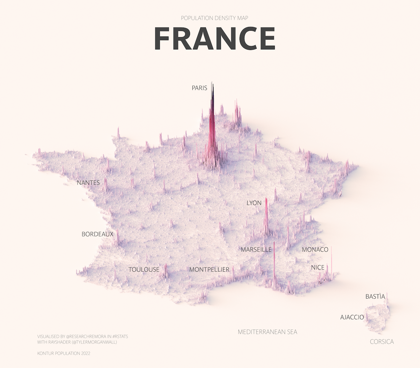
France is the world’s 7th largest economy and second-most-populous country in the EU with 65 million people. But a staggering one-fifth of the French population lives in Paris and its surrounding metro—the most populous urban area in Europe.
Many residents in the Paris metropolitan area are employed in the service sector, which makes up one-third of France’s $2.78 trillion gross domestic product.
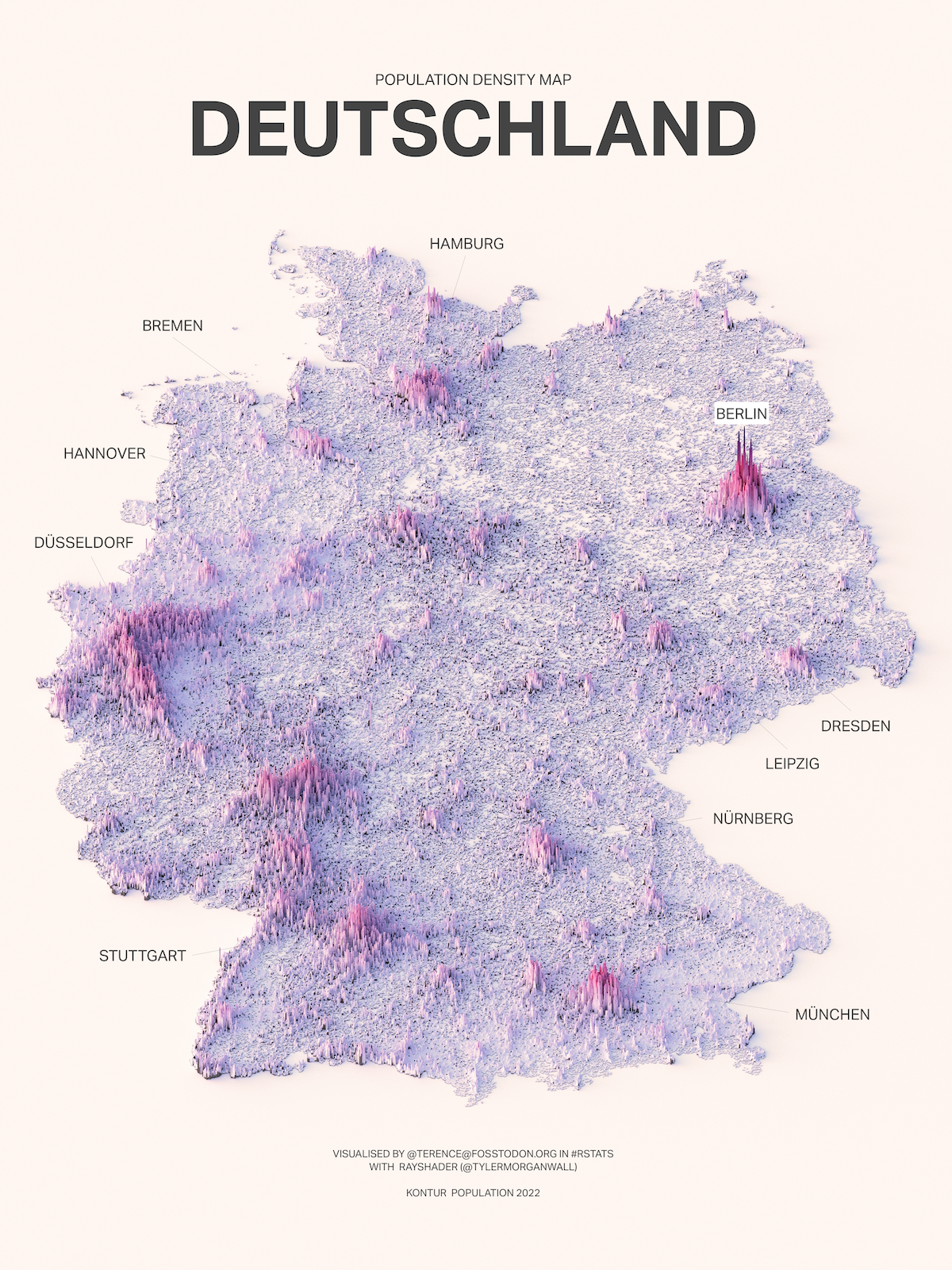
Unlike France, Germany has many dense cities and regions, with Berlin, Munich, Stuttgart, and Cologne all having over a million residents. Berlin is the most populated at 3.5 million residents in the city proper, and 6 million in the wider urban area.
That said, the relatively recent reunification of West and East Germany in 1991 meant that post-WWII growth was mostly concentrated in West Germany (and West Berlin).
Italy and Chile: Coast to Coast
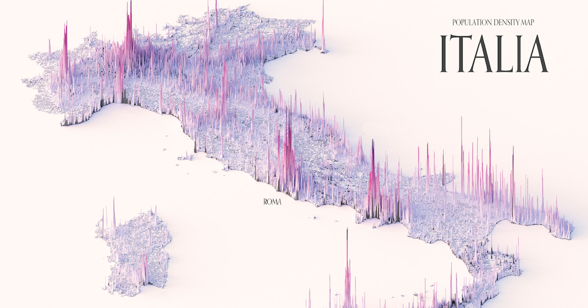
In Italy, another phenomenon affects population density and urban development—a sprawling coastline.
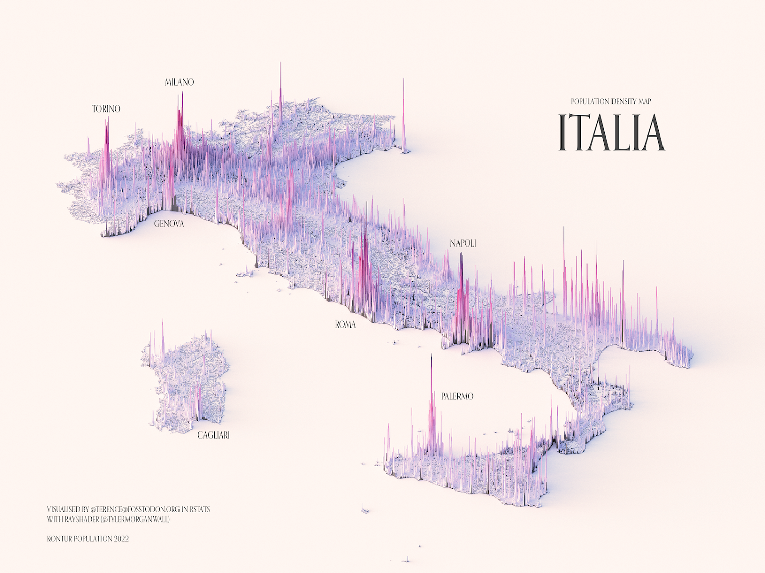
Despite having a large population of 59 million and large metropolitan areas throughout, Italy’s population spikes are closer to the water.
The port cities of Genoa, Napoli, and Palermo all have large spikes relative to the rest of the country, as does the capital, Rome. Despite its city center located 15 miles inland from the sea, it extends to the shore through the district of Ostia, where the ancient port of Rome existed.

Meanwhile in Chile, stuck between the Andes to the east and the Pacific Ocean to the west, population spikes corroborate with its many port towns and cities.
However, the country is more concentrated than Italy, with 40% of its residents congregating around the capital of Santiago.
Turkey and Canada: Marred by Mountains and Climes
Though Chile has difficulties with terrain, it is relatively consistent. Other countries have to attempt to settle many different climes—regions defined by their climates.
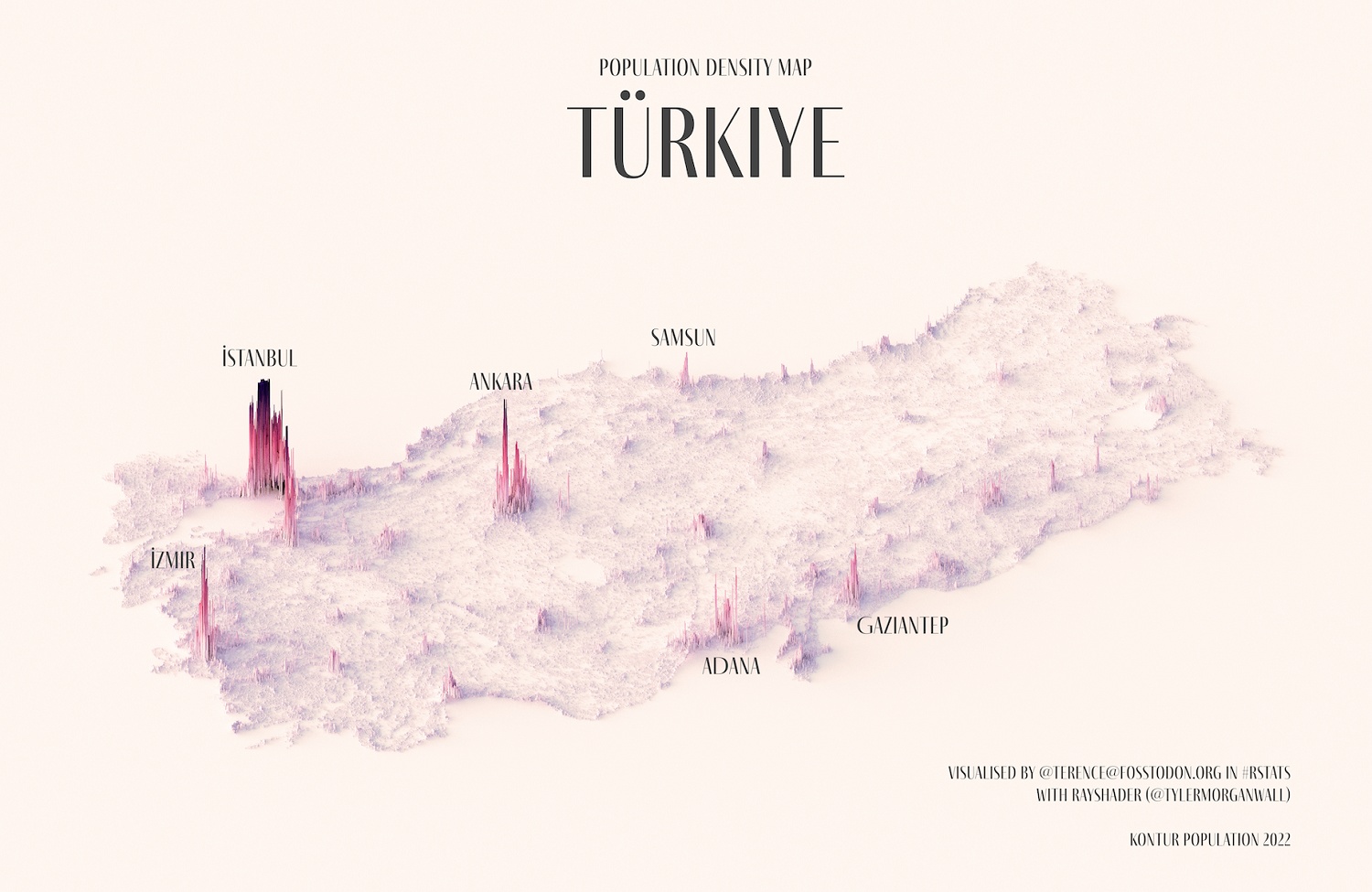
Mountains to the south and east, a large, semi-arid plateau, and even a small desert leave few centers of urban growth in Türkiye.
Predictably, further west, as the elevation comes down to the Aegean and Mediterranean Seas, population spikes begin to heighten. The largest of course is the economic and cultural hub of Istanbul, though the capital Ankara is also prominent with more than 5 million residents.
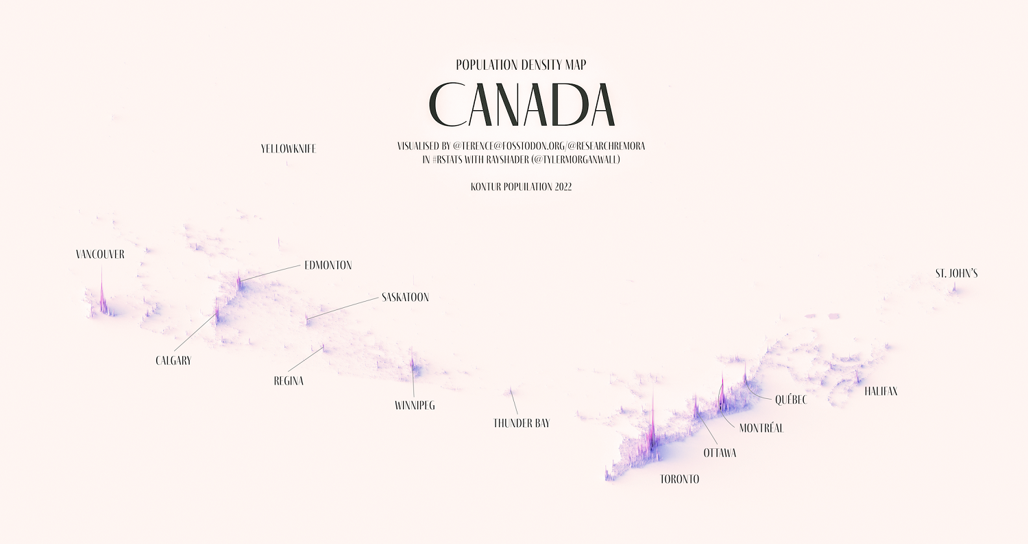
In Canada, the Rocky Mountains to the west and freezing cold temperatures in the center and north account for the large country’s relative emptiness.
Though population spikes in Western Canada are growing rapidly, highly populous urban centers are noticeably concentrated along the St. Lawrence River, with the Greater Toronto Area accounting for more than one-sixth of the country’s 39 million people.
Increasing Urbanization
According to the World Bank, more than half of the world’s population currently lives in cities, and that trend is only growing.
By 2050, 7 out of 10 people are projected to live in cities. This congregation makes cities a beehive of productivity and innovation—with more than 80% of the world’s GDP being generated at these population centers.
It’s in this context that mapping and studying urban development becomes all the more important, particularly as policymakers try their hand at sustainable urban planning.
As Teo puts it:
“By showing where people are (and are not), they show us where political and economic power is concentrated, and perhaps where and who our governments represent.”

This article was published as a part of Visual Capitalist's Creator Program, which features data-driven visuals from some of our favorite Creators around the world.


Demographics
Countries With the Largest Happiness Gains Since 2010
Tracking Gallup survey data for more than a decade reveals insights into the regions seeing happiness gains.
Countries With the Largest Happiness Gains Since 2010
This was originally posted on our Voronoi app. Download the app for free on iOS or Android and discover incredible data-driven charts from a variety of trusted sources.
In 2011, Bhutan sponsored a UN resolution that invited governments to prioritize happiness and well-being as a way to measure social and economic development.
And thus, the World Happiness Report was born.
In 2012, the first report released, examining Gallup poll data from 2006–2010 that asked respondents in nearly every country to evaluate their life on a 0–10 scale. From this they extrapolated a single “happiness score” out of 10 to compare how happy countries are.
More than a decade later, the 2024 World Happiness Report continues the mission to quantify, measure, and compare well-being. Its latest findings also include how countries have become happier in the intervening years.
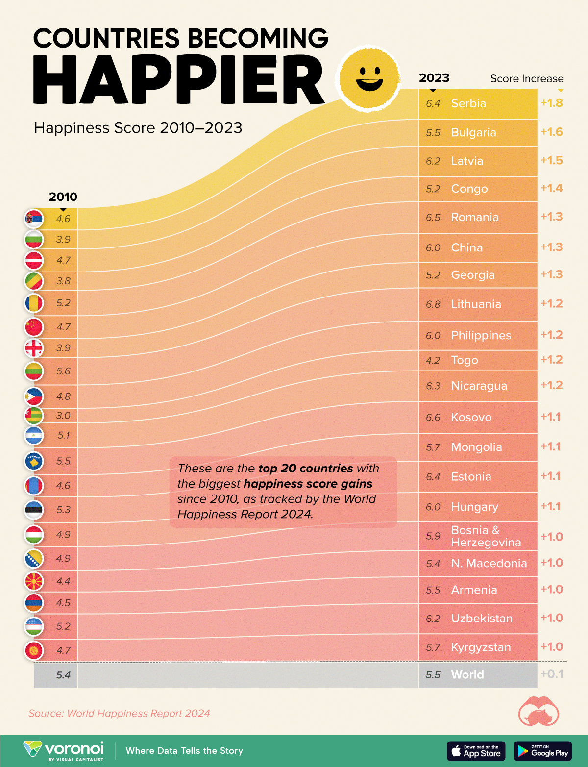
We visualize these findings in the above chart, which shows the 20 countries that have seen their happiness scores grow the most since 2010.
Which Countries Have Become Happier Since 2010?
Serbia leads a list of 12 Eastern European nations whose average happiness score has improved more than 20% in the last decade.
In the same time period, the Serbian economy has doubled to $80 billion, and its per capita GDP has nearly doubled to $9,538 in current dollar terms.
| Rank | Country | Happiness Score Gains (2010–2024) | 2024 Happiness Score (out of 10) |
|---|---|---|---|
| 1 | 🇷🇸 Serbia | +1.8 | 6.4 |
| 2 | 🇧🇬 Bulgaria | +1.6 | 5.5 |
| 3 | 🇱🇻 Latvia | +1.5 | 6.2 |
| 4 | 🇨🇬 Congo | +1.4 | 5.2 |
| 5 | 🇷🇴 Romania | +1.3 | 6.5 |
| 6 | 🇨🇳 China | +1.3 | 6.0 |
| 7 | 🇬🇪 Georgia | +1.3 | 5.2 |
| 8 | 🇱🇹 Lithuania | +1.2 | 6.8 |
| 9 | 🇵🇭 Philippines | +1.2 | 6.0 |
| 10 | 🇹🇬 Togo | +1.2 | 4.2 |
| 11 | 🇳🇮 Nicaragua | +1.2 | 6.3 |
| 12 | 🇽🇰 Kosovo | +1.1 | 6.6 |
| 13 | 🇲🇳 Mongolia | +1.1 | 5.7 |
| 14 | 🇪🇪 Estonia | +1.1 | 6.4 |
| 15 | 🇭🇺 Hungary | +1.1 | 6.0 |
| 16 | 🇧🇦 Bosnia & Herzegovina | +1.0 | 5.9 |
| 17 | 🇲🇰 North Macedonia | +1.0 | 5.4 |
| 18 | 🇦🇲 Armenia | +1.0 | 5.5 |
| 19 | 🇺🇿 Uzbekistan | +1.0 | 6.2 |
| 20 | 🇰🇬 Kyrgyzstan | +1.0 | 5.7 |
| N/A | 🌍 World | +0.1 | 5.5 |
Since the first report, Western Europe has on average been happier than Eastern Europe. But as seen with these happiness gains, Eastern Europe is now seeing their happiness levels converge closer to their Western counterparts. In fact, when looking at those under the age of 30, the most recent happiness scores are nearly the same across the continent.
All in all, 20 countries have increased their happiness score by a full point or more since 2010, on the 0–10 scale.

-

 Maps1 week ago
The Largest Earthquakes in the New York Area (1970-2024)
-

 Money2 weeks ago
Where Does One U.S. Tax Dollar Go?
-

 Automotive2 weeks ago
Almost Every EV Stock is Down After Q1 2024
-

 AI2 weeks ago
The Stock Performance of U.S. Chipmakers So Far in 2024
-

 Markets2 weeks ago
Charted: Big Four Market Share by S&P 500 Audits
-

 Real Estate2 weeks ago
Ranked: The Most Valuable Housing Markets in America
-

 Money2 weeks ago
Which States Have the Highest Minimum Wage in America?
-

 AI2 weeks ago
Ranked: Semiconductor Companies by Industry Revenue Share