Demographics
Population Boom: Charting How We Got to Nearly 8 Billion People
Article/Editing:
Today, the global population is estimated to sit at 7.91 billion people.
By the end of 2022 or within the first months of 2023, that number is expected to officially cross the 8 billion mark. Incredibly, each new billion people has come faster than the previous—it was roughly only a decade ago that we crossed the 7 billion threshold.
How did we get here, and what has global population growth looked like historically?
In this series of six charts from Our World in Data, we’ll break down how the global population got to its current point, as well as some big picture trends behind the data.
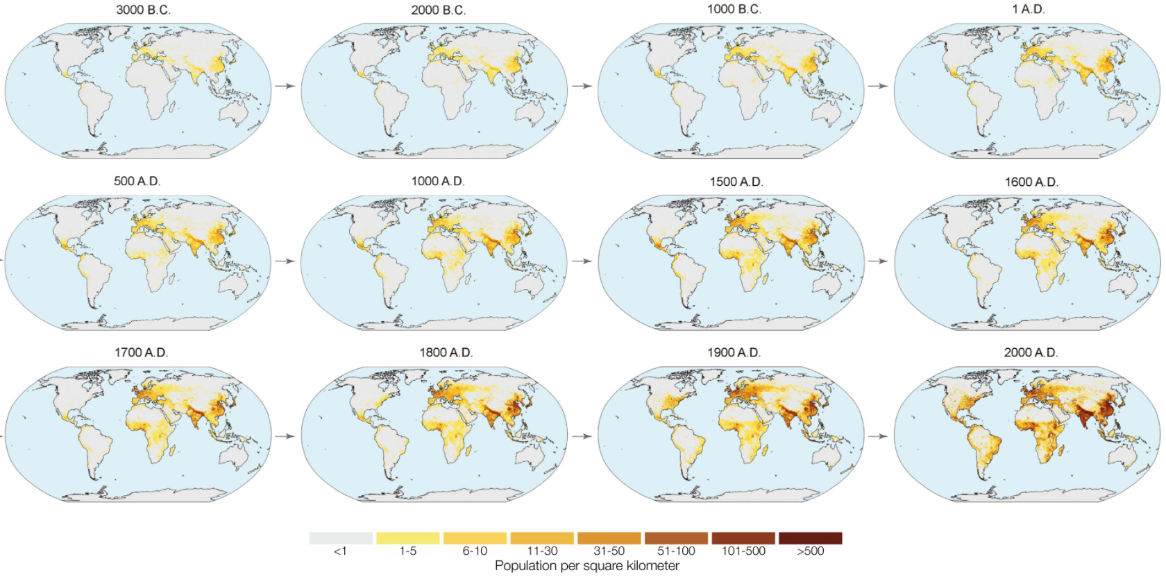
#1: Mapping the Population Over 5,000 Years
New York, São Paulo, and Jakarta were not always bustling metropolises. In fact, for long parts of the history of civilization, it was unusual to find humans congregating in many of the present-day city locations we now think of as population centers.
The human population has always moved around, seeking out new opportunity and freedoms.
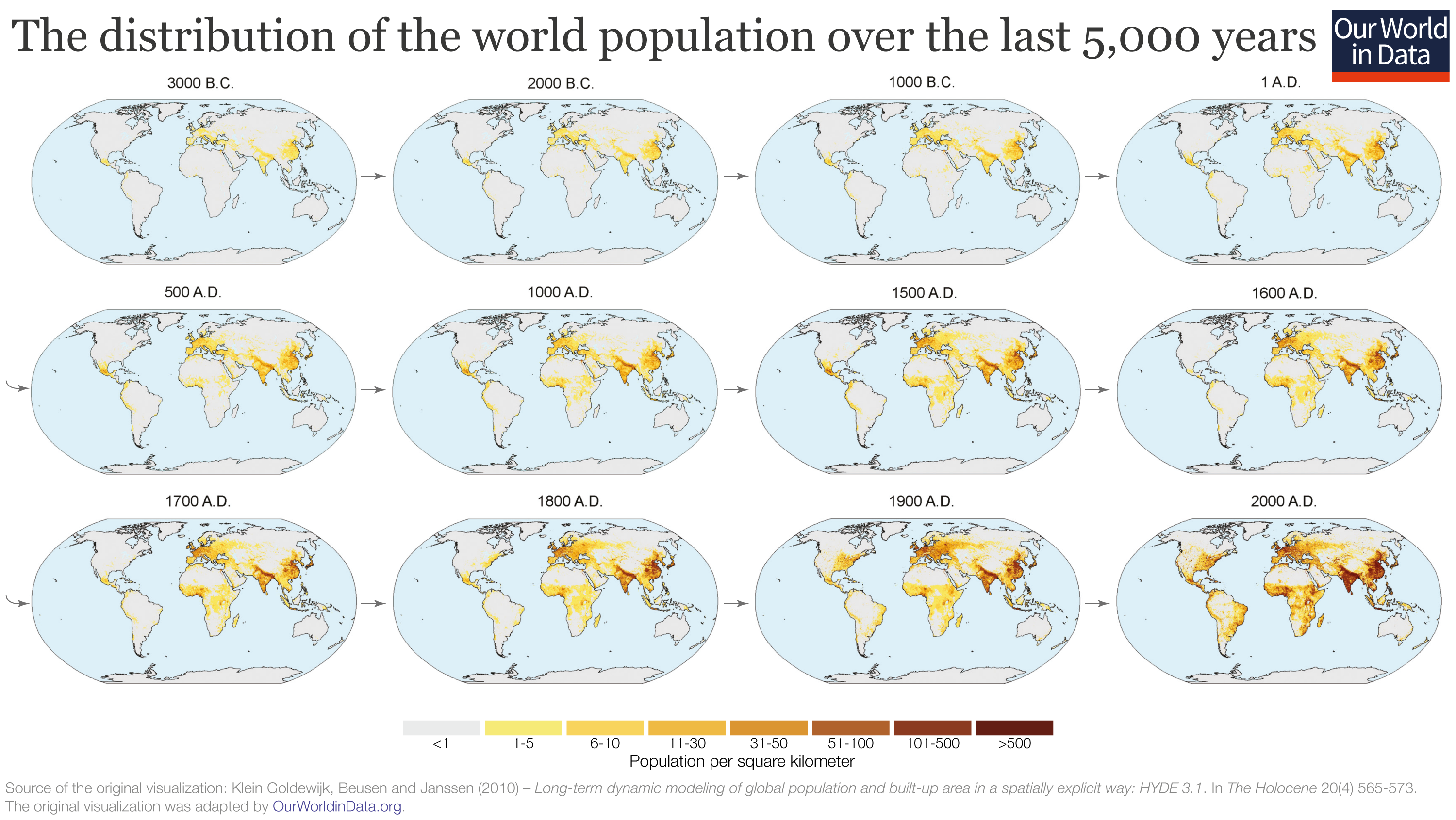
As of 3,000 BC, humans could be mainly found in Central America, the Mediterranean, the Fertile Crescent, and parts of India, Japan, and China. It’s no coincidence that that agriculture was independently discovered in many of these same places during the Neolithic Revolution.
#2: The Hockey Stick Curve
For even more context, let’s zoom way out by using a timeline that goes back to when woolly mammoths still roamed the Earth:
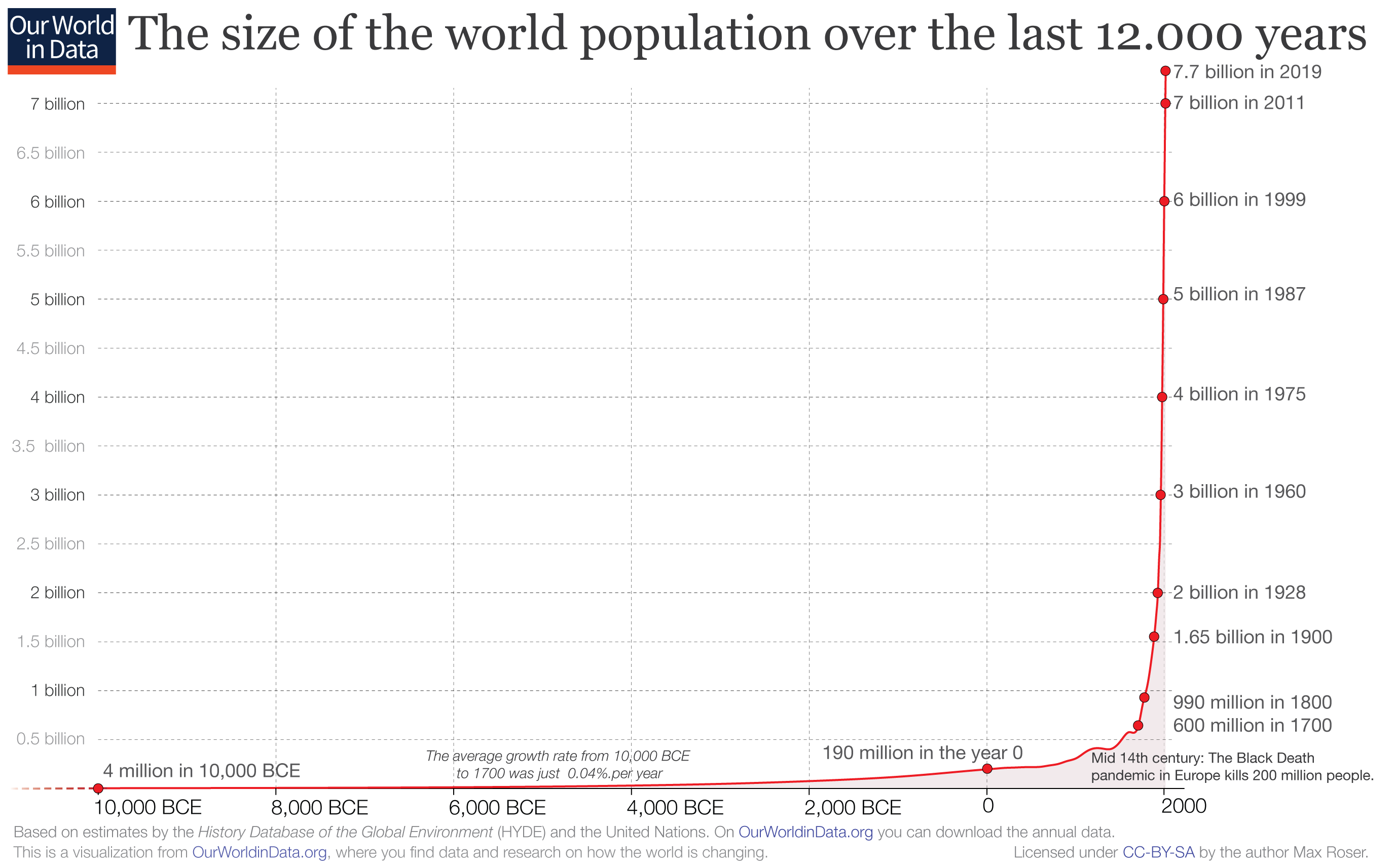
From this 10,000-foot view, it’s clear that human population growth started going exponential around the time of the Second Agricultural Revolution, which started in the 17th century in Britain. This is when new technologies and farming conventions took root, making it possible to grow the food supply at an unprecedented pace.
Soon these discoveries spread around the world, enabling population booms everywhere.
#3: The Time to Add 1 Billion
The data and projections in this chart are a few years old, but the concept remains the same:
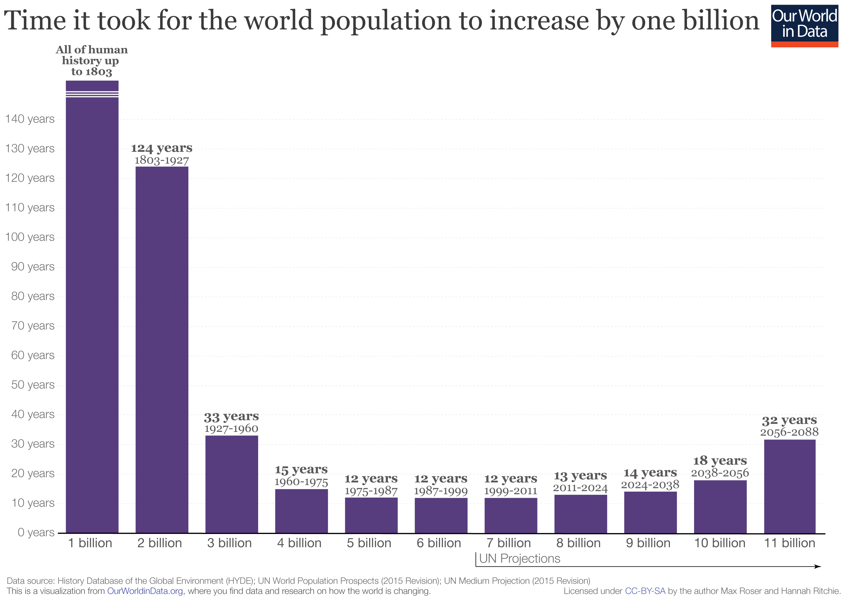
It took all of human history until 1803 to reach the first billion in population. The next billion took 124 years, and the next 33 years. More recent billions have come every dozen or so.
So why then, are future billion people additions projected to take longer and longer to achieve?
#4: The Growth Rate is Shrinking
Because of demographics and falling fertility rates, the growth rate of the global population has actually been on a downward trend for some time.
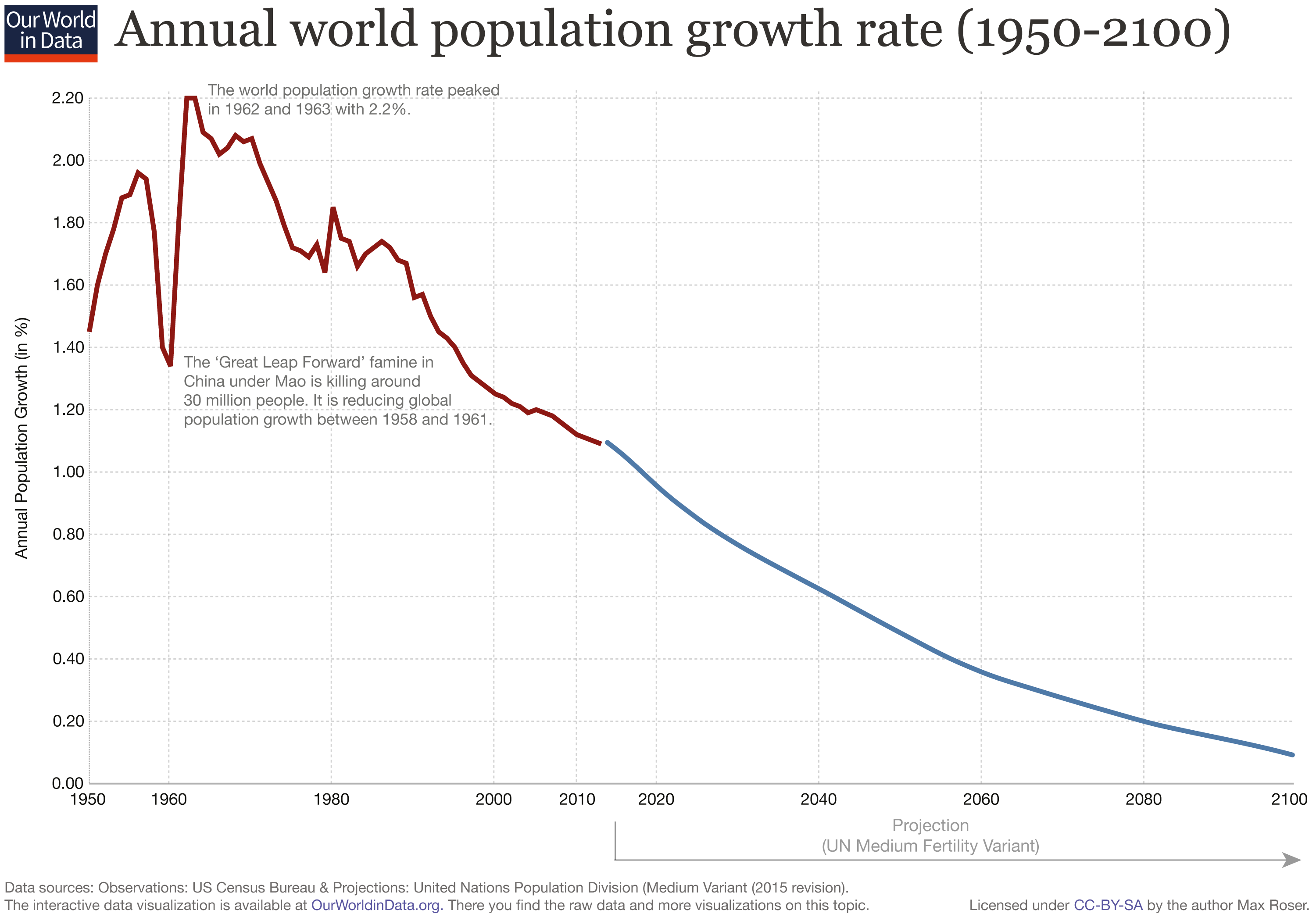
As this growth rate gets closer to zero, the population curve has become less exponential like we saw in the first graphs. Population growth is leveling out, and it may even go negative at some point in the future.
#5: The Regional Breakdown
Although the rate of population growth is expected to slow down, there are still parts of the world that are adding new people fast, as you can see on this interactive regional breakdown:
Since 1973, Asia has doubled its population from 2.3 billion to 4.6 billion people.
Comparatively, over the same time frame, Europe has gone from 670 million to 748 million, equal to just an 11% increase.
#6: The Present and Future of Population Growth
Population projections by groups like the United Nations see the global population peaking at around 10.9 billion people in 2100.
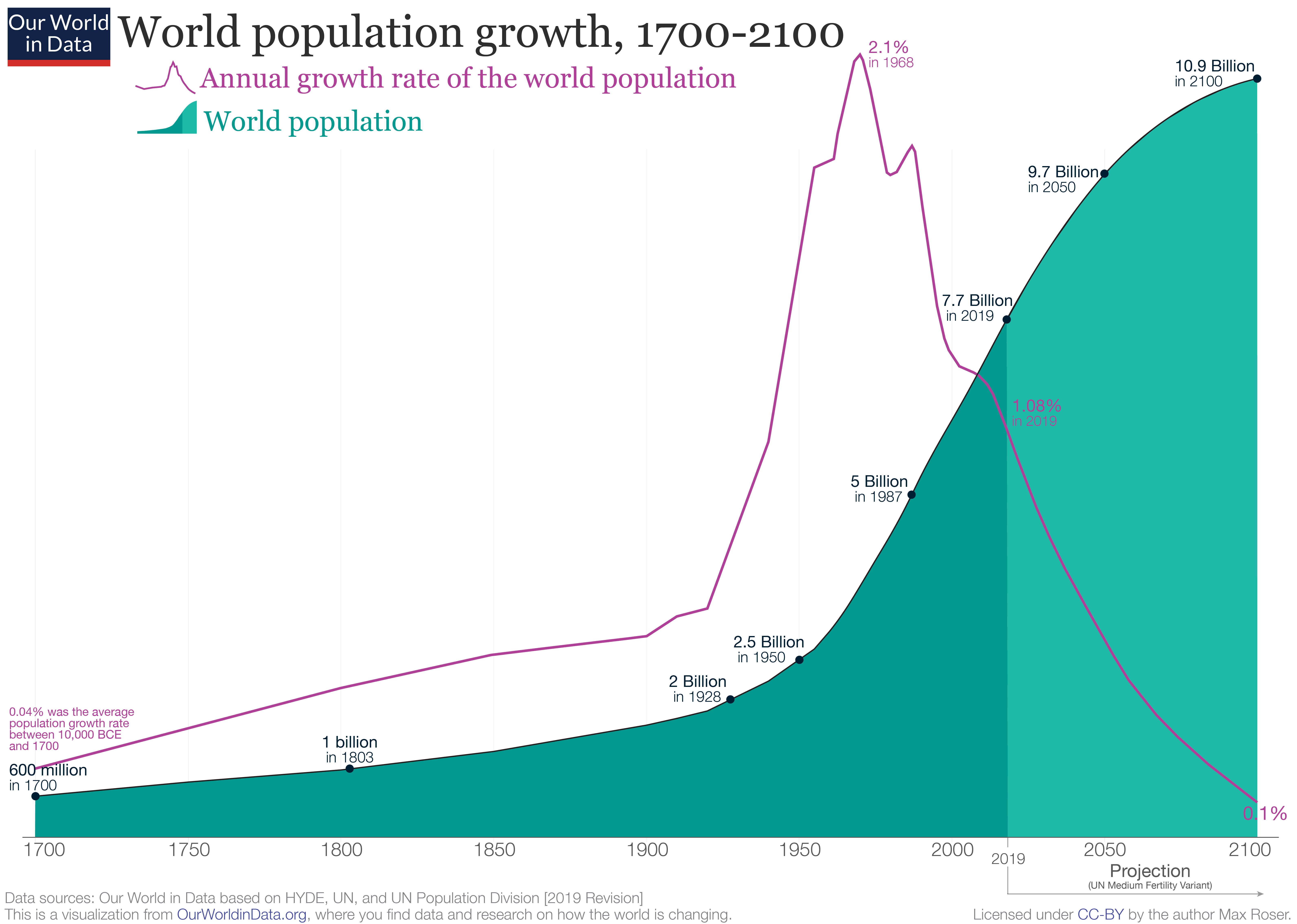
That said, there isn’t a consensus around this peak.
Organizations like the Institute for Health Metrics and Evaluation (IHME) have a different perspective, and they have recently modeled that the global population will top out at 9.7 billion people by the year 2064.
As we climb to surpass the 8 billion mark in the coming months, it will be interesting to see what path humanity ends up following.

This article was published as a part of Visual Capitalist's Creator Program, which features data-driven visuals from some of our favorite Creators around the world.


Demographics
The Countries That Have Become Sadder Since 2010
Tracking Gallup survey data for more than a decade reveals some countries are witnessing big happiness declines, reflecting their shifting socio-economic conditions.


The Countries That Have Become Sadder Since 2010
This was originally posted on our Voronoi app. Download the app for free on iOS or Android and discover incredible data-driven charts from a variety of trusted sources.
Can happiness be quantified?
Some approaches that try to answer this question make a distinction between two differing components of happiness: a daily experience part, and a more general life evaluation (which includes how people think about their life as a whole).
The World Happiness Report—first launched in 2012—has been making a serious go at quantifying happiness, by examining Gallup poll data that asks respondents in nearly every country to evaluate their life on a 0–10 scale. From this they extrapolate a single “happiness score” out of 10 to compare how happy (or unhappy) countries are.
More than a decade later, the 2024 World Happiness Report continues the mission. Its latest findings also include how some countries have become sadder in the intervening years.
Which Countries Have Become Unhappier Since 2010?
Afghanistan is the unhappiest country in the world right now, and is also 60% unhappier than over a decade ago, indicating how much life has worsened since 2010.
In 2021, the Taliban officially returned to power in Afghanistan, after nearly two decades of American occupation in the country. The Islamic fundamentalist group has made life harder, especially for women, who are restricted from pursuing higher education, travel, and work.
On a broader scale, the Afghan economy has suffered post-Taliban takeover, with various consequent effects: mass unemployment, a drop in income, malnutrition, and a crumbling healthcare system.
| Rank | Country | Happiness Score Loss (2010–24) | 2024 Happiness Score (out of 10) |
|---|---|---|---|
| 1 | 🇦🇫 Afghanistan | -2.6 | 1.7 |
| 2 | 🇱🇧 Lebanon | -2.3 | 2.7 |
| 3 | 🇯🇴 Jordan | -1.5 | 4.2 |
| 4 | 🇻🇪 Venezuela | -1.3 | 5.6 |
| 5 | 🇲🇼 Malawi | -1.2 | 3.4 |
| 6 | 🇿🇲 Zambia | -1.2 | 3.5 |
| 7 | 🇧🇼 Botswana | -1.2 | 3.4 |
| 8 | 🇾🇪 Yemen | -1.0 | 3.6 |
| 9 | 🇪🇬 Egypt | -1.0 | 4.0 |
| 10 | 🇮🇳 India | -0.9 | 4.1 |
| 11 | 🇧🇩 Bangladesh | -0.9 | 3.9 |
| 12 | 🇨🇩 DRC | -0.7 | 3.3 |
| 13 | 🇹🇳 Tunisia | -0.7 | 4.4 |
| 14 | 🇨🇦 Canada | -0.6 | 6.9 |
| 15 | 🇺🇸 U.S. | -0.6 | 6.7 |
| 16 | 🇨🇴 Colombia | -0.5 | 5.7 |
| 17 | 🇵🇦 Panama | -0.5 | 6.4 |
| 18 | 🇵🇰 Pakistan | -0.5 | 4.7 |
| 19 | 🇿🇼 Zimbabwe | -0.5 | 3.3 |
| 20 | 🇮🇪 Ireland | -0.5 | 6.8 |
| N/A | 🌍 World | +0.1 | 5.5 |
Nine countries in total saw their happiness score drop by a full point or more, on the 0–10 scale.
Noticeably, many of them have seen years of social and economic upheaval. Lebanon, for example, has been grappling with decades of corruption, and a severe liquidity crisis since 2019 that has resulted in a banking system collapse, sending poverty levels skyrocketing.
In Jordan, unprecedented population growth—from refugees leaving Iraq and Syria—has aggravated unemployment rates. A somewhat abrupt change in the line of succession has also raised concerns about political stability in the country.

-

 Green1 week ago
Ranked: The Countries With the Most Air Pollution in 2023
-

 Automotive2 weeks ago
Almost Every EV Stock is Down After Q1 2024
-

 AI2 weeks ago
The Stock Performance of U.S. Chipmakers So Far in 2024
-

 Markets2 weeks ago
Charted: Big Four Market Share by S&P 500 Audits
-

 Real Estate2 weeks ago
Ranked: The Most Valuable Housing Markets in America
-

 Money2 weeks ago
Which States Have the Highest Minimum Wage in America?
-

 AI2 weeks ago
Ranked: Semiconductor Companies by Industry Revenue Share
-

 Travel2 weeks ago
Ranked: The World’s Top Flight Routes, by Revenue