Markets
Visualizing America’s Most Popular Fast Food Chains
Article/Editing:
Visualizing America’s Most Popular Fast Food Chains
Fast food is big business in America. From national chains to regional specialties, the industry was worth $331.4 billion as of June 2022.
Which fast food brands are currently dominating this space? This graphic by Truman Du uses data from Quick Service Restaurant (QSR) Magazine to show the most popular fast food chains across America.
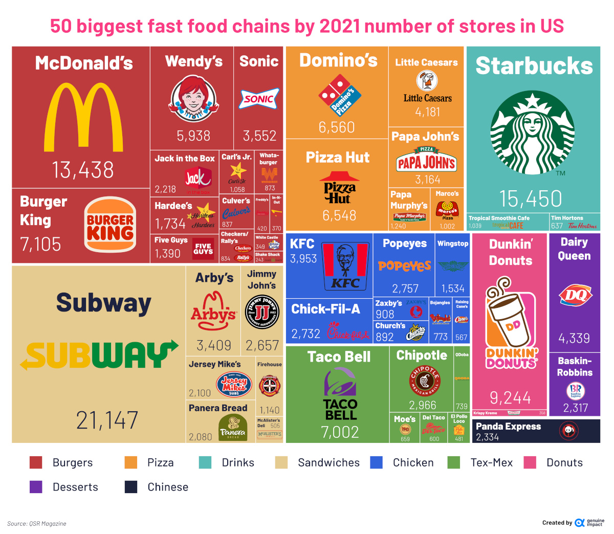
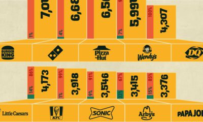
The Most Prevalent Fast Food Chains, by Store Count
Each year, QSR Magazine puts together a report that ranks America’s top 50 fast food chains. It uses a number of metrics to determine this, including total sales (which we’ve covered in a previous article), average-unit volume (AUVs), and growth figures.
For this graphic, Du zoomed in on a specific metric from the report—the number of stores that each fast food chain has across the country. Here are the top 50 chains, and the number of restaurants they each have across America:
| Rank | Brand | Total U.S. Stores (2021) |
|---|---|---|
| 1 | Subway | 21,147 |
| 2 | Starbucks | 15,450 |
| 3 | McDonald's | 13,438 |
| 4 | Dunkin' | 9,244 |
| 5 | Burger King | 7,105 |
| 6 | Taco Bell | 7,002 |
| 7 | Domino's | 6,560 |
| 8 | Pizza Hut | 6,548 |
| 9 | Wendy's | 5,938 |
| 10 | Dairy Queen | 4,339 |
| 11 | Little Caesars | 4,181 |
| 12 | KFC | 3,953 |
| 13 | Sonic Drive-in | 3,552 |
| 14 | Arby's | 3,409 |
| 15 | Papa Johns | 3,164 |
| 16 | Chipotle | 2,966 |
| 17 | Popeyes Louisiana Kitchen | 2,757 |
| 18 | Chick-Fil-A | 2,732 |
| 19 | Jimmy John's | 2,657 |
| 20 | Panda Express | 2,334 |
| 21 | Baskin-Robbins | 2,317 |
| 22 | Jack in the Box | 2,218 |
| 23 | Jersey Mike's | 2,100 |
| 24 | Panera Bread | 2,080 |
| 25 | Hardee's | 1,734 |
| 26 | Wingstop | 1,534 |
| 27 | Five Guys | 1,390 |
| 28 | Papa Murphy's | 1,240 |
| 29 | Firehouse Subs | 1,140 |
| 30 | Carl's Jr. | 1,058 |
| 31 | Tropical Smoothie Café | 1,039 |
| 32 | Marco's Pizza | 1,002 |
| 33 | Zaxby's | 908 |
| 34 | Church's Chicken | 892 |
| 35 | Whataburger | 873 |
| 36 | Culver's | 837 |
| 37 | Checkers / Rally's | 834 |
| 38 | Bojangles | 773 |
| 39 | Qdoba | 739 |
| 40 | Moe's | 659 |
| 41 | Tim Hortons | 637 |
| 42 | Del Taco | 600 |
| 43 | Raising Cane's | 567 |
| 44 | McAlister's Deli | 505 |
| 45 | El Pollo Loco | 481 |
| 46 | Freddy's Frozen Custard & Steakburgers | 420 |
| 47 | In-N-Out Burger | 370 |
| 48 | Krispy Kreme | 358 |
| 49 | White Castle | 349 |
| 50 | Shake Shack | 243 |
Subway takes first place with over 20,000 restaurants across the country—that’s more stores than all the other sandwich chains on the list put together.
Subway’s popularity is reflected in its sales figures, as well—in 2021, Subway generated about $9.4 billion in sales, about double its closest rival Arby’s.
Second on the list is Starbucks, with more than 15,000 stores across America. Despite a rough 2020, the coffee chain managed to turn things around in 2021, making more than $24 billion in sales that year.
The iconic burger joint McDonald’s comes in third, with more than 13,000 restaurants across the country. While the restaurant has fewer stores than Starbucks and Subway, it generated $46 billion in 2021 sales, which is more than Subway and Starbucks combined.
The “Stay in Your Lane” Curse
As the report shows, quick service restaurants are a popular dining option across America, and the successful ones have the potential to generate billions of dollars each year.
However, QSRs are not without their struggles. One difficulty facing fast food chains is the fact they’re often siloed into specific verticals—once a QSR establishes its niche, it can be difficult for that chain to branch out and successfully launch different menu items.
Take McDonald’s McPizza for example, which was launched in the mid 1980s and tested for a decade or so before being widely discontinued by 2000. Various factors contributed to its demise, but one major issue was the pizza’s relatively long cook-time of sixteen minutes.
Innovation in the Fast Food Industry
While fast food restaurants may have difficulty diversifying their menus, there’s still tons of innovation happening in the industry, especially when it comes to optimizing service and cutting wait times for customers.
For example, Starbucks’ mobile order and pay service, which allows customers to order from their phone, has grown 400% over the last five years. And in 2021, the McDonald’s app was downloaded 24 million times.
It’ll be interesting to see what changes in the next decade, as fast food companies continue to invest in their digital offers and tech support.

This article was published as a part of Visual Capitalist's Creator Program, which features data-driven visuals from some of our favorite Creators around the world.


Markets
U.S. Debt Interest Payments Reach $1 Trillion
U.S. debt interest payments have surged past the $1 trillion dollar mark, amid high interest rates and an ever-expanding debt burden.


U.S. Debt Interest Payments Reach $1 Trillion
This was originally posted on our Voronoi app. Download the app for free on iOS or Android and discover incredible data-driven charts from a variety of trusted sources.
The cost of paying for America’s national debt crossed the $1 trillion dollar mark in 2023, driven by high interest rates and a record $34 trillion mountain of debt.
Over the last decade, U.S. debt interest payments have more than doubled amid vast government spending during the pandemic crisis. As debt payments continue to soar, the Congressional Budget Office (CBO) reported that debt servicing costs surpassed defense spending for the first time ever this year.
This graphic shows the sharp rise in U.S. debt payments, based on data from the Federal Reserve.
A $1 Trillion Interest Bill, and Growing
Below, we show how U.S. debt interest payments have risen at a faster pace than at another time in modern history:
| Date | Interest Payments | U.S. National Debt |
|---|---|---|
| 2023 | $1.0T | $34.0T |
| 2022 | $830B | $31.4T |
| 2021 | $612B | $29.6T |
| 2020 | $518B | $27.7T |
| 2019 | $564B | $23.2T |
| 2018 | $571B | $22.0T |
| 2017 | $493B | $20.5T |
| 2016 | $460B | $20.0T |
| 2015 | $435B | $18.9T |
| 2014 | $442B | $18.1T |
| 2013 | $425B | $17.2T |
| 2012 | $417B | $16.4T |
| 2011 | $433B | $15.2T |
| 2010 | $400B | $14.0T |
| 2009 | $354B | $12.3T |
| 2008 | $380B | $10.7T |
| 2007 | $414B | $9.2T |
| 2006 | $387B | $8.7T |
| 2005 | $355B | $8.2T |
| 2004 | $318B | $7.6T |
| 2003 | $294B | $7.0T |
| 2002 | $298B | $6.4T |
| 2001 | $318B | $5.9T |
| 2000 | $353B | $5.7T |
| 1999 | $353B | $5.8T |
| 1998 | $360B | $5.6T |
| 1997 | $368B | $5.5T |
| 1996 | $362B | $5.3T |
| 1995 | $357B | $5.0T |
| 1994 | $334B | $4.8T |
| 1993 | $311B | $4.5T |
| 1992 | $306B | $4.2T |
| 1991 | $308B | $3.8T |
| 1990 | $298B | $3.4T |
| 1989 | $275B | $3.0T |
| 1988 | $254B | $2.7T |
| 1987 | $240B | $2.4T |
| 1986 | $225B | $2.2T |
| 1985 | $219B | $1.9T |
| 1984 | $205B | $1.7T |
| 1983 | $176B | $1.4T |
| 1982 | $157B | $1.2T |
| 1981 | $142B | $1.0T |
| 1980 | $113B | $930.2B |
| 1979 | $96B | $845.1B |
| 1978 | $84B | $789.2B |
| 1977 | $69B | $718.9B |
| 1976 | $61B | $653.5B |
| 1975 | $55B | $576.6B |
| 1974 | $50B | $492.7B |
| 1973 | $45B | $469.1B |
| 1972 | $39B | $448.5B |
| 1971 | $36B | $424.1B |
| 1970 | $35B | $389.2B |
| 1969 | $30B | $368.2B |
| 1968 | $25B | $358.0B |
| 1967 | $23B | $344.7B |
| 1966 | $21B | $329.3B |
Interest payments represent seasonally adjusted annual rate at the end of Q4.
At current rates, the U.S. national debt is growing by a remarkable $1 trillion about every 100 days, equal to roughly $3.6 trillion per year.
As the national debt has ballooned, debt payments even exceeded Medicaid outlays in 2023—one of the government’s largest expenditures. On average, the U.S. spent more than $2 billion per day on interest costs last year. Going further, the U.S. government is projected to spend a historic $12.4 trillion on interest payments over the next decade, averaging about $37,100 per American.
Exacerbating matters is that the U.S. is running a steep deficit, which stood at $1.1 trillion for the first six months of fiscal 2024. This has accelerated due to the 43% increase in debt servicing costs along with a $31 billion dollar increase in defense spending from a year earlier. Additionally, a $30 billion increase in funding for the Federal Deposit Insurance Corporation in light of the regional banking crisis last year was a major contributor to the deficit increase.
Overall, the CBO forecasts that roughly 75% of the federal deficit’s increase will be due to interest costs by 2034.

-

 Real Estate2 weeks ago
Visualizing America’s Shortage of Affordable Homes
-

 Technology1 week ago
Ranked: Semiconductor Companies by Industry Revenue Share
-

 Money1 week ago
Which States Have the Highest Minimum Wage in America?
-

 Real Estate1 week ago
Ranked: The Most Valuable Housing Markets in America
-

 Business2 weeks ago
Charted: Big Four Market Share by S&P 500 Audits
-

 AI2 weeks ago
The Stock Performance of U.S. Chipmakers So Far in 2024
-

 Misc2 weeks ago
Almost Every EV Stock is Down After Q1 2024
-

 Money2 weeks ago
Where Does One U.S. Tax Dollar Go?