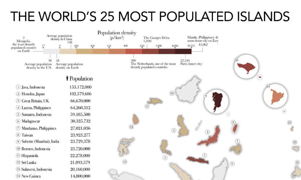
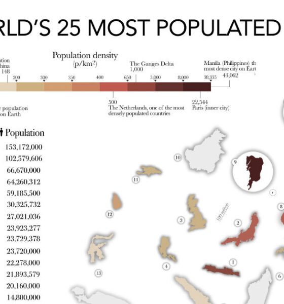

The most populated islands of the earth are teeming hubs of human activity, a far cry from the remote paradises...
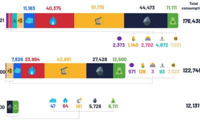

Despite the advent of renewable sources of energy, fossil fuels and their carbon emissions, haven’t gone anywhere.
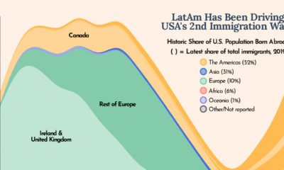

The U.S. is built on immigration and this chart shows how Latin America has been one of the biggest drivers of U.S. immigration in the last...
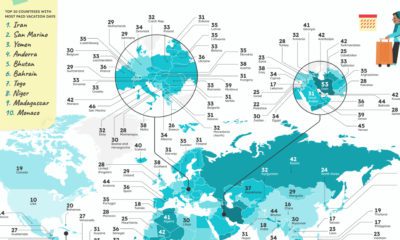

Which countries have the most vacation days, or the most public holidays? These graphics reveal how many paid vacation days each country mandates.
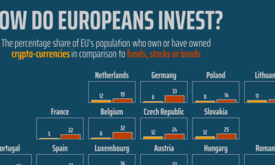

This chart shows crypto popularity amongst European Union investors relative to traditional assets like stocks, bonds, and funds.
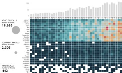

This interactive graphic visualizes U.S. automobile recalls over the past 40 years by type, company, components, and the number of people impacted.
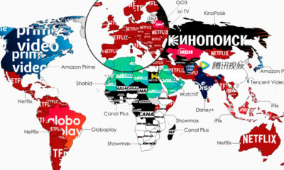

What is the top streaming service in each country? This map highlights the streaming services with the highest subscribers in 134 countries.


Which countries have the biggest online gambling markets? This graphic highlights the countries earning the highest gross revenues from online gambling.
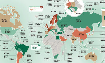

Where would you find the most and least expensive Starbucks coffee? These maps show the price of a Tall Latte in every country.
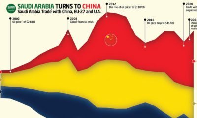

This graphic charts Saudi Arabia’s trading history with the EU, the U.S., and it's new largest trading partner — China.
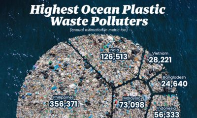

This graphic visualizes the top 10 countries emitting plastic pollutants into our oceans.