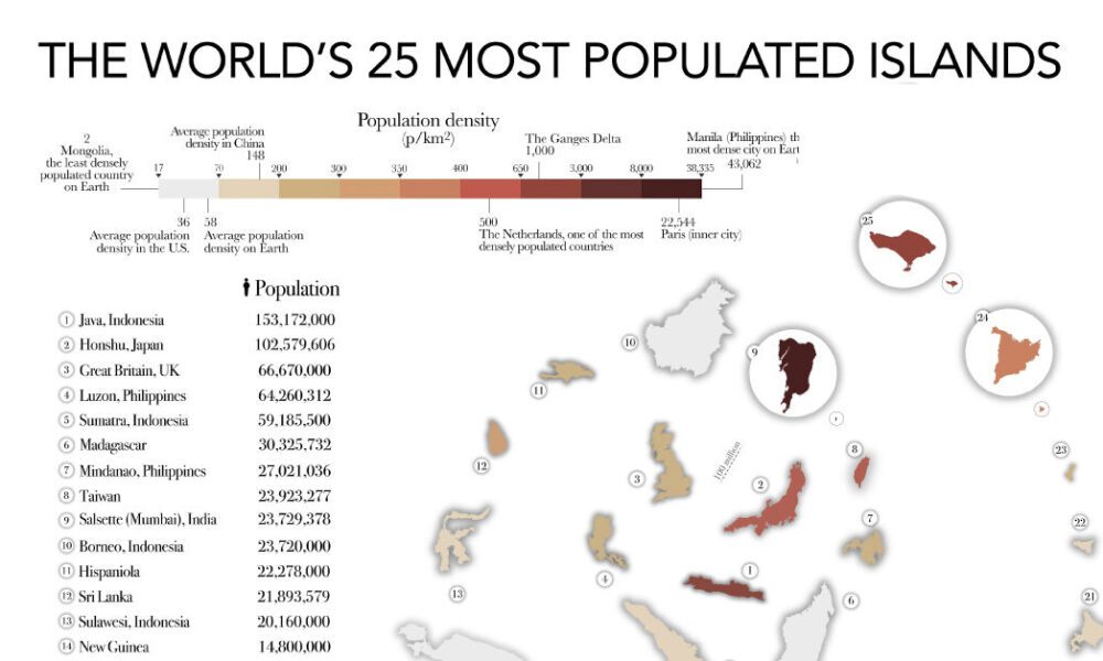
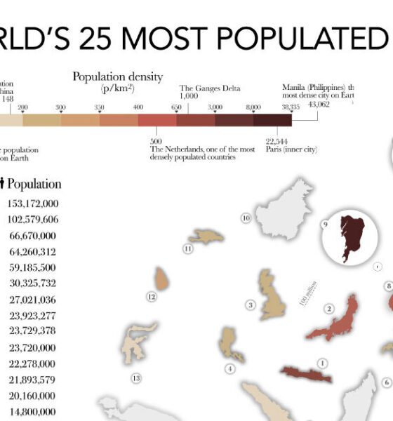

The most populated islands of the earth are teeming hubs of human activity, a far cry from the remote paradises...
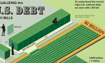

Can you picture what $31.4 trillion looks like? This graphic stacks up $1 bills to visualize U.S. debt in physical form.
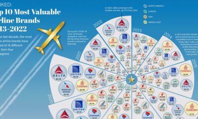

Airline brands have seen big up and down swings in valuation as of late. See how the 10 largest brand have changed from 2013 to 2022.
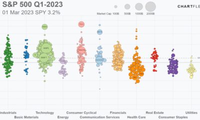

Track the S&P 500’s performance in 2023, including all 500 companies, and the sectors they belong to, in this animated video.
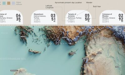

This graphic features the ancient seven wonders of the world that captivated people for thousands of years.
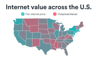

Which U.S. state has the best internet value? Browse this interactive map to see where states rank on the Internet Value Index.
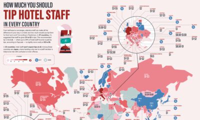

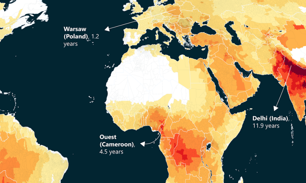
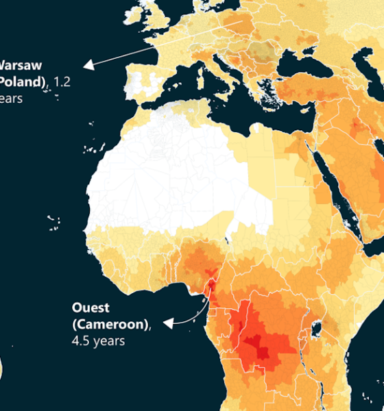
How much should you tip in each country for a restaurant, or a hotel? These maps show average tips in restaurants, hotels, and taxis.
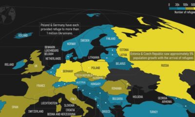

This map highlights European countries that became refugee destinations for Ukrainians who fled from the Russo-Ukrainian war.
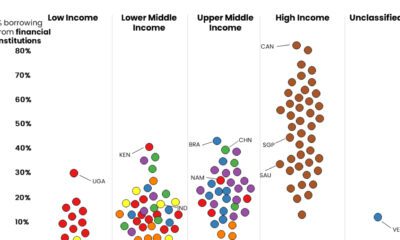

These graphics shed light on which people borrow money from financial institutions, and which rely on friends and family for monetary help.
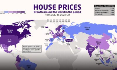

Which countries have seen the biggest spikes in housing prices? These maps show the change in real and nominal housing prices since 2010.


This chart shows the top ten best selling video games, ranked by software units sold. Six of them have been released in the last 12 years.