Markets
Mapping Shipping Lanes: Maritime Traffic Around the World
Article/Editing:
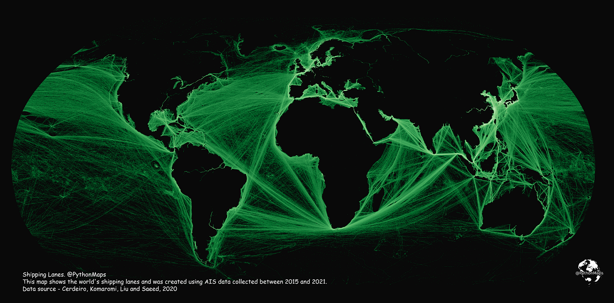
Click to view a larger version of the map.
Mapping Shipping Lanes: Maritime Traffic Around the World
Each year, thousands of ships travel across the globe, transporting everything from passengers to consumer goods like wheat and oil.
But just how busy are global maritime routes, and where are the world’s major shipping lanes? This map by Adam Symington paints a macro picture of the world’s maritime traffic by highlighting marine traffic density around the world.
It uses data from the International Monetary Fund (IMF) in partnership with The World Bank, as part of IMF’s World Seaborne Trade Monitoring System.
Data spans from Jan 2015 to Feb 2021 and includes five different types of ships: commercial ships, fishing ships, oil & gas, passenger ships, and leisure vessels.
An Overview of Key Maritime Shipping Lanes
If you take a look at the map, you’ll spot some distinct areas where traffic is heavily concentrated.
These high-density areas are the world’s main shipping lanes. Syminton provided some zoomed-in visuals of these waterways in detail, so let’s dive in:
Panama Canal

The Panama Canal is a man-made waterway that connects the Pacific and Atlantic Oceans. For ships traveling from the east to west coast of the U.S., this route avoids the far more treacherous Cape Horn at the tip of South America or the Bering Strait in the Arctic, and shaves off roughly 8,000 nautical miles—or 21 days off their journey.
In 2021, approximately 516.7 million tons of goods passed through the major waterway, according to Ricaurte Vasquez, the Panama Canal Authority’s administrator.
Strait of Malacca

This marine passage is the fastest connector between the Pacific and Indian oceans, winding through the Malay Peninsula and Sumatra. It’s a slender waterway—at its narrowest point, the canal is less than 1.9 miles wide. Approximately 70,000 ships pass through this strait each year.
The Danish Straits

Connecting the North Sea with the Baltic Sea, the Danish Straits include three channels: the Oresund, the Great Belt and the Little Belt.
The Danish Straits are known to be a major passageway for Russian oil exports—which, despite sanctions and boycotts against Russian oil, have remained strong throughout 2022 so far.
Suez Canal

This 120-mile-long artificial waterway runs through Egypt and connects the Mediterranean Sea to the Red Sea, saving ships traveling between Asia and Europe a long passage around Africa. Over 20,600 vessels traveled through the canal in 2021.
Last year, the canal made headlines after a 1,312-foot-long container ship called the Ever Given got stuck in the canal for six days, causing a massive traffic jam and halting billions of dollars worth of traded goods.
Strait of Hormuz

This 615-mile waterway connects the Persian Gulf and the Gulf of Oman and ultimately drains into the Arabian Sea. In 2020, the canal transported approximately 18 million barrels of oil every day.
The English Channel

Located between England and France, the 350-mile-long English Channel links the North Sea to the Atlantic Ocean. Approximately 500 vessels travel through the channel each day, making it one of the world’s busiest shipping lanes.
Some of the major European rivers are also clearly visible in these visualizations, including the Thames in the UK, the Seine in France, and the Meuse (or Mass) that flows through Belgium and the Netherlands.
COVID-19’s Impact on Maritime Transport
Though these maps show six years worth of marine traffic, it’s important to remember that many sectors were negatively impacted by the global pandemic, and maritime trade was no exception. In 2020, global maritime shipments dropped by 3.8% to 10.65 billion tons.
While the drop wasn’t as severe as expected, and output is projected to keep growing throughout 2022, certain areas are still feeling the effects of COVID-19-induced restrictions.
For instance, in March 2022, shipping volume at the port of Shanghai screeched to a halt due to strict lockdowns in Shanghai, triggered by a COVID-19 outbreak. Traffic was impacted for months, and while operations have rebounded, marine traffic in the area is still congested.


This article was published as a part of Visual Capitalist's Creator Program, which features data-driven visuals from some of our favorite Creators around the world.


Markets
U.S. Debt Interest Payments Reach $1 Trillion
U.S. debt interest payments have surged past the $1 trillion dollar mark, amid high interest rates and an ever-expanding debt burden.


U.S. Debt Interest Payments Reach $1 Trillion
This was originally posted on our Voronoi app. Download the app for free on iOS or Android and discover incredible data-driven charts from a variety of trusted sources.
The cost of paying for America’s national debt crossed the $1 trillion dollar mark in 2023, driven by high interest rates and a record $34 trillion mountain of debt.
Over the last decade, U.S. debt interest payments have more than doubled amid vast government spending during the pandemic crisis. As debt payments continue to soar, the Congressional Budget Office (CBO) reported that debt servicing costs surpassed defense spending for the first time ever this year.
This graphic shows the sharp rise in U.S. debt payments, based on data from the Federal Reserve.
A $1 Trillion Interest Bill, and Growing
Below, we show how U.S. debt interest payments have risen at a faster pace than at another time in modern history:
| Date | Interest Payments | U.S. National Debt |
|---|---|---|
| 2023 | $1.0T | $34.0T |
| 2022 | $830B | $31.4T |
| 2021 | $612B | $29.6T |
| 2020 | $518B | $27.7T |
| 2019 | $564B | $23.2T |
| 2018 | $571B | $22.0T |
| 2017 | $493B | $20.5T |
| 2016 | $460B | $20.0T |
| 2015 | $435B | $18.9T |
| 2014 | $442B | $18.1T |
| 2013 | $425B | $17.2T |
| 2012 | $417B | $16.4T |
| 2011 | $433B | $15.2T |
| 2010 | $400B | $14.0T |
| 2009 | $354B | $12.3T |
| 2008 | $380B | $10.7T |
| 2007 | $414B | $9.2T |
| 2006 | $387B | $8.7T |
| 2005 | $355B | $8.2T |
| 2004 | $318B | $7.6T |
| 2003 | $294B | $7.0T |
| 2002 | $298B | $6.4T |
| 2001 | $318B | $5.9T |
| 2000 | $353B | $5.7T |
| 1999 | $353B | $5.8T |
| 1998 | $360B | $5.6T |
| 1997 | $368B | $5.5T |
| 1996 | $362B | $5.3T |
| 1995 | $357B | $5.0T |
| 1994 | $334B | $4.8T |
| 1993 | $311B | $4.5T |
| 1992 | $306B | $4.2T |
| 1991 | $308B | $3.8T |
| 1990 | $298B | $3.4T |
| 1989 | $275B | $3.0T |
| 1988 | $254B | $2.7T |
| 1987 | $240B | $2.4T |
| 1986 | $225B | $2.2T |
| 1985 | $219B | $1.9T |
| 1984 | $205B | $1.7T |
| 1983 | $176B | $1.4T |
| 1982 | $157B | $1.2T |
| 1981 | $142B | $1.0T |
| 1980 | $113B | $930.2B |
| 1979 | $96B | $845.1B |
| 1978 | $84B | $789.2B |
| 1977 | $69B | $718.9B |
| 1976 | $61B | $653.5B |
| 1975 | $55B | $576.6B |
| 1974 | $50B | $492.7B |
| 1973 | $45B | $469.1B |
| 1972 | $39B | $448.5B |
| 1971 | $36B | $424.1B |
| 1970 | $35B | $389.2B |
| 1969 | $30B | $368.2B |
| 1968 | $25B | $358.0B |
| 1967 | $23B | $344.7B |
| 1966 | $21B | $329.3B |
Interest payments represent seasonally adjusted annual rate at the end of Q4.
At current rates, the U.S. national debt is growing by a remarkable $1 trillion about every 100 days, equal to roughly $3.6 trillion per year.
As the national debt has ballooned, debt payments even exceeded Medicaid outlays in 2023—one of the government’s largest expenditures. On average, the U.S. spent more than $2 billion per day on interest costs last year. Going further, the U.S. government is projected to spend a historic $12.4 trillion on interest payments over the next decade, averaging about $37,100 per American.
Exacerbating matters is that the U.S. is running a steep deficit, which stood at $1.1 trillion for the first six months of fiscal 2024. This has accelerated due to the 43% increase in debt servicing costs along with a $31 billion dollar increase in defense spending from a year earlier. Additionally, a $30 billion increase in funding for the Federal Deposit Insurance Corporation in light of the regional banking crisis last year was a major contributor to the deficit increase.
Overall, the CBO forecasts that roughly 75% of the federal deficit’s increase will be due to interest costs by 2034.

-

 Real Estate2 weeks ago
Visualizing America’s Shortage of Affordable Homes
-

 Technology1 week ago
Ranked: Semiconductor Companies by Industry Revenue Share
-

 Money1 week ago
Which States Have the Highest Minimum Wage in America?
-

 Real Estate1 week ago
Ranked: The Most Valuable Housing Markets in America
-

 Business2 weeks ago
Charted: Big Four Market Share by S&P 500 Audits
-

 AI2 weeks ago
The Stock Performance of U.S. Chipmakers So Far in 2024
-

 Misc2 weeks ago
Almost Every EV Stock is Down After Q1 2024
-

 Money2 weeks ago
Where Does One U.S. Tax Dollar Go?