Demographics
Animation: The Global Population Over 300 Years, by Country
Article/Editing:
Animation: The Global Population Over 300 Years, by Country
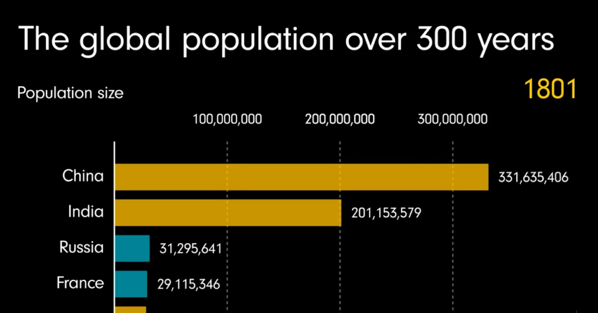
Since the 1800s, our global population has grown from 984 million people to almost 8 billion—an increase of more than 700%.
Which regions around the world have led this growth, and what’s expected for the rest of the century? This animated visualization by James Eagle shows 300 years of population growth, including historical figures as well as projections up to the year 2100.
Asia’s Current Dominance
For centuries, more than half of the world’s population has been concentrated in Asia. At certain points throughout history, the region has made up nearly 70% of the world’s population.
Here’s a look at 2021 figures, and how large each region’s population is relative to each other:
| Rank | Region | % of Global Population (2021) |
|---|---|---|
| 1 | Asia | 59.2% |
| 2 | Africa | 17.9% |
| 3 | Europe | 9.3% |
| 4 | North America | 7.5% |
| 5 | South America | 5.5% |
| 6 | Oceania | 0.6% |
China and India have been Asia’s largest population hubs, with China historically leading the front. In the 1950s China’s population was nearly double the size of India’s, but the gap has fluctuated over the years.
As China’s population growth continued, it was causing problems for the country as it struggled to scale up food production and infrastructure. By 1979, the Chinese government rolled out a one-child policy in an attempt to control the situation.
The program, which ended in 2016, had a number of unintended ramifications, but ultimately, it did succeed in slowing down the country’s population growth. And now, India is projected to overtake China as the world’s most populous country as early as 2023.
Africa’s Growing Piece of the Pie
Although Asia dominates the charts when it comes to overall population numbers currently, Africa’s growing population numbers are often overlooked.
While the continent’s total population is smaller than Asia’s, it will soon be home to the world’s largest working-age population, which could have a significant impact on the global economy in the years ahead.
This growth is being led by Nigeria, Africa’s most populous country. With megacities like Lagos (metro population: 21 million) and over 217 million inhabitants in total, Nigeria is projected to be the world’s third most populous country by the year 2050. Nigeria’s rapid growth is largely thanks to its high birth rate, which is nearly double the global average.

This article was published as a part of Visual Capitalist's Creator Program, which features data-driven visuals from some of our favorite Creators around the world.


Demographics
The Countries That Have Become Sadder Since 2010
Tracking Gallup survey data for more than a decade reveals some countries are witnessing big happiness declines, reflecting their shifting socio-economic conditions.


The Countries That Have Become Sadder Since 2010
This was originally posted on our Voronoi app. Download the app for free on iOS or Android and discover incredible data-driven charts from a variety of trusted sources.
Can happiness be quantified?
Some approaches that try to answer this question make a distinction between two differing components of happiness: a daily experience part, and a more general life evaluation (which includes how people think about their life as a whole).
The World Happiness Report—first launched in 2012—has been making a serious go at quantifying happiness, by examining Gallup poll data that asks respondents in nearly every country to evaluate their life on a 0–10 scale. From this they extrapolate a single “happiness score” out of 10 to compare how happy (or unhappy) countries are.
More than a decade later, the 2024 World Happiness Report continues the mission. Its latest findings also include how some countries have become sadder in the intervening years.
Which Countries Have Become Unhappier Since 2010?
Afghanistan is the unhappiest country in the world right now, and is also 60% unhappier than over a decade ago, indicating how much life has worsened since 2010.
In 2021, the Taliban officially returned to power in Afghanistan, after nearly two decades of American occupation in the country. The Islamic fundamentalist group has made life harder, especially for women, who are restricted from pursuing higher education, travel, and work.
On a broader scale, the Afghan economy has suffered post-Taliban takeover, with various consequent effects: mass unemployment, a drop in income, malnutrition, and a crumbling healthcare system.
| Rank | Country | Happiness Score Loss (2010–24) | 2024 Happiness Score (out of 10) |
|---|---|---|---|
| 1 | 🇦🇫 Afghanistan | -2.6 | 1.7 |
| 2 | 🇱🇧 Lebanon | -2.3 | 2.7 |
| 3 | 🇯🇴 Jordan | -1.5 | 4.2 |
| 4 | 🇻🇪 Venezuela | -1.3 | 5.6 |
| 5 | 🇲🇼 Malawi | -1.2 | 3.4 |
| 6 | 🇿🇲 Zambia | -1.2 | 3.5 |
| 7 | 🇧🇼 Botswana | -1.2 | 3.4 |
| 8 | 🇾🇪 Yemen | -1.0 | 3.6 |
| 9 | 🇪🇬 Egypt | -1.0 | 4.0 |
| 10 | 🇮🇳 India | -0.9 | 4.1 |
| 11 | 🇧🇩 Bangladesh | -0.9 | 3.9 |
| 12 | 🇨🇩 DRC | -0.7 | 3.3 |
| 13 | 🇹🇳 Tunisia | -0.7 | 4.4 |
| 14 | 🇨🇦 Canada | -0.6 | 6.9 |
| 15 | 🇺🇸 U.S. | -0.6 | 6.7 |
| 16 | 🇨🇴 Colombia | -0.5 | 5.7 |
| 17 | 🇵🇦 Panama | -0.5 | 6.4 |
| 18 | 🇵🇰 Pakistan | -0.5 | 4.7 |
| 19 | 🇿🇼 Zimbabwe | -0.5 | 3.3 |
| 20 | 🇮🇪 Ireland | -0.5 | 6.8 |
| N/A | 🌍 World | +0.1 | 5.5 |
Nine countries in total saw their happiness score drop by a full point or more, on the 0–10 scale.
Noticeably, many of them have seen years of social and economic upheaval. Lebanon, for example, has been grappling with decades of corruption, and a severe liquidity crisis since 2019 that has resulted in a banking system collapse, sending poverty levels skyrocketing.
In Jordan, unprecedented population growth—from refugees leaving Iraq and Syria—has aggravated unemployment rates. A somewhat abrupt change in the line of succession has also raised concerns about political stability in the country.

-

 Money2 weeks ago
Which States Have the Highest Minimum Wage in America?
-

 Misc1 week ago
Airline Incidents: How Do Boeing and Airbus Compare?
-

 Environment1 week ago
Top Countries By Forest Growth Since 2001
-

 Economy2 weeks ago
Where U.S. Inflation Hit the Hardest in March 2024
-

 Demographics2 weeks ago
The Smallest Gender Wage Gaps in OECD Countries
-

 Markets2 weeks ago
The Top 10 States by Real GDP Growth in 2023
-

 Demographics2 weeks ago
Population Projections: The World’s 6 Largest Countries in 2075
-

 Travel2 weeks ago
Ranked: The World’s Top Flight Routes, by Revenue