Demographics
Charted: The Global Decline of Fertility Rates
Article/Editing:
Charted: The Global Decline of Fertility Rates
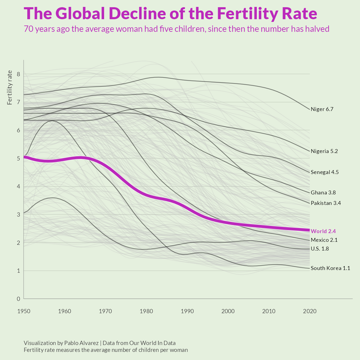
Over the last 50 years, fertility rates have dropped drastically around the world. In 1952, the average global family had five children—now, they have less than three.
This graphic by Pablo Alvarez uses tracked fertility rates from Our World in Data to show how rates have evolved (and largely fallen) over the past decades.
What’s The Difference Between Fertility Rates and Birth Rates?
Though both measures relate to population growth, a country’s birth rate and fertility rate are noticeably different:
- Birth Rate: The total number of births in a year per 1,000 individuals.
- Fertility Rate: The total number of births in a year per 1,000 women of reproductive age in a population.
As such, the fertility rate is a more specific measure, which as Britannica highlights, “allows for more efficient and beneficial planning and resource allocation.” Not including immigration, a given area needs an overall total fertility rate of 2.1 to keep a stable population.
Global Fertility Rates since 1952
For the last half-century, fertility rates have steadily decreased worldwide. Here’s a look at the average number of children per woman since 1952:
| Year | Average # of children per family | % change (y-o-y) |
|---|---|---|
| 1951 | 5.0 | -0.5% |
| 1952 | 5.0 | -1.4% |
| 1953 | 4.9 | -0.7% |
| 1954 | 4.9 | -0.5% |
| 1955 | 4.9 | -0.3% |
| 1956 | 4.9 | -0.1% |
| 1957 | 4.9 | 0.1% |
| 1958 | 4.9 | 0.3% |
| 1959 | 4.9 | 0.4% |
| 1960 | 5.0 | 0.5% |
| 1961 | 5.0 | 0.5% |
| 1962 | 5.0 | 0.4% |
| 1963 | 5.0 | 0.3% |
| 1964 | 5.0 | 0.1% |
| 1965 | 5.0 | -0.2% |
| 1966 | 5.0 | -0.5% |
| 1967 | 5.0 | -0.8% |
| 1968 | 4.9 | -1.1% |
| 1969 | 4.8 | -1.4% |
| 1970 | 4.7 | -1.8% |
| 1971 | 4.6 | -2.1% |
| 1972 | 4.5 | -2.5% |
| 1973 | 4.4 | -2.7% |
| 1974 | 4.3 | -2.9% |
| 1975 | 4.2 | -2.9% |
| 1976 | 4.0 | -2.8% |
| 1977 | 3.9 | -2.7% |
| 1978 | 3.8 | -2.4% |
| 1979 | 3.8 | -2.1% |
| 1980 | 3.7 | -1.7% |
| 1981 | 3.6 | -1.3% |
| 1982 | 3.6 | -1.0% |
| 1983 | 3.6 | -0.8% |
| 1984 | 3.6 | -0.7% |
| 1985 | 3.5 | -0.8% |
| 1986 | 3.5 | -1.0% |
| 1987 | 3.4 | -1.4% |
| 1988 | 3.4 | -1.7% |
| 1989 | 3.3 | -2.1% |
| 1990 | 3.2 | -2.4% |
| 1991 | 3.1 | -2.6% |
| 1992 | 3.1 | -2.6% |
| 1993 | 3.0 | -2.4% |
| 1994 | 2.9 | -2.2% |
| 1995 | 2.9 | -1.8% |
| 1996 | 2.8 | -1.5% |
| 1997 | 2.8 | -1.3% |
| 1998 | 2.8 | -1.1% |
| 1999 | 2.7 | -1.1% |
| 2000 | 2.7 | -0.9% |
| 2001 | 2.7 | -0.9% |
| 2002 | 2.7 | -0.7% |
| 2003 | 2.6 | -0.6% |
| 2004 | 2.6 | -0.6% |
| 2005 | 2.6 | -0.5% |
| 2006 | 2.6 | -0.5% |
| 2007 | 2.6 | -0.5% |
| 2008 | 2.6 | -0.5% |
| 2009 | 2.6 | -0.5% |
| 2010 | 2.5 | -0.5% |
| 2011 | 2.5 | -0.5% |
| 2012 | 2.5 | -0.5% |
| 2013 | 2.5 | -0.5% |
| 2014 | 2.5 | -0.4% |
| 2015 | 2.5 | -0.4% |
| 2016 | 2.5 | -0.4% |
| 2017 | 2.5 | -0.4% |
| 2018 | 2.5 | -0.4% |
| 2019 | 2.5 | -0.4% |
| 2020 | 2.4 | -0.4% |
Why are women having fewer children? There are a number of theories and empirical research studies to help explain this decrease, but according to Dr. Max Roser, the founder of Our World in Data, most of the literature boils down to three main factors:
- Women’s empowerment, particularly in education and the workforce
- Lower child mortality
- Increased cost to raising children
Research has found that higher education in women is correlated with lower fertility. For instance, in Iran in the 1950s, women had an average of three years of schooling and raised seven children on average.
But by 2010, when Iranian women had nine years of schooling on average, the average fertility rate in the country had dropped to 1.8.
This theory is further supported when you look at countries where women’s education is still relatively lagging. For instance, in 2010, women in Niger had 1.3 years of education on average, and an average of more than seven children—more than double the global average at that time.
The Societal Impact
Lower fertility rates, coupled with increased life expectancies around the world, are creating an aging population. Since 1950, the global median age has grown from 25 years to 33 years.
An older population comes with a number of economic risks, including rising healthcare costs and a smaller global workforce.
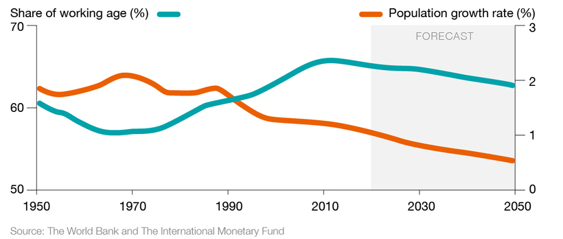
According to a report by the World Bank, the world’s working-age population peaked back in 2012. Since then, it’s been on the decline.
A smaller working population puts more pressure on those who are working to support those who are collecting pensions. This could ultimately lead to an economic slowdown if countries don’t prepare and alter their pension systems accordingly, to account for our aging population.

This article was published as a part of Visual Capitalist's Creator Program, which features data-driven visuals from some of our favorite Creators around the world.


Demographics
The Countries That Have Become Sadder Since 2010
Tracking Gallup survey data for more than a decade reveals some countries are witnessing big happiness declines, reflecting their shifting socio-economic conditions.


The Countries That Have Become Sadder Since 2010
This was originally posted on our Voronoi app. Download the app for free on iOS or Android and discover incredible data-driven charts from a variety of trusted sources.
Can happiness be quantified?
Some approaches that try to answer this question make a distinction between two differing components of happiness: a daily experience part, and a more general life evaluation (which includes how people think about their life as a whole).
The World Happiness Report—first launched in 2012—has been making a serious go at quantifying happiness, by examining Gallup poll data that asks respondents in nearly every country to evaluate their life on a 0–10 scale. From this they extrapolate a single “happiness score” out of 10 to compare how happy (or unhappy) countries are.
More than a decade later, the 2024 World Happiness Report continues the mission. Its latest findings also include how some countries have become sadder in the intervening years.
Which Countries Have Become Unhappier Since 2010?
Afghanistan is the unhappiest country in the world right now, and is also 60% unhappier than over a decade ago, indicating how much life has worsened since 2010.
In 2021, the Taliban officially returned to power in Afghanistan, after nearly two decades of American occupation in the country. The Islamic fundamentalist group has made life harder, especially for women, who are restricted from pursuing higher education, travel, and work.
On a broader scale, the Afghan economy has suffered post-Taliban takeover, with various consequent effects: mass unemployment, a drop in income, malnutrition, and a crumbling healthcare system.
| Rank | Country | Happiness Score Loss (2010–24) | 2024 Happiness Score (out of 10) |
|---|---|---|---|
| 1 | 🇦🇫 Afghanistan | -2.6 | 1.7 |
| 2 | 🇱🇧 Lebanon | -2.3 | 2.7 |
| 3 | 🇯🇴 Jordan | -1.5 | 4.2 |
| 4 | 🇻🇪 Venezuela | -1.3 | 5.6 |
| 5 | 🇲🇼 Malawi | -1.2 | 3.4 |
| 6 | 🇿🇲 Zambia | -1.2 | 3.5 |
| 7 | 🇧🇼 Botswana | -1.2 | 3.4 |
| 8 | 🇾🇪 Yemen | -1.0 | 3.6 |
| 9 | 🇪🇬 Egypt | -1.0 | 4.0 |
| 10 | 🇮🇳 India | -0.9 | 4.1 |
| 11 | 🇧🇩 Bangladesh | -0.9 | 3.9 |
| 12 | 🇨🇩 DRC | -0.7 | 3.3 |
| 13 | 🇹🇳 Tunisia | -0.7 | 4.4 |
| 14 | 🇨🇦 Canada | -0.6 | 6.9 |
| 15 | 🇺🇸 U.S. | -0.6 | 6.7 |
| 16 | 🇨🇴 Colombia | -0.5 | 5.7 |
| 17 | 🇵🇦 Panama | -0.5 | 6.4 |
| 18 | 🇵🇰 Pakistan | -0.5 | 4.7 |
| 19 | 🇿🇼 Zimbabwe | -0.5 | 3.3 |
| 20 | 🇮🇪 Ireland | -0.5 | 6.8 |
| N/A | 🌍 World | +0.1 | 5.5 |
Nine countries in total saw their happiness score drop by a full point or more, on the 0–10 scale.
Noticeably, many of them have seen years of social and economic upheaval. Lebanon, for example, has been grappling with decades of corruption, and a severe liquidity crisis since 2019 that has resulted in a banking system collapse, sending poverty levels skyrocketing.
In Jordan, unprecedented population growth—from refugees leaving Iraq and Syria—has aggravated unemployment rates. A somewhat abrupt change in the line of succession has also raised concerns about political stability in the country.

-

 Green1 week ago
Ranked: The Countries With the Most Air Pollution in 2023
-

 Automotive2 weeks ago
Almost Every EV Stock is Down After Q1 2024
-

 AI2 weeks ago
The Stock Performance of U.S. Chipmakers So Far in 2024
-

 Markets2 weeks ago
Charted: Big Four Market Share by S&P 500 Audits
-

 Real Estate2 weeks ago
Ranked: The Most Valuable Housing Markets in America
-

 Money2 weeks ago
Which States Have the Highest Minimum Wage in America?
-

 AI2 weeks ago
Ranked: Semiconductor Companies by Industry Revenue Share
-

 Travel2 weeks ago
Ranked: The World’s Top Flight Routes, by Revenue