Demographics
Charted: The Working Hours of Americans at Different Income Levels
Article/Editing:
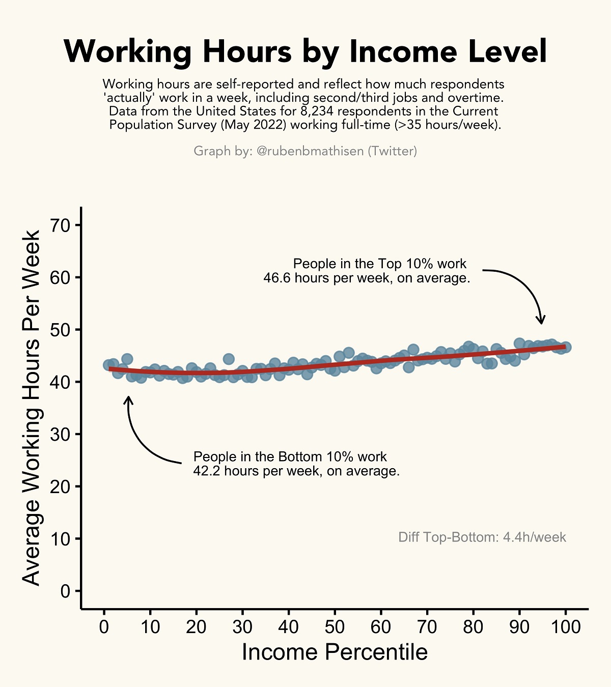
The Actual Working Hours of Different Income Levels
Do you really need to work 100-hour weeks for success?
In 2021, America’s top 10% of income earners made at least $129,181 a year—more than double the average individual income across the country.
When looking at differences between income groups, there are many preconceived notions about the work involved. But what are the actual average working hours for different income groups?
This graphic by Ruben Berge Mathisen uses the latest U.S. Census data to show the average working hours of Americans at different income levels.
Comparing Average Work Weeks
The data used for this graphic comes from the U.S. Census Bureau’s May 2022 Current Population Survey, which surveys more than 8,000 Americans from various socioeconomic backgrounds.
Importantly, the data reflects the average work hours that respondents in each income percentile “actually” work each week, and not what’s on their contract. This also includes overtime, other jobs, or side gigs.
According to the survey data, America’s top 10% income percentile works 4.4 hours more each week than those in the bottom 10%. And in surveys across other countries, though with hundreds of respondents instead of thousands, the discrepancy was similar:
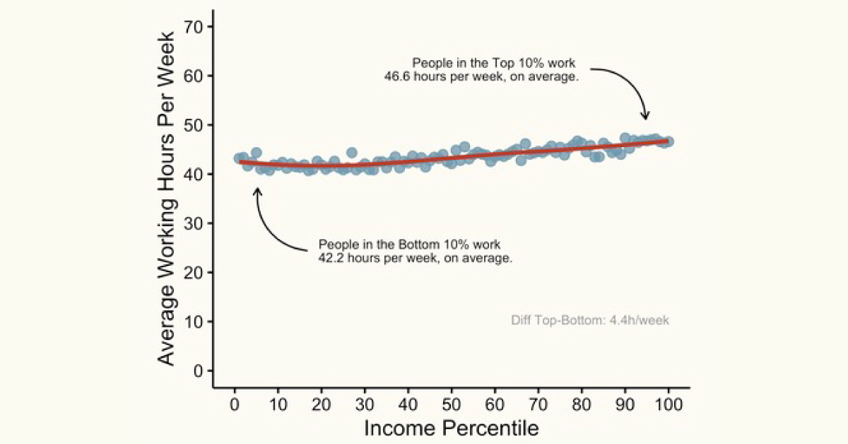
Do the rich really work longer hours than the poor?
The graph below plots data from 27 countries.
On average, the Top 10% actually works ~1 hour less per week than the Bottom 10%, among full-time workers. Working hours are usually pretty similar though.#dataviz pic.twitter.com/Ue23VweJ9C
— Ruben Mathisen (@rubenbmathisen) August 7, 2022
While both income and wealth gaps are generally widening globally, it’s interesting to see that higher earners aren’t necessarily working more hours to achieve their increasingly larger salaries.
In fact, the top 10% in the 27 countries shown in the graphic are actually working around 1 hour less each week than the bottom 10%, at least among full-time workers.
Zooming Out: Average Working Hours per Country
Similarities arise when comparing average working hours across different countries. For starters, people living in poorer countries typically work longer hours.
According to Our World in Data, the average worker in Cambodia works about 9.4 hours a day, while in Switzerland, people work an average of 6 hours a day.
While many factors contribute to this discrepancy in working hours, one large factor cited is tech innovation, or things like physical machines, processes, and systems that make work more efficient and productive. This allows wealthier countries (and industries) to increase their output without putting in as many hours.
For example, from 1948 to 2011, farm production per hour in the U.S. became 16x more productive, thanks to innovations like improved machinery, better fertilizers, and more efficient land management systems.

This article was published as a part of Visual Capitalist's Creator Program, which features data-driven visuals from some of our favorite Creators around the world.


Demographics
The Countries That Have Become Sadder Since 2010
Tracking Gallup survey data for more than a decade reveals some countries are witnessing big happiness declines, reflecting their shifting socio-economic conditions.


The Countries That Have Become Sadder Since 2010
This was originally posted on our Voronoi app. Download the app for free on iOS or Android and discover incredible data-driven charts from a variety of trusted sources.
Can happiness be quantified?
Some approaches that try to answer this question make a distinction between two differing components of happiness: a daily experience part, and a more general life evaluation (which includes how people think about their life as a whole).
The World Happiness Report—first launched in 2012—has been making a serious go at quantifying happiness, by examining Gallup poll data that asks respondents in nearly every country to evaluate their life on a 0–10 scale. From this they extrapolate a single “happiness score” out of 10 to compare how happy (or unhappy) countries are.
More than a decade later, the 2024 World Happiness Report continues the mission. Its latest findings also include how some countries have become sadder in the intervening years.
Which Countries Have Become Unhappier Since 2010?
Afghanistan is the unhappiest country in the world right now, and is also 60% unhappier than over a decade ago, indicating how much life has worsened since 2010.
In 2021, the Taliban officially returned to power in Afghanistan, after nearly two decades of American occupation in the country. The Islamic fundamentalist group has made life harder, especially for women, who are restricted from pursuing higher education, travel, and work.
On a broader scale, the Afghan economy has suffered post-Taliban takeover, with various consequent effects: mass unemployment, a drop in income, malnutrition, and a crumbling healthcare system.
| Rank | Country | Happiness Score Loss (2010–24) | 2024 Happiness Score (out of 10) |
|---|---|---|---|
| 1 | 🇦🇫 Afghanistan | -2.6 | 1.7 |
| 2 | 🇱🇧 Lebanon | -2.3 | 2.7 |
| 3 | 🇯🇴 Jordan | -1.5 | 4.2 |
| 4 | 🇻🇪 Venezuela | -1.3 | 5.6 |
| 5 | 🇲🇼 Malawi | -1.2 | 3.4 |
| 6 | 🇿🇲 Zambia | -1.2 | 3.5 |
| 7 | 🇧🇼 Botswana | -1.2 | 3.4 |
| 8 | 🇾🇪 Yemen | -1.0 | 3.6 |
| 9 | 🇪🇬 Egypt | -1.0 | 4.0 |
| 10 | 🇮🇳 India | -0.9 | 4.1 |
| 11 | 🇧🇩 Bangladesh | -0.9 | 3.9 |
| 12 | 🇨🇩 DRC | -0.7 | 3.3 |
| 13 | 🇹🇳 Tunisia | -0.7 | 4.4 |
| 14 | 🇨🇦 Canada | -0.6 | 6.9 |
| 15 | 🇺🇸 U.S. | -0.6 | 6.7 |
| 16 | 🇨🇴 Colombia | -0.5 | 5.7 |
| 17 | 🇵🇦 Panama | -0.5 | 6.4 |
| 18 | 🇵🇰 Pakistan | -0.5 | 4.7 |
| 19 | 🇿🇼 Zimbabwe | -0.5 | 3.3 |
| 20 | 🇮🇪 Ireland | -0.5 | 6.8 |
| N/A | 🌍 World | +0.1 | 5.5 |
Nine countries in total saw their happiness score drop by a full point or more, on the 0–10 scale.
Noticeably, many of them have seen years of social and economic upheaval. Lebanon, for example, has been grappling with decades of corruption, and a severe liquidity crisis since 2019 that has resulted in a banking system collapse, sending poverty levels skyrocketing.
In Jordan, unprecedented population growth—from refugees leaving Iraq and Syria—has aggravated unemployment rates. A somewhat abrupt change in the line of succession has also raised concerns about political stability in the country.

-

 Green1 week ago
Ranked: The Countries With the Most Air Pollution in 2023
-

 AI2 weeks ago
The Stock Performance of U.S. Chipmakers So Far in 2024
-

 Markets2 weeks ago
Charted: Big Four Market Share by S&P 500 Audits
-

 Real Estate2 weeks ago
Ranked: The Most Valuable Housing Markets in America
-

 Money2 weeks ago
Which States Have the Highest Minimum Wage in America?
-

 AI2 weeks ago
Ranked: Semiconductor Companies by Industry Revenue Share
-

 Travel2 weeks ago
Ranked: The World’s Top Flight Routes, by Revenue
-

 Countries2 weeks ago
Population Projections: The World’s 6 Largest Countries in 2075