Money
The Big Mac Index: A Measure of Purchasing Power Parity & Burger Inflation
Article/Editing:
The Big Mac Index: A Measure of PPP and Burger Inflation
The Big Mac was created in 1967 by Jim Delligati, a McDonald’s franchise owner in Pennsylvania. It was launched throughout the U.S. the following year, and today you can buy one in more than 70 countries. However, the price you pay will vary based on where you are, as evidenced by the Big Mac Index.
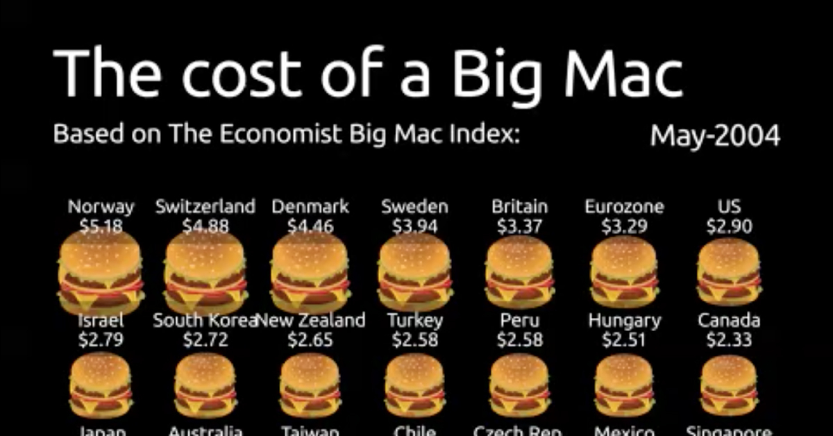
Spanning from 2004-2022, this animation from James Eagle shows the U.S. dollar price of a Big Mac in select countries around the world.
What Does the Big Mac Index Show?
The Big Mac Index was invented by The Economist in 1986. It is intended to be a lighthearted way to demonstrate the concept of purchasing power parity. In other words, it helps illustrate the idea that market exchange rates between countries may be “out of whack” when compared to the cost of buying the same basket of goods and services in those places.
Given that McDonald’s is one of the biggest companies in the world and the Big Mac is widely available globally, it means that the famous burger can be used as a basic goods comparison between most countries. It also has the advantage of having the same inputs and distribution system, with a few minor modifications (like chicken patties in India instead of beef).
Using the price of a Big Mac in two countries, the index can give an indication as to whether a currency may be over or undervalued. For example, a Big Mac costs ¥24.40 in China and $5.81 in the United States. By comparing the implied exchange rate to the actual exchange rate, we can see whether the Yuan is over or undervalued.
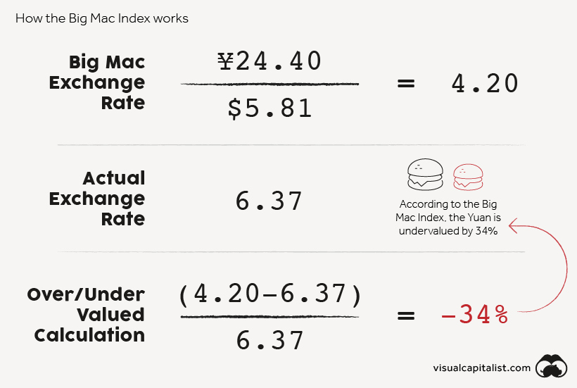
According to the Big Mac Index, the Yuan is undervalued by 34%.
Beyond currency misalignment, the index has other uses. For instance, it shows inflation in burger prices over time. If we compare the price of a Big Mac across countries in the same currency—such as the U.S. dollar—we are also able to see where burgers are cheaper or relatively more expensive.
Burger Costs Around the World
In the animation, all Big Mac prices have been converted from local currency to U.S. dollars based on the actual exchange rate in effect at the time. Below, we show the change in price of a Big Mac in select countries, ordered by January 2022 prices.
| Country | May 2004 | January 2022 | % change |
|---|---|---|---|
| Switzerland | $4.88 | $6.98 | 43% |
| Norway | $5.18 | $6.39 | 23% |
| United States | $2.90 | $5.81 | 100% |
| Sweden | $3.94 | $5.79 | 47% |
| Israel | $2.79 | $5.35 | 92% |
| Canada | $2.33 | $5.32 | 129% |
| Venezuela | $1.48 | $5.06 | 243% |
| Euro area | $3.29 | $4.95 | 51% |
| Denmark | $4.46 | $4.82 | 8% |
| Britain | $3.37 | $4.82 | 43% |
| New Zealand | $2.65 | $4.60 | 73% |
| Australia | $2.27 | $4.51 | 98% |
| Singapore | $1.93 | $4.36 | 126% |
| Brazil | $1.70 | $4.31 | 154% |
| Argentina | $1.48 | $4.29 | 190% |
| Sri Lanka | $1.41 | $4.15 | 193% |
| Czech Republic | $2.13 | $4.11 | 93% |
| Chile | $2.18 | $3.88 | 78% |
| Thailand | $1.45 | $3.84 | 166% |
| China | $1.26 | $3.83 | 205% |
| South Korea | $2.72 | $3.82 | 40% |
| Poland | $1.63 | $3.44 | 111% |
| Japan | $2.32 | $3.38 | 46% |
| Peru | $2.58 | $3.36 | 31% |
| Mexico | $2.07 | $3.34 | 62% |
| Hungary | $2.51 | $3.09 | 23% |
| Hong Kong | $1.54 | $2.82 | 83% |
| Philippines | $1.23 | $2.79 | 126% |
| Taiwan | $2.25 | $2.70 | 20% |
| South Africa | $1.86 | $2.58 | 39% |
| Ukraine | $1.36 | $2.43 | 79% |
| Malaysia | $1.33 | $2.39 | 80% |
| Indonesia | $1.77 | $2.36 | 34% |
| Turkey | $2.58 | $1.86 | -28% |
| Russia | $1.45 | $1.74 | 20% |
Switzerland takes the cake for the priciest Big Mac, followed closely behind by Norway. Both countries have relatively high price levels but also enjoy higher wages when compared to other OECD countries.
Venezuela has seen the largest jump in burger prices, with the cost of a Big Mac climbing nearly 250% since 2004. The country has been plagued by hyperinflation for years, so it’s no surprise to see large price swings in the country’s data.
While it appears that the price of a Big Mac has decreased in Turkey, this is because the prices are shown in U.S. dollars. The new Turkish lira has depreciated against the U.S. dollar more than 90% since it was introduced in 2005.
Finally, it’s worth noting that Russia has the cheapest Big Mac, reflecting the country’s lower price levels. Labor costs in Russia are roughly a third of those in Switzerland.
The Limitations of Burgernomics
The Big Mac Index is useful for a number of reasons. Investors can use it to measure inflation over time, and compare this to official records. This can help them value bonds and other securities that are sensitive to inflation. The Big Mac Index also indicates whether a currency may be over or undervalued, and investors can place foreign exchange trades accordingly.
Of course, the index does have shortcomings. Here are some that economists have noted.
- Non-traded services can have different prices across countries. The price of a Big Mac will be influenced by the costs of things like labor, but this is not a reflection of relative currency values. The Economist now releases a GDP-adjusted version of the Big Mac Index to help address this criticism.
- McDonald’s is not in every country in the world. This means the geographic reach of the Big Mac Index has some limitations, particularly in Africa.
- The index lacks diversity. The index is made up of one item: the Big Mac. Because of this, it lacks the diversity of other economic metrics such as the Consumer Price Index.
Despite all of these limitations, the Big Mac Index does act as a good starting place for understanding purchasing power parity. Through the simplicity of burgers, complex economic theory is easier to digest.

This article was published as a part of Visual Capitalist's Creator Program, which features data-driven visuals from some of our favorite Creators around the world.


Money
How Debt-to-GDP Ratios Have Changed Since 2000
See how much the debt-to-GDP ratios of advanced economies have grown (or shrank) since the year 2000.


How Debt-to-GDP Ratios Have Changed Since 2000
This was originally posted on our Voronoi app. Download the app for free on Apple or Android and discover incredible data-driven charts from a variety of trusted sources.
Government debt levels have grown in most parts of the world since the 2008 financial crisis, and even more so after the COVID-19 pandemic.
To gain perspective on this long-term trend, we’ve visualized the debt-to-GDP ratios of advanced economies, as of 2000 and 2024 (estimated). All figures were sourced from the IMF’s World Economic Outlook.
Data and Highlights
The data we used to create this graphic is listed in the table below. “Government gross debt” consists of all liabilities that require payment(s) of interest and/or principal in the future.
| Country | 2000 (%) | 2024 (%) | Change (pp) |
|---|---|---|---|
| 🇯🇵 Japan | 135.6 | 251.9 | +116.3 |
| 🇸🇬 Singapore | 82.3 | 168.3 | +86.0 |
| 🇺🇸 United States | 55.6 | 126.9 | +71.3 |
| 🇬🇧 United Kingdom | 36.6 | 105.9 | +69.3 |
| 🇬🇷 Greece | 104.9 | 160.2 | +55.3 |
| 🇫🇷 France | 58.9 | 110.5 | +51.6 |
| 🇵🇹 Portugal | 54.2 | 104.0 | +49.8 |
| 🇪🇸 Spain | 57.8 | 104.7 | +46.9 |
| 🇸🇮 Slovenia | 25.9 | 66.5 | +40.6 |
| 🇫🇮 Finland | 42.4 | 76.5 | +34.1 |
| 🇭🇷 Croatia | 35.4 | 61.8 | +26.4 |
| 🇨🇦 Canada | 80.4 | 103.3 | +22.9 |
| 🇨🇾 Cyprus | 56.0 | 70.9 | +14.9 |
| 🇦🇹 Austria | 65.7 | 74.0 | +8.3 |
| 🇸🇰 Slovak Republic | 50.5 | 56.5 | +6.0 |
| 🇩🇪 Germany | 59.3 | 64.0 | +4.7 |
| 🇧🇪 Belgium | 109.6 | 106.8 | -2.8 |
| 🇮🇱 Israel | 77.4 | 56.8 | -20.6 |
| 🇮🇸 Iceland | 75.8 | 54.6 | -21.2 |
The debt-to-GDP ratio indicates how much a country owes compared to the size of its economy, reflecting its ability to manage and repay debts. Percentage point (pp) changes shown above indicate the increase or decrease of these ratios.
Countries with the Biggest Increases
Japan (+116 pp), Singapore (+86 pp), and the U.S. (+71 pp) have grown their debt as a percentage of GDP the most since the year 2000.
All three of these countries have stable, well-developed economies, so it’s unlikely that any of them will default on their growing debts. With that said, higher government debt leads to increased interest payments, which in turn can diminish available funds for future government budgets.
This is a rising issue in the U.S., where annual interest payments on the national debt have surpassed $1 trillion for the first time ever.
Only 3 Countries Saw Declines
Among this list of advanced economies, Belgium (-2.8 pp), Iceland (-21.2 pp), and Israel (-20.6 pp) were the only countries that decreased their debt-to-GDP ratio since the year 2000.
According to Fitch Ratings, Iceland’s debt ratio has decreased due to strong GDP growth and the use of its cash deposits to pay down upcoming maturities.
See More Debt Graphics from Visual Capitalist
Curious to see which countries have the most government debt in dollars? Check out this graphic that breaks down $97 trillion in debt as of 2023.

-

 Travel1 week ago
Airline Incidents: How Do Boeing and Airbus Compare?
-

 Markets2 weeks ago
Visualizing America’s Shortage of Affordable Homes
-

 Green2 weeks ago
Ranked: Top Countries by Total Forest Loss Since 2001
-

 Money2 weeks ago
Where Does One U.S. Tax Dollar Go?
-

 Misc2 weeks ago
Almost Every EV Stock is Down After Q1 2024
-

 AI2 weeks ago
The Stock Performance of U.S. Chipmakers So Far in 2024
-

 Markets2 weeks ago
Charted: Big Four Market Share by S&P 500 Audits
-

 Real Estate2 weeks ago
Ranked: The Most Valuable Housing Markets in America