Technology
Apple’s Colossal Market Cap as it Hits $3 Trillion
Article/Editing:
Apple’s Colossal Market Cap in Context
In January of 2019, Apple’s market capitalization stood at $700 billion.
While this was perceived as a colossal figure at the time, when we fast forward to today, that valuation seems a lot more modest. Since then, Apple has surged to touch a $3 trillion valuation on January 3rd, 2022.
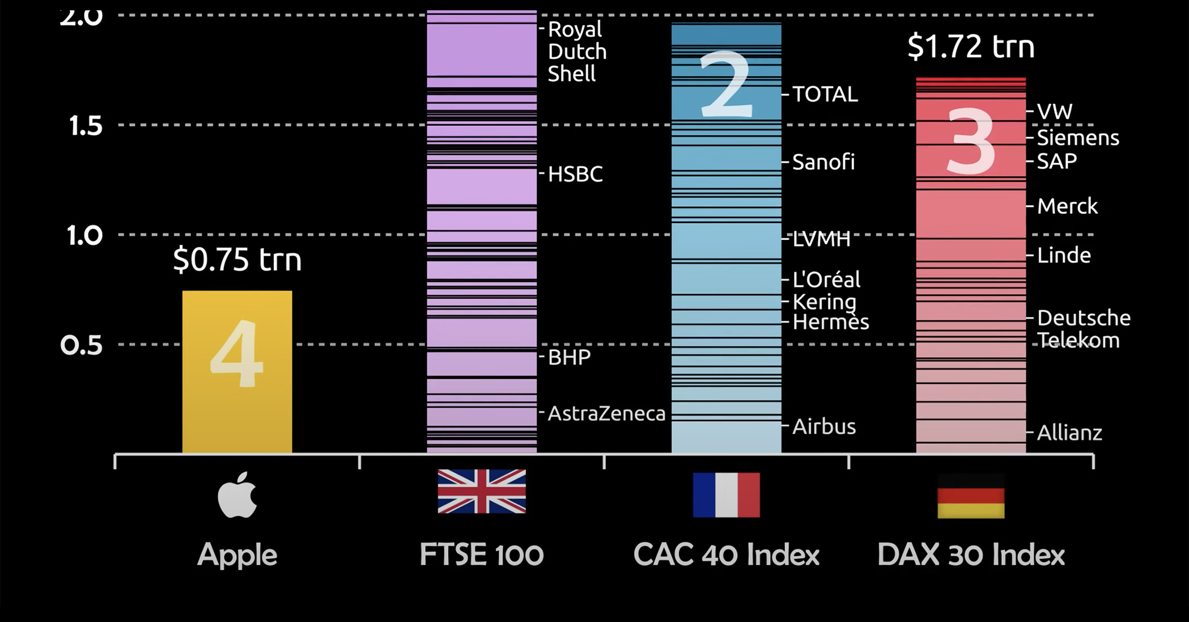
To gauge just how monstrous of a figure this is, consider that Apple is no longer comparable to just companies, but to countries and even entire stock indexes. This animation from James Eagle ranks the growth in Apple’s market cap alongside top indexes from the UK, France, and Germany.
Let’s take a closer look.
Apple Takes On Europe
The three indexes Apple is compared to are heavyweights in their own right.
The FTSE 100 consists of giants like HSBC and vaccine producer AstraZeneca, while the CAC 40 Index is home to LVMH, which made Bernard Arnault the richest man in the world for a period of time last year.
Nonetheless, Apple’s market cap exceeds that of the 100 companies in the FTSE, as well as the 40 in each of the CAC and DAX indexes.
| Stock/Index | Market Cap ($T) | Country of Origin |
|---|---|---|
| Apple | $3.00T | 🇺🇸 |
| FTSE 100 | $2.90T | 🇬🇧 |
| CAC 40 Index | $2.76T | 🇫🇷 |
| DAX 40 (Dax 30) Index* | $2.50T | 🇩🇪 |
*Germany’s flagship DAX Index expanded from 30 to 40 constituents in September 2021.
It’s important to note, that while Apple’s growth is stellar, European companies have simultaneously seen a decline in their share of the overall global stock market, which helps make these comparisons even more eye-catching.
For example, before 2005, publicly-traded European companies represented almost 30% of global stock market capitalization, but those figures have been cut in half to just 15% today.
Here are some other approaches to measure Apple’s dominance.
Apple’s Revenue Per Minute vs Other Tech Giants
Stepping away from market capitalization, another unique way to measure Apple’s success is in how much sales they generate on a per minute basis. In doing so, we see that they generate a massive $848,090 per minute.
Here’s how Apple revenue per minute compares to other Big Tech giants:
| Company | Revenue Per Minute |
|---|---|
| Amazon | $955,517 |
| Apple | $848,090 |
| Alphabet (Google) | $433,014 |
| Microsoft | $327,823 |
| $213,628 | |
| Tesla | $81,766 |
| Netflix | $50,566 |
Furthermore, Apple’s profits aren’t too shabby either: their $20.5 billion in net income last quarter equates to $156,000 in profits per minute.
How Apple Compares To Countries
Lastly, we can compare Apple’s market cap to the GDP of countries.
| Country (excluding Apple) | Total Value ($T) |
|---|---|
| Apple | $3.0T |
| Italy | $2.0T |
| Brazil | $1.8T |
| Canada | $1.7T |
| Russia | $1.7T |
| South Korea | $1.6T |
| Australia | $1.4T |
| Spain | $1.4T |
| Mexico | $1.3T |
| Indonesia | $1.1T |
What might be most impressive here is that Apple’s market cap eclipses the GDP of major developed economies, such as Canada and Australia. That means the company is more valuable than the entire economic production of these countries in a calendar year.
That’s some serious scale.

This article was published as a part of Visual Capitalist's Creator Program, which features data-driven visuals from some of our favorite Creators around the world.


Brands
How Tech Logos Have Evolved Over Time
From complete overhauls to more subtle tweaks, these tech logos have had quite a journey. Featuring: Google, Apple, and more.


How Tech Logos Have Evolved Over Time
This was originally posted on our Voronoi app. Download the app for free on iOS or Android and discover incredible data-driven charts from a variety of trusted sources.
One would be hard-pressed to find a company that has never changed its logo. Granted, some brands—like Rolex, IBM, and Coca-Cola—tend to just have more minimalistic updates. But other companies undergo an entire identity change, thus necessitating a full overhaul.
In this graphic, we visualized the evolution of prominent tech companies’ logos over time. All of these brands ranked highly in a Q1 2024 YouGov study of America’s most famous tech brands. The logo changes are sourced from 1000logos.net.
How Many Times Has Google Changed Its Logo?
Google and Facebook share a 98% fame rating according to YouGov. But while Facebook’s rise was captured in The Social Network (2010), Google’s history tends to be a little less lionized in popular culture.
For example, Google was initially called “Backrub” because it analyzed “back links” to understand how important a website was. Since its founding, Google has undergone eight logo changes, finally settling on its current one in 2015.
| Company | Number of Logo Changes |
|---|---|
| 8 | |
| HP | 8 |
| Amazon | 6 |
| Microsoft | 6 |
| Samsung | 6 |
| Apple | 5* |
Note: *Includes color changes. Source: 1000Logos.net
Another fun origin story is Microsoft, which started off as Traf-O-Data, a traffic counter reading company that generated reports for traffic engineers. By 1975, the company was renamed. But it wasn’t until 2012 that Microsoft put the iconic Windows logo—still the most popular desktop operating system—alongside its name.
And then there’s Samsung, which started as a grocery trading store in 1938. Its pivot to electronics started in the 1970s with black and white television sets. For 55 years, the company kept some form of stars from its first logo, until 1993, when the iconic encircled blue Samsung logo debuted.
Finally, Apple’s first logo in 1976 featured Isaac Newton reading under a tree—moments before an apple fell on his head. Two years later, the iconic bitten apple logo would be designed at Steve Jobs’ behest, and it would take another two decades for it to go monochrome.

-

 Green1 week ago
Ranked: The Countries With the Most Air Pollution in 2023
-

 Automotive2 weeks ago
Almost Every EV Stock is Down After Q1 2024
-

 AI2 weeks ago
The Stock Performance of U.S. Chipmakers So Far in 2024
-

 Markets2 weeks ago
Charted: Big Four Market Share by S&P 500 Audits
-

 Real Estate2 weeks ago
Ranked: The Most Valuable Housing Markets in America
-

 Money2 weeks ago
Which States Have the Highest Minimum Wage in America?
-

 AI2 weeks ago
Ranked: Semiconductor Companies by Industry Revenue Share
-

 Travel2 weeks ago
Ranked: The World’s Top Flight Routes, by Revenue