Markets
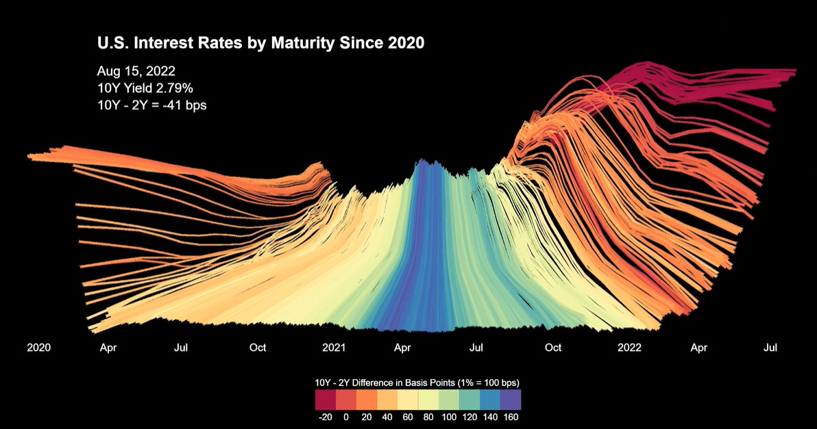
Animation: Visualizing U.S. Interest Rates Since 2020
Article/Editing:
Visualizing Interest Rates Since 2020
In March 2020, the U.S. Federal Reserve cut already depressed interest rates to historic lows amid an unraveling COVID-19 pandemic.
Fast-forward to 2022, and the central bank is grappling with a very different economic situation that includes high inflation, low unemployment, and increasing wage growth. Given these conditions, it raised interest rates to 2.25% up from 0% in just five months.
The above visualization from Jan Varsava shows U.S. interest rates over the last two years along with its impact on Treasury yields, often considered a key indicator for the economy.
Timeline of Interest Rates
Below, we show how U.S. interest rates have changed over the course of the pandemic:
| Date | Federal Funds Rate (Range) | Rate Change (bps) |
|---|---|---|
| July 27, 2022 | 2.25% to 2.50% | +75 |
| June 16, 2022 | 1.50% to 1.75% | +75 |
| May 5, 2022 | 0.75% to 1.00% | +50 |
| March 17, 2022 | 0.25% to 0.50% | +25 |
| March 16, 2020 | 0.00% to 0.25% | -100 |
| March 3, 2020 | 1.00% to 1.25% | -150 |
In early 2020, the Federal Reserve cut interest rates from 1% to 0% in emergency meetings. The U.S. economy then jumped back from its shortest recession ever recorded, partially supported by massive policy stimulus.
But by 2022, as the inflation rate hit 40-year highs, the central bank had to make its first rate increase in over two years. During the following Federal Reserve meetings, interest rates were then hiked 50 basis points, and then 75 basis points two times shortly after.
Despite these efforts to rein in inflation, price pressures remain high. The war in Ukraine, supply disruptions, and rising demand all contribute to higher prices, along with increasing public-debt loads. In fact, a Federal Reserve estimate suggests that inflation was 2.5% higher due to the $1.9 trillion stimulus, an effect of “fiscal inflation.”
Impact on the Treasury Yield Curve
The sharp rise in interest rates has sent shockwaves through markets. The S&P 500 Index has steadily declined 19% year-to-date, and the NASDAQ Composite Index has fallen over 27%.
Bond markets are also showing signs of uncertainty, with the 10-year minus 2-year Treasury yield curve acting as a prime example. This yield curve subtracts the return on short-term government bonds from long-term government bonds.
When long-term bond yields are lower than short-term yields—in other words, the yield curve inverts—it indicates that markets predict slower future growth. In recent history, the yield curve inverting has often signaled a recession. The table below shows periods of yield curve inversions for one month or more since 1978.
| Yield Curve Inversion Date | Number of Months | Maximum Difference (10 yr - 2 yr bps) |
|---|---|---|
| Aug 1978 | 21 | -241 |
| Sep 1980 | 13 | -170 |
| Jan 1982 | 4 | -71 |
| Jun 1982 | 1 | -34 |
| Dec 1988 | 6 | -45 |
| Aug 1989 | 2 | -18 |
| Jun 1998 | 1 | -7 |
| Feb 2000 | 10 | -51 |
| Feb 2006 | 1 | -16 |
| Jun 2006 | 1 | -7 |
| Aug 2006 | 7 | -19 |
| Jul 2022 | 2* | -48 |
*Data as of September 9, 2022
Source: Federal Reserve
For example, the yield curve inverted in February 2000 to a bottom of -51 basis points difference between the 10-year Treasury yield and the 2-year Treasury yield. In March 2001, the U.S. economy went into recession as the Dotcom Bubble burst.
More recently, the yield curve has inverted to its steepest level in two decades.
This trend is extending to other countries as well. Both New Zealand and the UK’s yield curves inverted in August. In Australia, the yield spread between 3-year and 10-year bond futures—its primary measure—was at its narrowest in a decade.
What’s On the Horizon?
Sustained Treasury yield inversions have sometimes occurred after tightening monetary policy.
In both 1980 and 2000, the Federal Reserve increased interest rates to fight inflation. For instance, when interest rates jumped to 20% in 1981 under Federal Reserve Chairman Paul Volcker, the U.S. Treasury yield inverted over 150 basis points.
This suggests that monetary policy can have a large impact on the direction of the yield curve. That’s because short-term interest rates rise when the central bank raises interest rates to combat inflation.
On the flip side, long-term bonds like the 10-year Treasury yield can be affected by growth prospects and market sentiment. If growth expectations are low and market uncertainty is high, it may cause yields to fall. Taken together, whether or not the economy could be headed for a recession remains unclear.

This article was published as a part of Visual Capitalist's Creator Program, which features data-driven visuals from some of our favorite Creators around the world.


Markets
U.S. Debt Interest Payments Reach $1 Trillion
U.S. debt interest payments have surged past the $1 trillion dollar mark, amid high interest rates and an ever-expanding debt burden.


U.S. Debt Interest Payments Reach $1 Trillion
This was originally posted on our Voronoi app. Download the app for free on iOS or Android and discover incredible data-driven charts from a variety of trusted sources.
The cost of paying for America’s national debt crossed the $1 trillion dollar mark in 2023, driven by high interest rates and a record $34 trillion mountain of debt.
Over the last decade, U.S. debt interest payments have more than doubled amid vast government spending during the pandemic crisis. As debt payments continue to soar, the Congressional Budget Office (CBO) reported that debt servicing costs surpassed defense spending for the first time ever this year.
This graphic shows the sharp rise in U.S. debt payments, based on data from the Federal Reserve.
A $1 Trillion Interest Bill, and Growing
Below, we show how U.S. debt interest payments have risen at a faster pace than at another time in modern history:
| Date | Interest Payments | U.S. National Debt |
|---|---|---|
| 2023 | $1.0T | $34.0T |
| 2022 | $830B | $31.4T |
| 2021 | $612B | $29.6T |
| 2020 | $518B | $27.7T |
| 2019 | $564B | $23.2T |
| 2018 | $571B | $22.0T |
| 2017 | $493B | $20.5T |
| 2016 | $460B | $20.0T |
| 2015 | $435B | $18.9T |
| 2014 | $442B | $18.1T |
| 2013 | $425B | $17.2T |
| 2012 | $417B | $16.4T |
| 2011 | $433B | $15.2T |
| 2010 | $400B | $14.0T |
| 2009 | $354B | $12.3T |
| 2008 | $380B | $10.7T |
| 2007 | $414B | $9.2T |
| 2006 | $387B | $8.7T |
| 2005 | $355B | $8.2T |
| 2004 | $318B | $7.6T |
| 2003 | $294B | $7.0T |
| 2002 | $298B | $6.4T |
| 2001 | $318B | $5.9T |
| 2000 | $353B | $5.7T |
| 1999 | $353B | $5.8T |
| 1998 | $360B | $5.6T |
| 1997 | $368B | $5.5T |
| 1996 | $362B | $5.3T |
| 1995 | $357B | $5.0T |
| 1994 | $334B | $4.8T |
| 1993 | $311B | $4.5T |
| 1992 | $306B | $4.2T |
| 1991 | $308B | $3.8T |
| 1990 | $298B | $3.4T |
| 1989 | $275B | $3.0T |
| 1988 | $254B | $2.7T |
| 1987 | $240B | $2.4T |
| 1986 | $225B | $2.2T |
| 1985 | $219B | $1.9T |
| 1984 | $205B | $1.7T |
| 1983 | $176B | $1.4T |
| 1982 | $157B | $1.2T |
| 1981 | $142B | $1.0T |
| 1980 | $113B | $930.2B |
| 1979 | $96B | $845.1B |
| 1978 | $84B | $789.2B |
| 1977 | $69B | $718.9B |
| 1976 | $61B | $653.5B |
| 1975 | $55B | $576.6B |
| 1974 | $50B | $492.7B |
| 1973 | $45B | $469.1B |
| 1972 | $39B | $448.5B |
| 1971 | $36B | $424.1B |
| 1970 | $35B | $389.2B |
| 1969 | $30B | $368.2B |
| 1968 | $25B | $358.0B |
| 1967 | $23B | $344.7B |
| 1966 | $21B | $329.3B |
Interest payments represent seasonally adjusted annual rate at the end of Q4.
At current rates, the U.S. national debt is growing by a remarkable $1 trillion about every 100 days, equal to roughly $3.6 trillion per year.
As the national debt has ballooned, debt payments even exceeded Medicaid outlays in 2023—one of the government’s largest expenditures. On average, the U.S. spent more than $2 billion per day on interest costs last year. Going further, the U.S. government is projected to spend a historic $12.4 trillion on interest payments over the next decade, averaging about $37,100 per American.
Exacerbating matters is that the U.S. is running a steep deficit, which stood at $1.1 trillion for the first six months of fiscal 2024. This has accelerated due to the 43% increase in debt servicing costs along with a $31 billion dollar increase in defense spending from a year earlier. Additionally, a $30 billion increase in funding for the Federal Deposit Insurance Corporation in light of the regional banking crisis last year was a major contributor to the deficit increase.
Overall, the CBO forecasts that roughly 75% of the federal deficit’s increase will be due to interest costs by 2034.

-

 Green2 weeks ago
Ranked: Top Countries by Total Forest Loss Since 2001
-

 Travel1 week ago
Ranked: The World’s Top Flight Routes, by Revenue
-

 Technology1 week ago
Ranked: Semiconductor Companies by Industry Revenue Share
-

 Money2 weeks ago
Which States Have the Highest Minimum Wage in America?
-

 Real Estate2 weeks ago
Ranked: The Most Valuable Housing Markets in America
-

 Markets2 weeks ago
Charted: Big Four Market Share by S&P 500 Audits
-

 AI2 weeks ago
The Stock Performance of U.S. Chipmakers So Far in 2024
-

 Automotive2 weeks ago
Almost Every EV Stock is Down After Q1 2024