Demographics
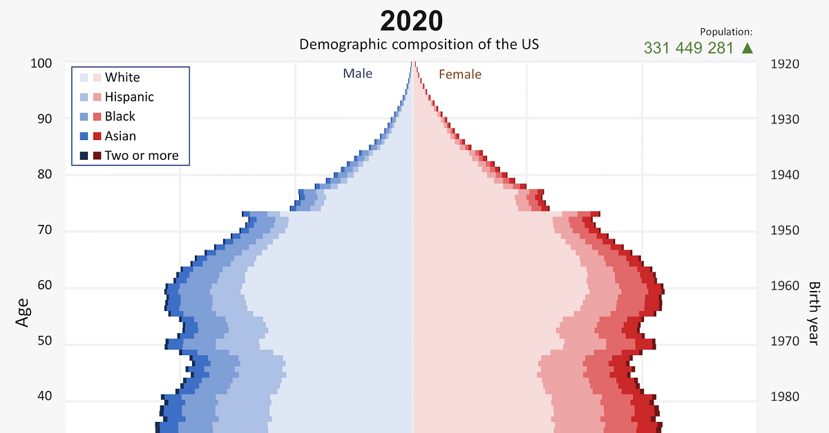
Animated Chart: America’s Demographics Over 100+ Years
Article/Editing:
Animated: America’s Demographics Over 100+ Years
The United States has famously been called a melting pot, due its demographic makeup of various cultures, races, religions, and languages. But what shape does that mixture take? And how has it changed over time?
Beginning over 100 years ago, this video from Kaj Tallungs assesses how America’s demographics have changed from 1901 to 2020. It uses data from multiple sources including the U.S. Census Bureau, the National Center for Health Statistics, and the Human Mortality Database.
A Look at the Total Population
The most obvious takeaway from this animation is that America’s population has soared over the last century. America’s population grew from 77 million in 1901 to over 330 million in 2020—or total growth of 330% over the 119 years.
And the U.S. has continued to add to its population totals. Here’s a brief look at at the population in 2021 by regional breakdowns:
| Region | Population (2021) | Share of Total Population |
|---|---|---|
| South | 127,225,329 | 38.3% |
| West | 78,667,134 | 23.7% |
| Midwest | 68,841,444 | 20.7% |
| Northeast | 57,159,838 | 17.2% |
And here’s a glance at how some of the population shakes out, across the top 10 most populous states in the country:
| Rank | State | Population (2021) |
|---|---|---|
| #1 | California | 39,237,836 |
| #2 | Texas | 29,527,941 |
| #3 | Florida | 21,781,128 |
| #4 | New York | 19,835,913 |
| #5 | Pennsylvania | 12,964,056 |
| #6 | Illinois | 12,671,469 |
| #7 | Ohio | 11,780,017 |
| #8 | Georgia | 10,799,566 |
| #9 | North Carolina | 10,551,162 |
| #10 | Michigan | 10,050,811 |
Demographic Breakdowns
Diving a little deeper, the country’s demographic breakdowns have also changed significantly over the last 100+ years. While the share of men and women is an obvious near-even split, age and race distributions have changed drastically.
For starters, though birth rates have remained fairly strong in the U.S., they have been slowing over time. This is similar to many other Western countries, and can eventually result in a larger share of elderly people as well as an increased financial cost of subsidizing their care. Additionally, fewer births results in a depleting workforce as the young population shrinks.
The shares of Black, Asian, Hispanic, and people of two or more races have also been growing. In fact, between 2010–2020 the population of people identifying as two races or more increased by a whopping 276%.
Here’s a glance at some of the other demographic growth rates over the 2010-2020 period:
- Black or African American alone population: +5.6%
- Asian alone population: +35.5%
- Hispanic or Latino alone population: +23%
- White population: -9%
Looking Ahead
Like many countries, a “graying” of the population will become a concern in the United States.
By 2060, it is expected that 95 million Americans will be over 65. But the share of those 18 and under will also continue to grow (albeit at a much slower pace) from 74 million people in 2020 to 80 million in 2060.
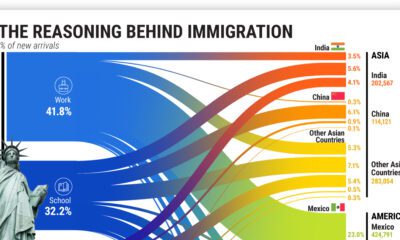
Another interesting insight from the Census Bureau is that from 2016–2060, the American-born population is expected to grow by only 20%, whereas the foreign-born population—the share of population who will immigrate to the U.S.—is expected to rise 58%.
True to the melting pot moniker, America’s demographics will continue to change dramatically over the coming decades.

This article was published as a part of Visual Capitalist's Creator Program, which features data-driven visuals from some of our favorite Creators around the world.


Demographics
The Countries That Have Become Sadder Since 2010
Tracking Gallup survey data for more than a decade reveals some countries are witnessing big happiness declines, reflecting their shifting socio-economic conditions.


The Countries That Have Become Sadder Since 2010
This was originally posted on our Voronoi app. Download the app for free on iOS or Android and discover incredible data-driven charts from a variety of trusted sources.
Can happiness be quantified?
Some approaches that try to answer this question make a distinction between two differing components of happiness: a daily experience part, and a more general life evaluation (which includes how people think about their life as a whole).
The World Happiness Report—first launched in 2012—has been making a serious go at quantifying happiness, by examining Gallup poll data that asks respondents in nearly every country to evaluate their life on a 0–10 scale. From this they extrapolate a single “happiness score” out of 10 to compare how happy (or unhappy) countries are.
More than a decade later, the 2024 World Happiness Report continues the mission. Its latest findings also include how some countries have become sadder in the intervening years.
Which Countries Have Become Unhappier Since 2010?
Afghanistan is the unhappiest country in the world right now, and is also 60% unhappier than over a decade ago, indicating how much life has worsened since 2010.
In 2021, the Taliban officially returned to power in Afghanistan, after nearly two decades of American occupation in the country. The Islamic fundamentalist group has made life harder, especially for women, who are restricted from pursuing higher education, travel, and work.
On a broader scale, the Afghan economy has suffered post-Taliban takeover, with various consequent effects: mass unemployment, a drop in income, malnutrition, and a crumbling healthcare system.
| Rank | Country | Happiness Score Loss (2010–24) | 2024 Happiness Score (out of 10) |
|---|---|---|---|
| 1 | 🇦🇫 Afghanistan | -2.6 | 1.7 |
| 2 | 🇱🇧 Lebanon | -2.3 | 2.7 |
| 3 | 🇯🇴 Jordan | -1.5 | 4.2 |
| 4 | 🇻🇪 Venezuela | -1.3 | 5.6 |
| 5 | 🇲🇼 Malawi | -1.2 | 3.4 |
| 6 | 🇿🇲 Zambia | -1.2 | 3.5 |
| 7 | 🇧🇼 Botswana | -1.2 | 3.4 |
| 8 | 🇾🇪 Yemen | -1.0 | 3.6 |
| 9 | 🇪🇬 Egypt | -1.0 | 4.0 |
| 10 | 🇮🇳 India | -0.9 | 4.1 |
| 11 | 🇧🇩 Bangladesh | -0.9 | 3.9 |
| 12 | 🇨🇩 DRC | -0.7 | 3.3 |
| 13 | 🇹🇳 Tunisia | -0.7 | 4.4 |
| 14 | 🇨🇦 Canada | -0.6 | 6.9 |
| 15 | 🇺🇸 U.S. | -0.6 | 6.7 |
| 16 | 🇨🇴 Colombia | -0.5 | 5.7 |
| 17 | 🇵🇦 Panama | -0.5 | 6.4 |
| 18 | 🇵🇰 Pakistan | -0.5 | 4.7 |
| 19 | 🇿🇼 Zimbabwe | -0.5 | 3.3 |
| 20 | 🇮🇪 Ireland | -0.5 | 6.8 |
| N/A | 🌍 World | +0.1 | 5.5 |
Nine countries in total saw their happiness score drop by a full point or more, on the 0–10 scale.
Noticeably, many of them have seen years of social and economic upheaval. Lebanon, for example, has been grappling with decades of corruption, and a severe liquidity crisis since 2019 that has resulted in a banking system collapse, sending poverty levels skyrocketing.
In Jordan, unprecedented population growth—from refugees leaving Iraq and Syria—has aggravated unemployment rates. A somewhat abrupt change in the line of succession has also raised concerns about political stability in the country.

-

 Markets1 week ago
Ranked: The Largest U.S. Corporations by Number of Employees
-

 Green3 weeks ago
Ranked: Top Countries by Total Forest Loss Since 2001
-

 Money2 weeks ago
Where Does One U.S. Tax Dollar Go?
-

 Automotive2 weeks ago
Almost Every EV Stock is Down After Q1 2024
-

 AI2 weeks ago
The Stock Performance of U.S. Chipmakers So Far in 2024
-

 Markets2 weeks ago
Charted: Big Four Market Share by S&P 500 Audits
-

 Real Estate2 weeks ago
Ranked: The Most Valuable Housing Markets in America
-

 Money2 weeks ago
Which States Have the Highest Minimum Wage in America?