In this ninth edition of our yearly round-up, we highlight visualizations that broke new ground in design and data-driven reporting.
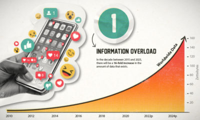

This era of data abundance should be propelling humankind forward, but valuable insights are often lost in the noise. Data storytelling holds the key.
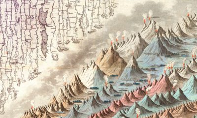

This iconic infographic map is an early and ambitious attempt to compare the world's tallest mountains and longest rivers.
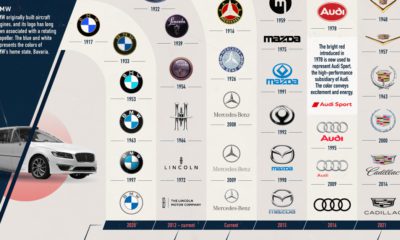

Automakers are some of the most recognizable brands in the world. See how car logos for these select brands have evolved over time in this graphic.
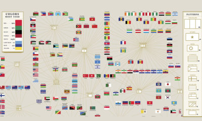

Flags of countries around the world use many common colors, patterns, and elements to convey symbolic meanings.


 Creator Program