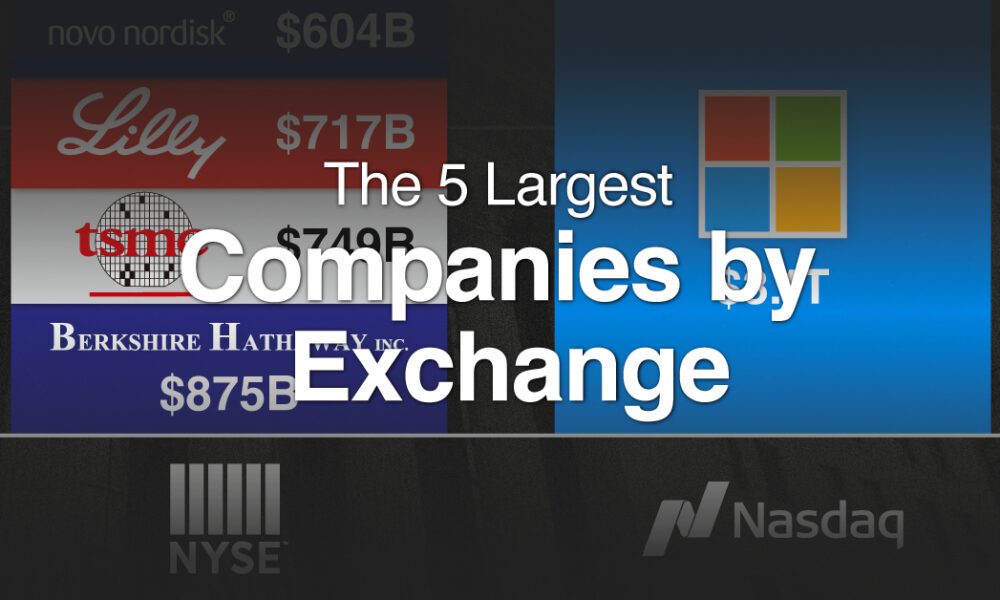
With trillion dollar valuations becoming more common, we've compared the five biggest companies by stock exchange.
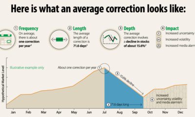

Why do stock market corrections happen, and how often does a market correction turn into a bear market? This infographic breaks it all down.
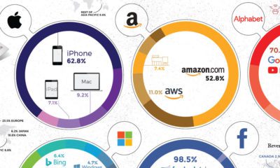

Collectively, the Big Five tech giants combine for revenues of $802 billion, which is bigger than Saudi Arabia's economy. Here's how it breaks down.
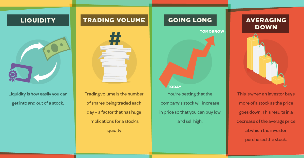
Getting a grasp on the market can be a daunting task for new investors, but this infographic is an easy first step to help in understanding...
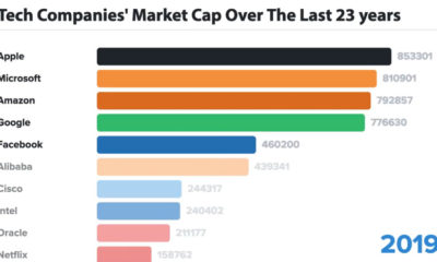

In business, the only constant is change - and for tech companies, this is even more true. Here are the biggest tech companies over 23 years.
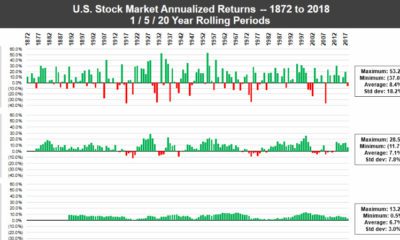

In any given year, the stock market can be a crapshoot - but over long periods of time, the U.S. market has consistently performed for investors.
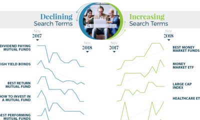

What types of investments are investors searching for? Get a unique picture of it in this infographic, which visualizes search trends between 2017 and 2018.
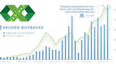

In 2018, companies announced over $1 trillion in stock buybacks. We explain what the proponents and detractors of buybacks are arguing about.
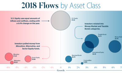

This infographic breaks down investment flows into funds (mutual funds, ETFs, etc.) over the course of 2018 to show how and when investors changed strategies.
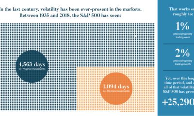

We look at the last century of markets to discover five important lessons about volatility. Here's what you should know about volatility going forward.
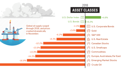

Investors saw a sea of red in 2018 - here's a visual recap of how markets performed, including the big winners and losers from a volatile...


