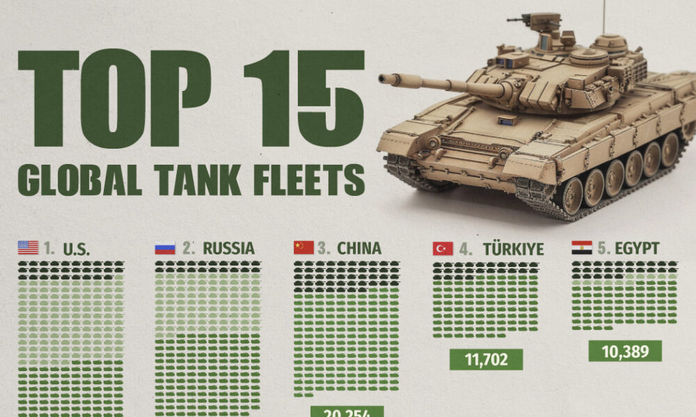
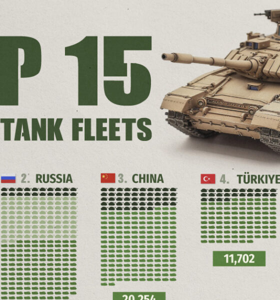
Heavily armed and armored, the modern tank is a versatile and mobile weapons platform, and a critical piece of contemporary...
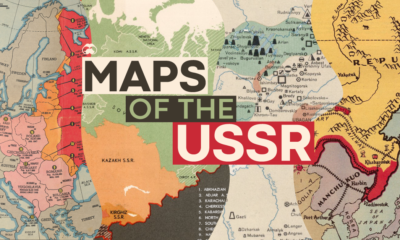

These historical maps tell the story of the USSR, and how its territorial expansion and contraction is linked to present day geopolitical events.
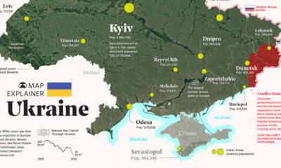

Ukraine has made the headlines due to the ongoing tensions with Russia. In this map infographic, we examine Ukraine from a structural point of view.
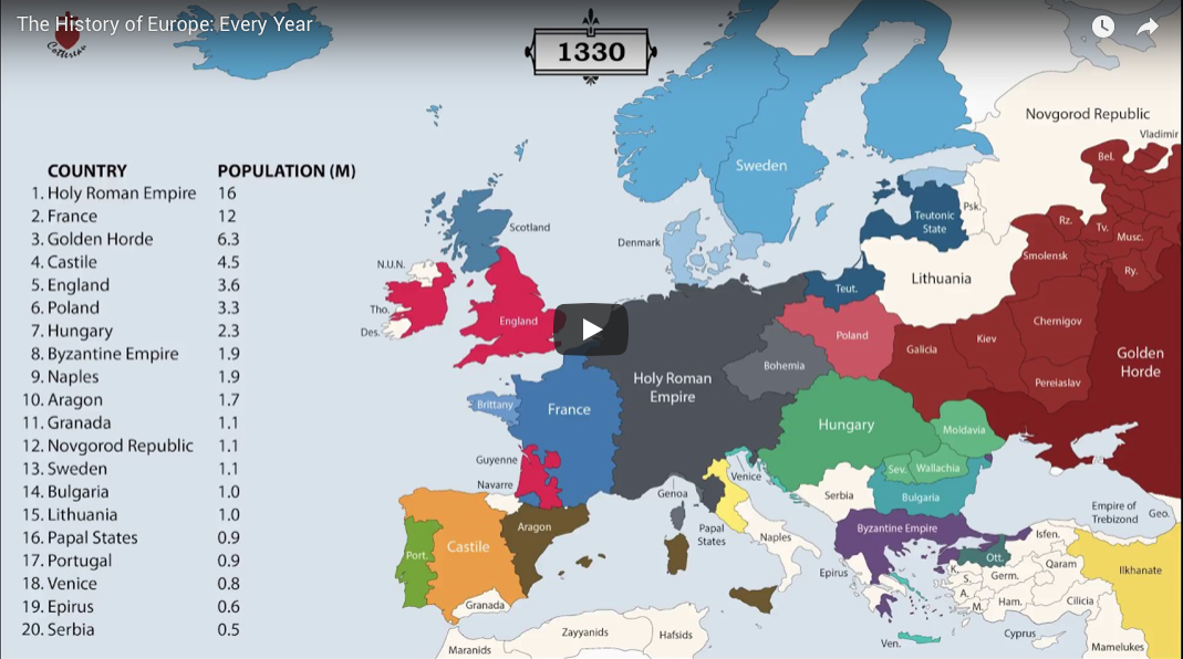
The history of Europe is breathtakingly complex, but this animation helps makes sense of 2,400 years of change on the European map.


In 2021, we live in a time of relative peace, however, as this map reveals, that does not mean there are no conflicts in the world...
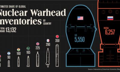

How big is the world’s nuclear arsenal? Here are the stockpiles of the nine countries with nuclear weapons.
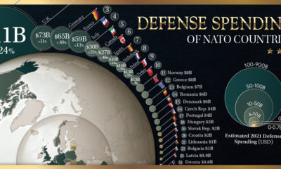

How much does each country in the military alliance contribute to NATO defense spending? We break it down with this map.
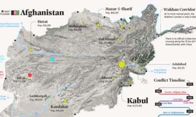

This map explainer looks at Afghanistan from a structural point of view, delving into geography and population patterns.
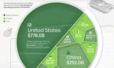

The U.S. is well known for its enormous defense budget, but how does it compare to the rest of the world's military spending?


There are over 18 million living veterans in the U.S., but how many are ultra wealthy? This visual ranks the richest veterans in America.
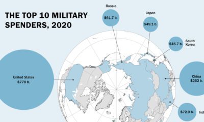

Global military spending is now at a 32-year high. We show countries' military spending by dollars and as a portion of GDP.


