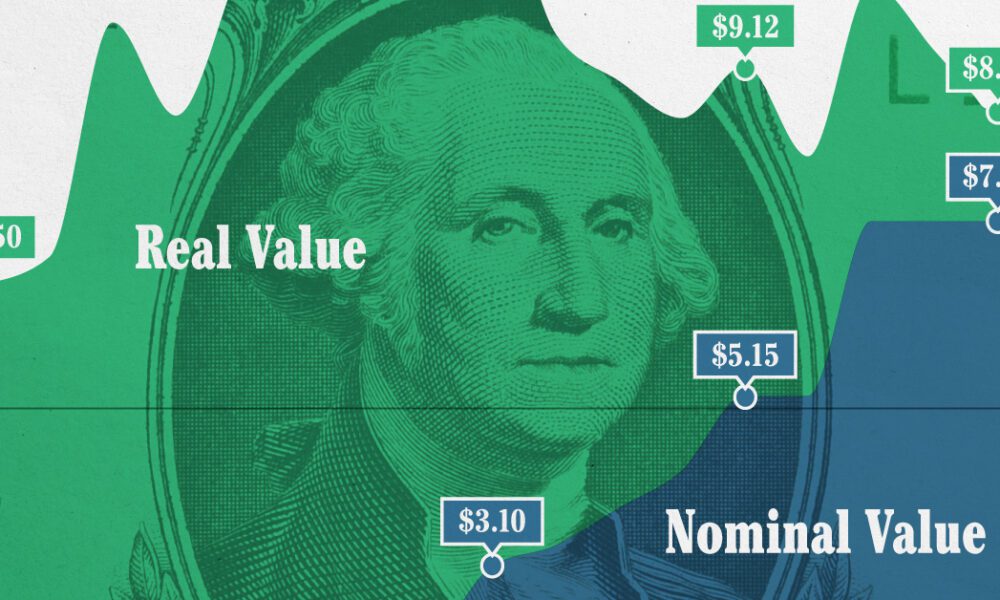
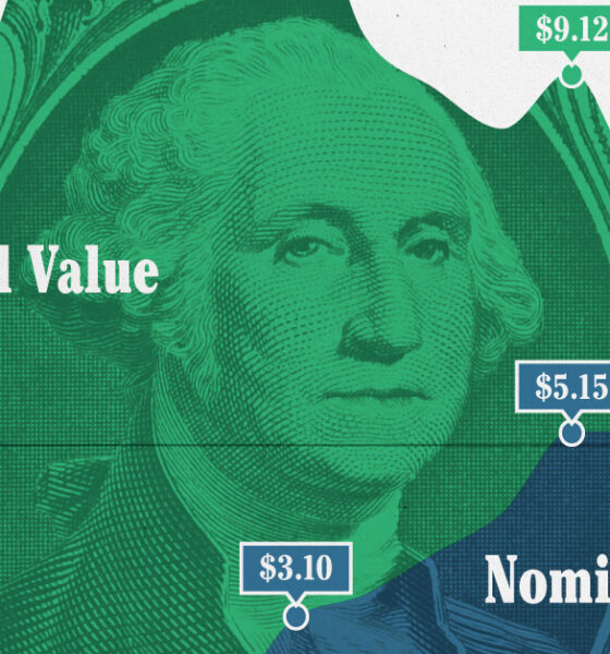
This graphic compares the nominal vs. inflation-adjusted value of the U.S. minimum wage, from 1940 to 2023.
We look at the latest data from the World Bank, which reveals a drop in extreme poverty of 1 billion people globally since the year 1990.
These key insights from the world’s top investors – like Ray Dalio and John Bogle – will free you from your fear of stock market crashes.
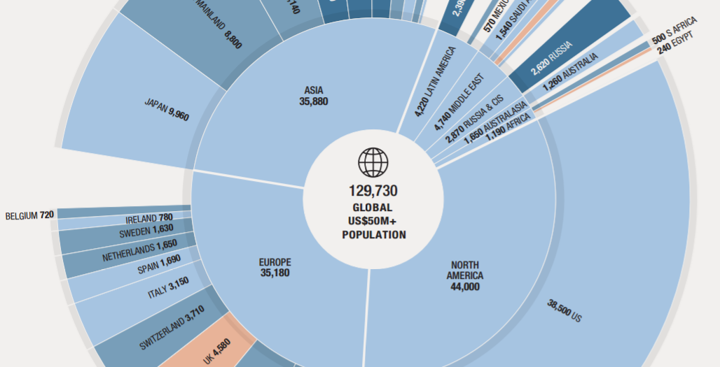
This nifty visualization from Knight Frank breaks down the world's population of ultra-wealthy ($50mm+) people by country and region.
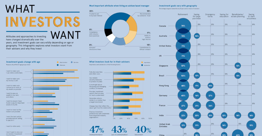
Are all investors saving for retirement, or do they have other investment goals in mind? Here's a look at goals sorted by geography and generation.
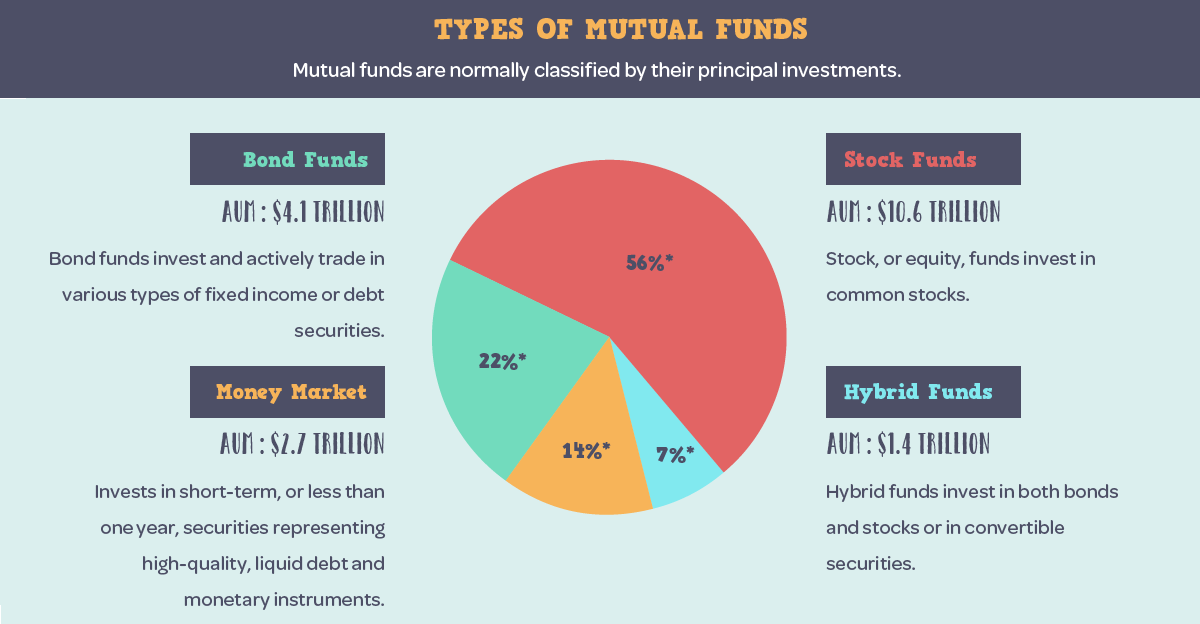
A look at mutual fund basics, their history, the different types of funds, and how today's mutual funds break down by country and assets under management.
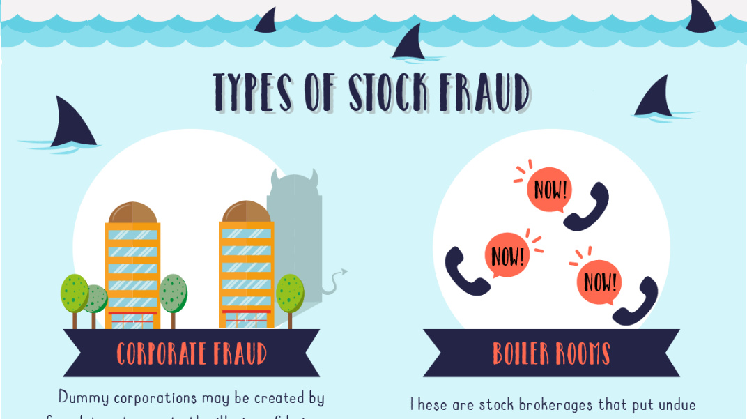
What are the eight types of stock fraud, and what are the tell-tale signs that indicate a situation may be fraudulent? This infographic dives in.

The traditional credit score is becoming obsolete - and now, big data and new tech are already starting to shape the modern credit landscape.
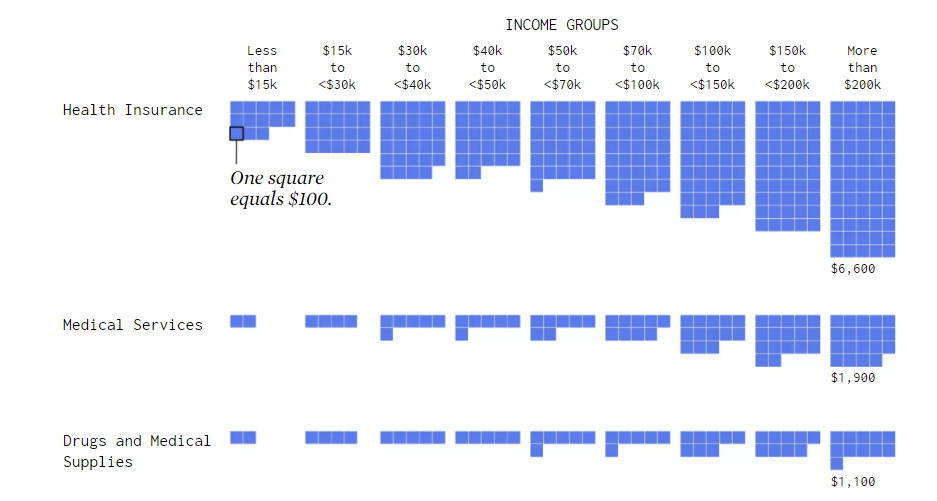
Visualizing how different income groups spend their money on things like housing, food, transportation, health, and travel.

Wealth 101 is a new educational resource that uses infographics to explain topics related to personal finance and achieving financial independence.
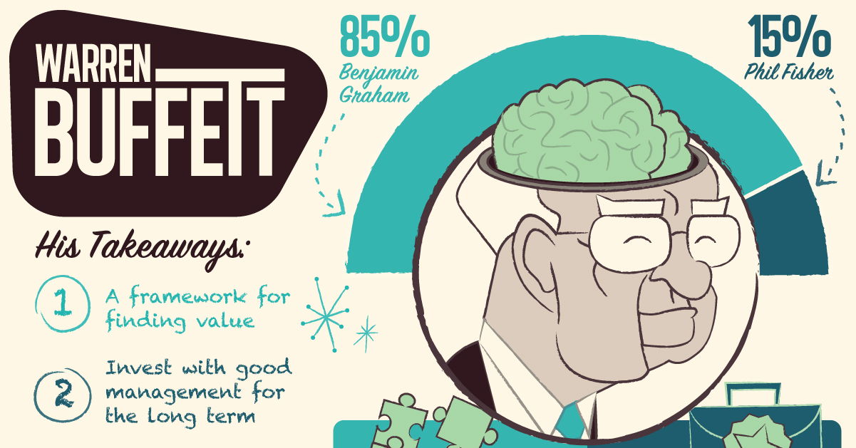
How does the world's greatest investor think about making investment decisions? Take a look inside Warren Buffett's brain in this massive infographic.


