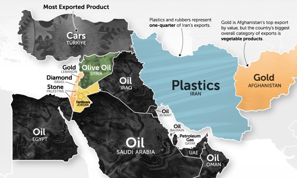
It's more than just oil. This map of Middle East exports shows the top global product of each country by...
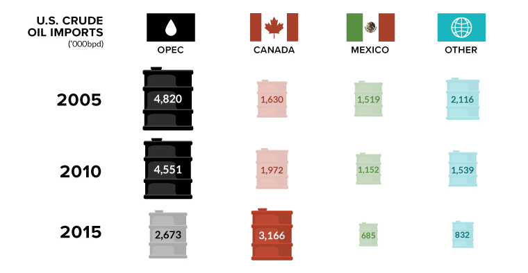
Canada is in, and OPEC is out. In this week's chart on oil imports, we also look at the declining influence of the world's most infamous...
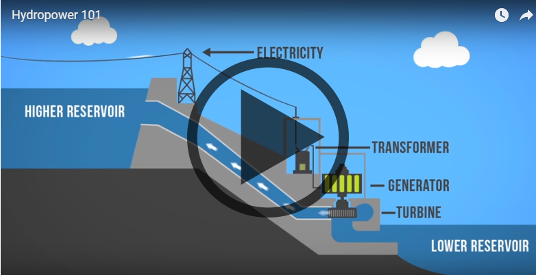
Want to learn about how different energy sources work? Check out these short, fact-driven videos on topics like oil, hydro, solar, wind, LNG, or fracking.
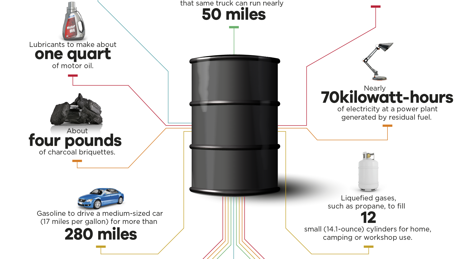
You may think of oil as the gooey black stuff used to make gasoline. However, it has thousands of applications - here's what comes from one...
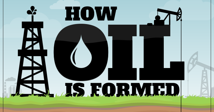
This infographic shows how oil is formed, along with some history, uses, and types of oil found. It also presents a lesser-known theory on how oil...
It's been two years since the oil price crash. This chart looks at three sets of oil data, while we check in on the economies most...
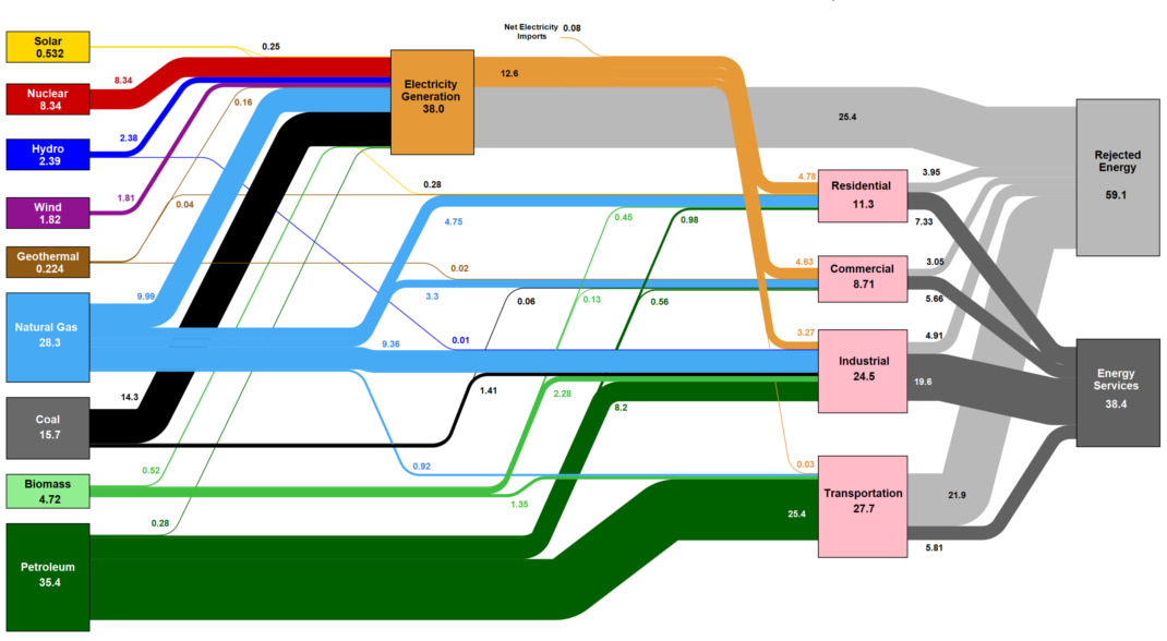
This massive diagram shows all energy created in the U.S., and where it goes. It's not sexy, but it gives a great 10,000 ft overview of...
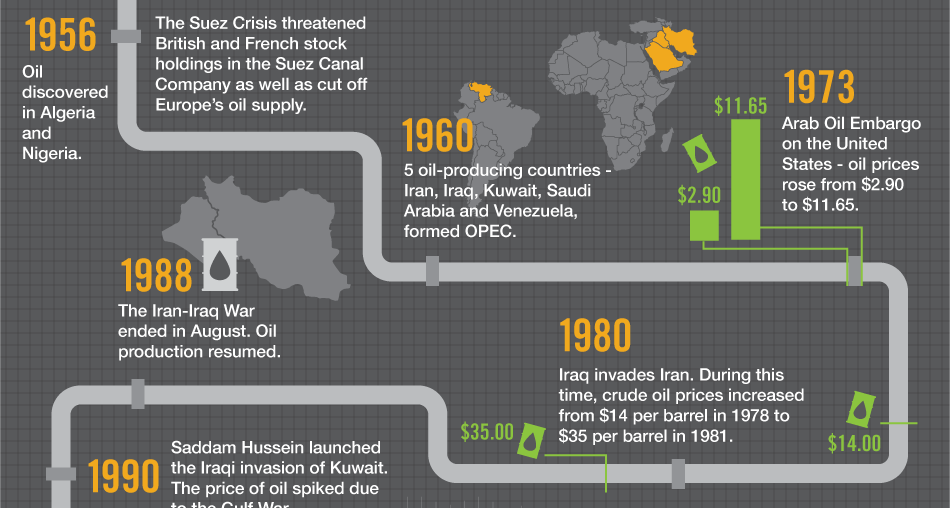
Oil is the world's most traded commodity and a staple for investors - this infographic shows the volatile history of crude oil markets.
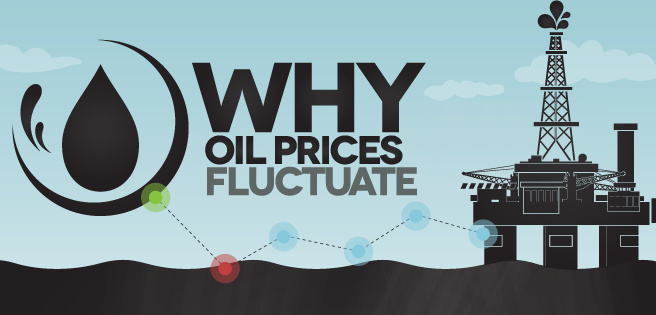
There are multiple factors that determine how oil prices fluctuate, and many of them are interconnected. Learn about them all in this infographic.
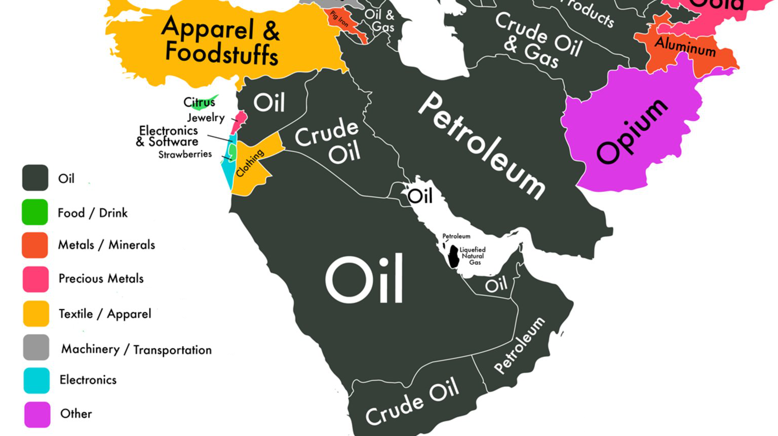
If we could only show you one map to explain the economy of the Middle East, it would be this one.
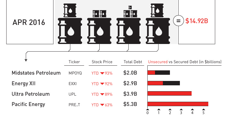
April was a record-setting month for bankruptcies in the oil patch. We put the 11 bankruptcies and $15 billion of outstanding debt in context.


