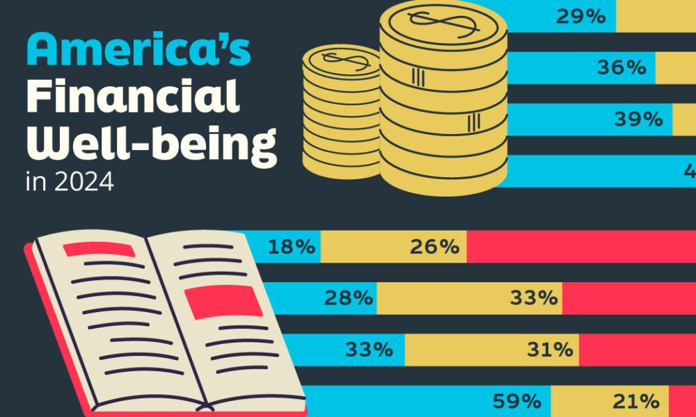
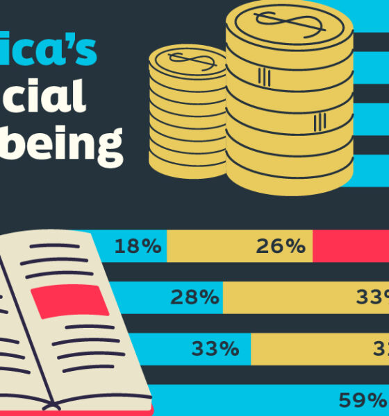
Older, better-educated adults are winning the savings game, reveals a January survey by the National Opinion Research Center at the...
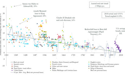

Could interest rates enter negative territory permanently? This chart plots trend data over 700 years, showing that it could be a possibility.
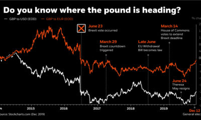

This infographic uses the recent Brexit-related volatility of the British pound to illustrate how currency risk can impact an investor's portfolio.
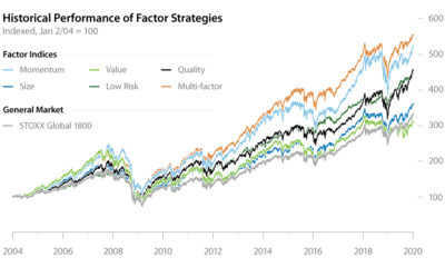

Factor investing has demonstrated its potential to outperform the general market for years. In this infographic, learn how to apply it in your portfolio.
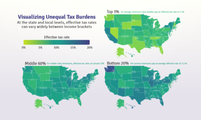

Poor families pay a higher share of their income towards state and local taxes than wealthy families. These maps show the inequitable tax burdens.
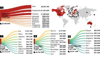

This infographic looks at who is giving – and who is receiving – the billions of dollars in foreign aid that flows between countries each year.
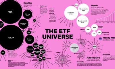

The global ETF universe has grown to be worth $5.75 trillion — here's how the assets break down by type, sector, and investment focus.
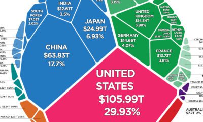

There is $360.6 trillion of wealth globally. This graphic shows how it breaks down by country, to show who owns all of the world's wealth.
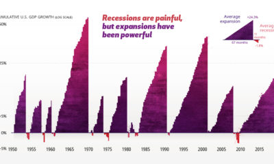

The economic cycle is a series of peaks and valleys. Analyzing economic data going back to 1950 helps put recessions into perspective.
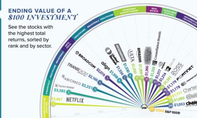

This graphic reveals the best-performing stocks over the last 10 years, and shows how much an initial $100 investment would be worth today.
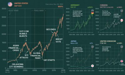

Ever wonder what other major stock markets would look like, if they were on the same scale of the S&P 500? We chart them all over...


