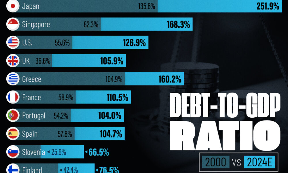
See how much the debt-to-GDP ratios of advanced economies have grown (or shrank) since the year 2000.
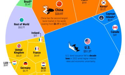

The global bond market stands at $133 trillion in value. Here are the major players in bond markets worldwide.
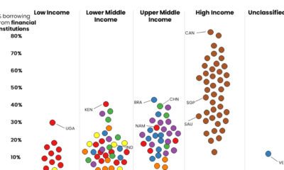

These graphics shed light on which people borrow money from financial institutions, and which rely on friends and family for monetary help.
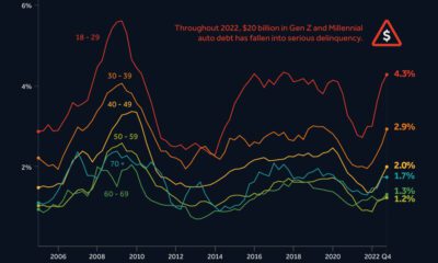

After a borrowing spree during COVID-19, younger Americans are struggling to keep up with their auto loan payments.
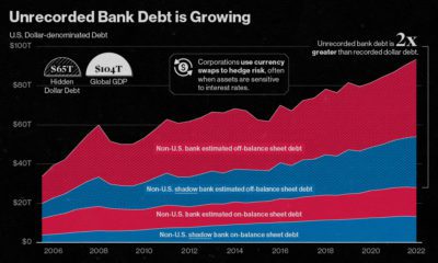

Since 2008, the value of unrecorded dollar debt has doubled. Here's why this is increasing risk in global financial markets.
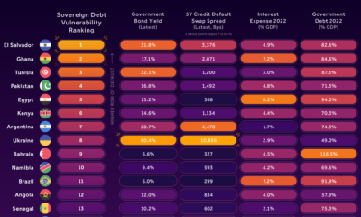

In this infographic, we examine new data that ranks the top 25 countries by their default risk.
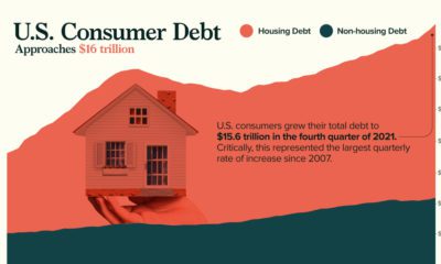

Robust growth in mortgages has pushed U.S. consumer debt to nearly $16 trillion. Click to gain further insight into the situation.


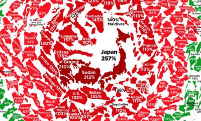
Global debt reached $226T by the end of 2020 – the biggest one-year jump since WWII. This graphic compares the debt-to-GDP ratio of various countries.
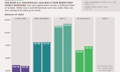

The majority of U.S. households saw debts rise in 2020. This data looks at the growth in household debt and the existing debt pile, by generation
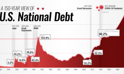

This interactive visual shows how the U.S. national debt has fluctuated since 1900, as well as projections all the way to 2050.

After an unprecedented borrowing spree in response to COVID-19, what does government debt look like around the world?


 Creator Program