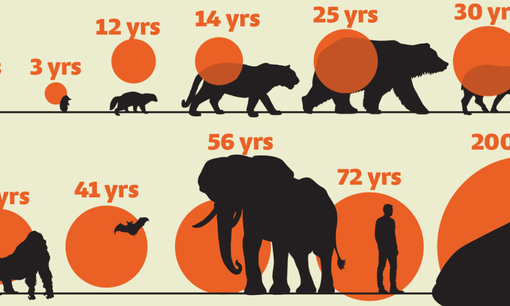
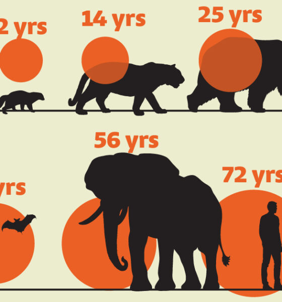
While smaller animals such as weasels typically live 1-2 years, larger counterparts can thrive for decades.
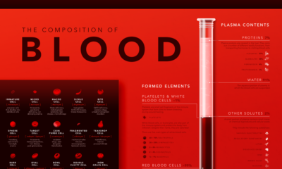

Despite its simple appearance, blood is made up of many microscopic elements. This infographic visualizes the composition of blood.
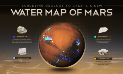

This new planet-wide animated map, based on a decade of space agency research, shows where water can be found on Mars.

All living things have a genetic system made up of DNA. This graphic explores the basics of DNA composition and structure.
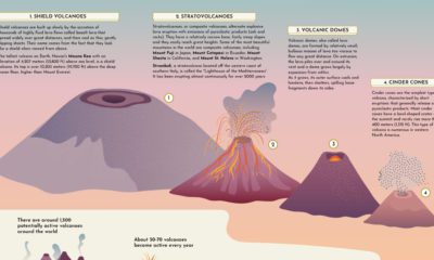

This graphic provides a brief introduction to volcanoes, explaining their different types of shapes and sizes, and how they erupt.
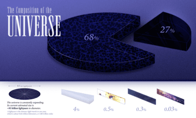

We explore the ultimate frontier: the composition of the entire known universe, some of which are still being investigated today.
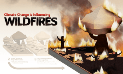

More carbon in the atmosphere is creating a hotter world—and gradually fueling both climate change and instances of wildfires.
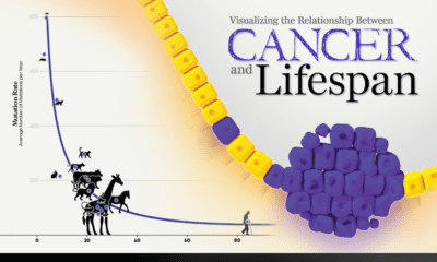

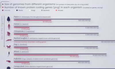
New research links mutation rates and lifespan. We visualize the data supporting this new framework for understanding cancer.
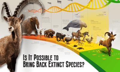

This graphic provides an introduction to de-extinction, a field of biology focused on reviving extinct animal species.
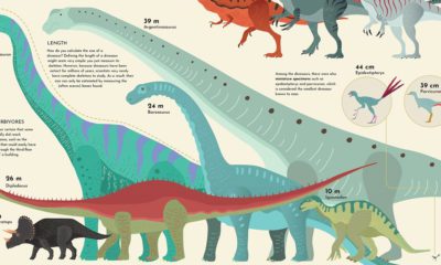

The largest dinosaur that ever lived was as long as a 13-story building. We show how the sizes of dinosaurs measured up.
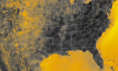

Wind is a great renewable energy source, but the spread of potential power is uneven. This graphic maps the average wind speed of the continental U.S.


 Creator Program