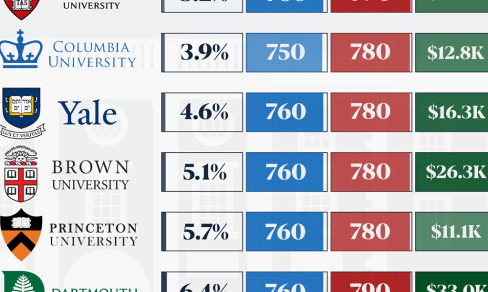
We detail the admission rates and average annual cost for Ivy League schools, as well as the median SAT scores...
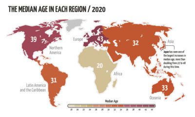

The world’s population is aging, but not at the same rate. This animated map visualizes the changes in median age in every region since 1950.
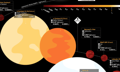

This graphic visualizes the 44 closest stars, revealing key facts such as distance from Earth, brightness, and whether potential planets are in orbit.
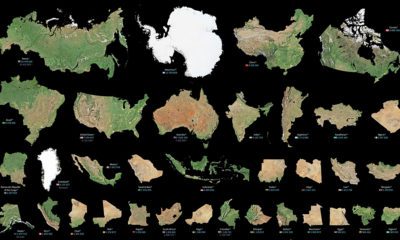

Maps can distort the size and shape of countries. This visualization puts the true size of land masses together from biggest to smallest.
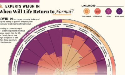

COVID-19 has caused a massive shake-up of our daily lives. Here, 511 epidemiologists offer their insights on when they might resume 20 common activities.
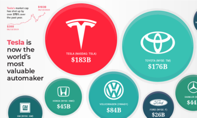

Thanks to a surging stock price, Tesla is now the world's most valuable automaker – surpassing industry giants Toyota and Volkswagen.
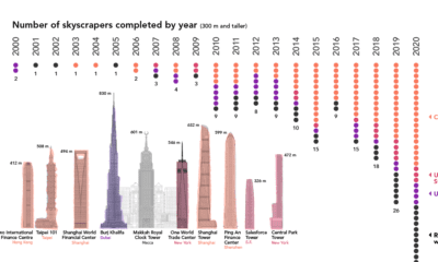

Once a rarity, supertall skyscrapers now punctuate the skylines of cities around the world. We chart the construction of these structures over the past 20 years


This map of civil unrest in the United States helps provide much needed context on how individual events fit within the nation-wide pattern over time.
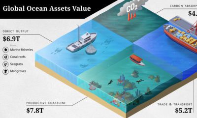

The ocean economy is under threat. How are human activities impacting the sustainable use of our ocean assets, valued at over $24 trillion?
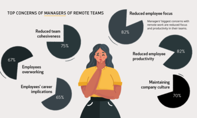

During the pandemic, millions of people have transitioned to working remotely. But how do workers and managers actually feel about it?
Our planet is in a constant state of creation and destruction as the plates of the earth collide. This visualization looks at earthquake magnitude.


