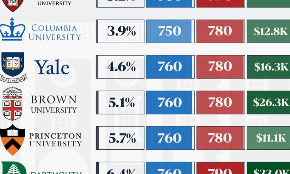
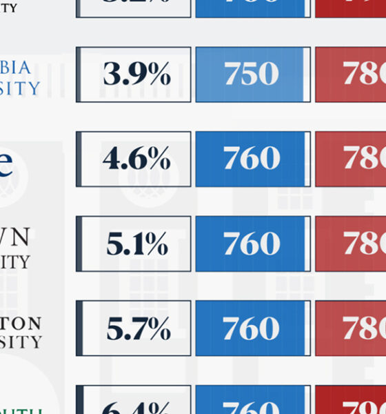
We detail the admission rates and average annual cost for Ivy League schools, as well as the median SAT scores...
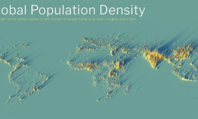

What does population density look like on a global scale? These detailed 3D renders illustrate our biggest urban areas and highlight population trends.
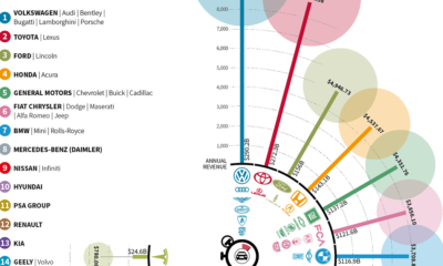

The world's largest automakers generate a staggering amount of revenue. In fact, in the time it took you to read this, Volkswagen earned over $50,000.
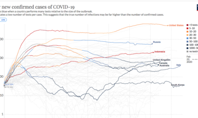

This continuously updated chart provides a more complete look at the efficacy of COVID-19 containment strategies.
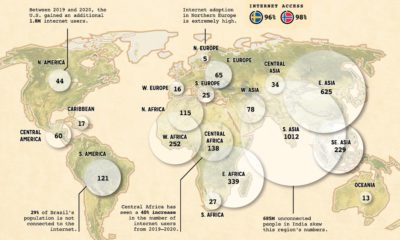

When it comes to worldwide internet use, which regions are the most disconnected? And which regions have the most opportunity for growth?


How does coffee get from a faraway plant to your morning cup? See the great journey of beans through the coffee supply chain.
Ammonium nitrate is dangerous, and every few years, there's a new explosion that causes widespread damage. These are some of the biggest ones.
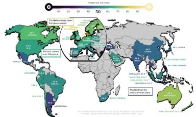

As the global population ages, pension reform is more important than ever. Here’s a breakdown of how key countries rank in terms of pension plans.
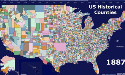

This video highlights the history of American counties, and how their boundaries have changed over the last 300 years.


This fascinating animated map provides an overview of the top trending Google searches in every state over the last decade.
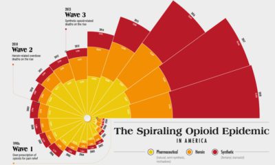

Since the 1990s, the opioid crisis has claimed thousands of lives. This visualization shows how the epidemic has come in three distinct waves.


