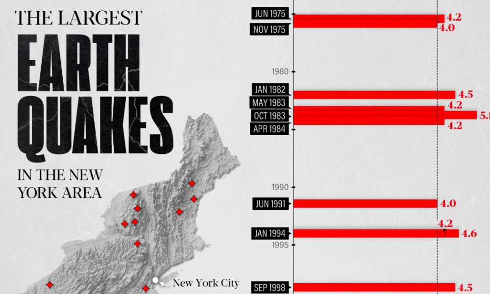
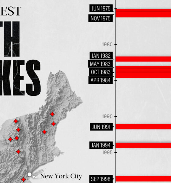
The earthquake that shook buildings across New York in April 2024 was the third-largest quake in the Northeast U.S. over...

Which U.S. cities are growing the fastest? Here are the 20 fastest growing cities in the U.S., based on projected population growth to 2025.

See the world's 100 biggest islands in a side-by-side comparison. Then, we look to see which islands have the highest population densities.
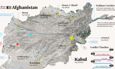

This map explainer looks at Afghanistan from a structural point of view, delving into geography and population patterns.
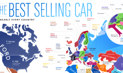

From American trucks to European sedans, this map shows the best-selling vehicles in the world.

The world map you know is totally wrong. Check out this clever graphic, which helps put into perspective the true size of countries.
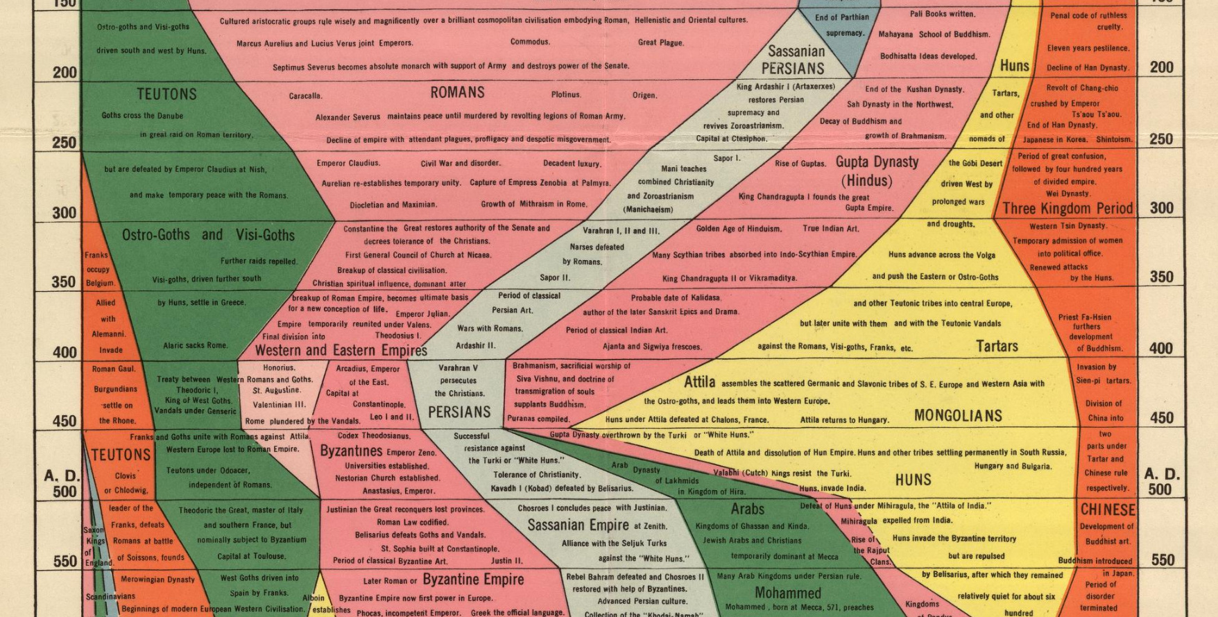
We examine an ambitious timeline that details the power of various civilizations going all the way back to 2,000 B.C.
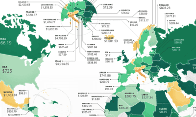

These maps show the most (and least) costly countries for starting a business by relative costs.
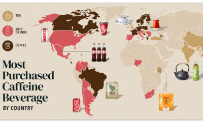

Do you drink coffee, tea, or cola? Each country has their own drink preference.
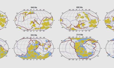

This animated map shows the last billion years of Earth's tectonic plate movement in just 40 seconds.
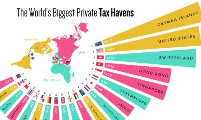

What countries or territories do the ultra-wealthy use as tax havens?


