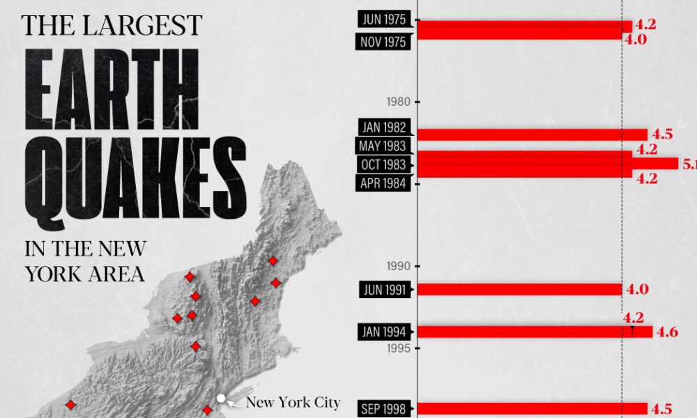
The earthquake that shook buildings across New York in April 2024 was the third-largest quake in the Northeast U.S. over...
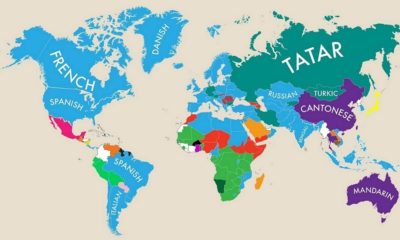

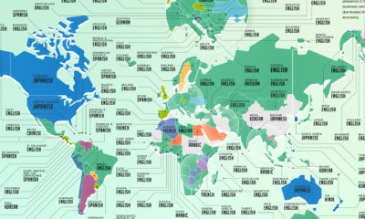
This fascinating map highlights the second most commonly spoken primary language in almost nearly every country.
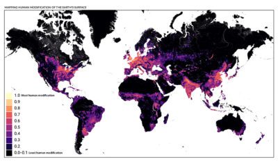

This detailed map looks at where humans have (and haven't) modified Earth's terrestrial environment. See human impact in incredible detail.
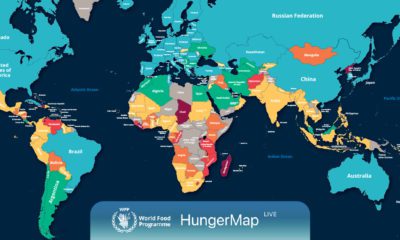

Every day, hunger affects more than 700 million people. This live map from the UN highlights where hunger is hitting hardest around the world.
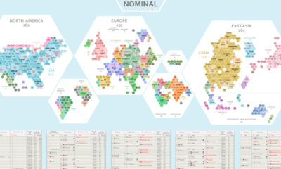

Where does the world's economic activity take place? This cartogram shows the $94 trillion global economy divided into 1,000 hexagons.
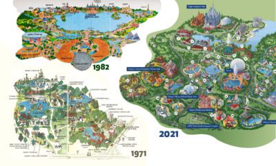

Historical maps highlight the Magic Kingdom's dramatic transformation from swampland to the biggest theme park in the world.
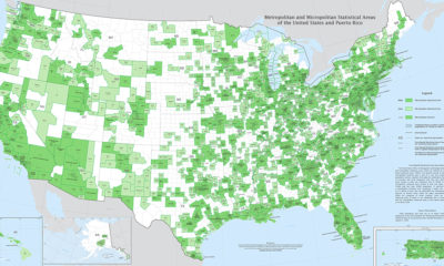

Fitting a complex population center into a tidy statistical box is no easy feat. Thankfully, this U.S. Census Bureau map is up to the challenge.


From Fords in the Midwest to Toyotas on the coasts, here are the best selling vehicles in America, visualized by state.
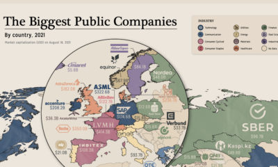

Tech, finance or energy giant? We mapped the biggest companies by market cap and industry.


This unique map graphic uses the Great Lakes region as a point of comparison for the top 25 largest lakes in the world.

Learning a new language has become a popular hobby during the pandemic. Here’s a look at the most popular languages people wanted to learn around the...


