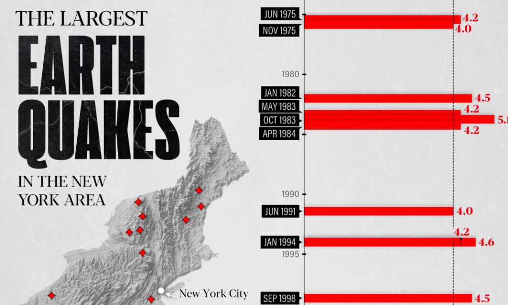
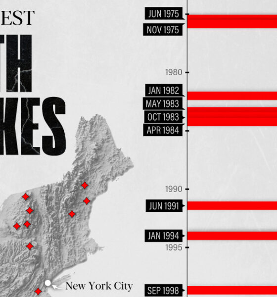
The earthquake that shook buildings across New York in April 2024 was the third-largest quake in the Northeast U.S. over...

Which countries have the most vacation days, or the most public holidays? These graphics reveal how many paid vacation days each country mandates.

From New York to Damascus, this infographic uses EIU cost of living data to rank the world's most and least expensive cities to live in
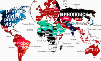

What is the top streaming service in each country? This map highlights the streaming services with the highest subscribers in 134 countries.
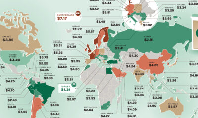

Where would you find the most and least expensive Starbucks coffee? These maps show the price of a Tall Latte in every country.
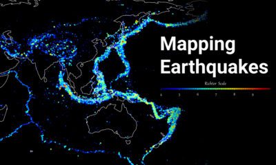

Where do the world's major earthquakes happen? This map highlights the epicenters of earthquakes on record between 1956 and 2022.
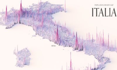

These maps show the population density of several countries, using 3D spikes to denote where more people live.
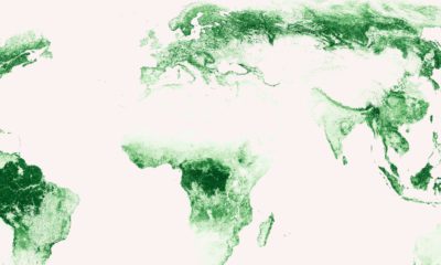

Where are the world's forests? These high-resolution maps show how the world’s carbon-sequestering forests are spread.
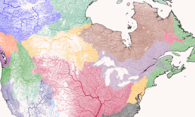

Where does each river start, converge, and end? This series of maps traces river basins in each continent around the world.


This map juxtaposes nations and Indian states to provide a new perspective on the world's soon-to-be most populous country
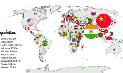

Which countries have the largest populations, or the highest GDP? This animation compares countries based on 20 different metrics.


 Creator Program