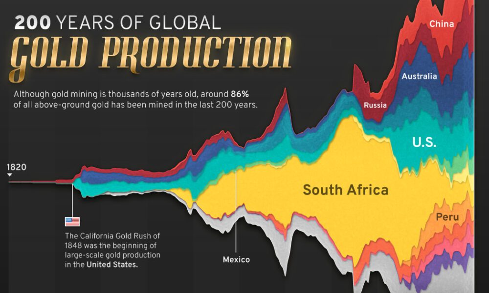
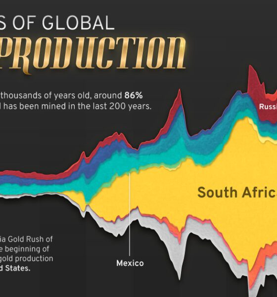
Global gold production has grown exponentially since the 1800s, with 86% of all above-ground gold mined in the last 200...

This infographic highlights the need for new gold mining projects and shows the next generation of America's gold deposits.
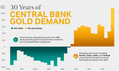

Globally, central banks bought a record 1,136 tonnes of gold in 2022. How has central bank gold demand changed over the last three decades?
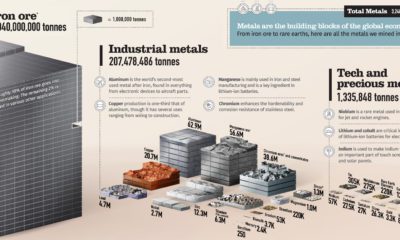

From iron ore to rare earths, over 3 billion tonnes of metals are mined each year. This chart shows them all on a relative scale.


A mining company’s past projects and funding strength are interlinked. This infographic outlines how a company's ability to raise capital can determine the fate of a...
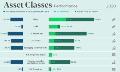

The markets were volatile but offered great opportunity in 2020. See how every asset class, currency, and S&P 500 sector performed over the year.
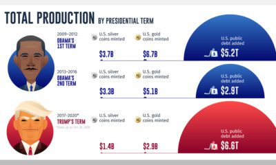

While gold and silver coin production during U.S. presidencies has declined, public debt continues to climb to historically high levels.
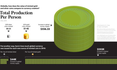

In 2019, the value of global money creation was over 500 times higher than the world's gold and silver coin production combined.
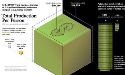

Amid trillions in COVID-19 stimulus, this graphic compares new U.S. dollars printed to U.S. precious metal coin production.
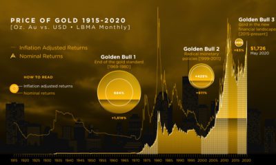

We break down gold's three major bull markets over the last century. This includes the current one, in which gold has hit 8-year highs.


