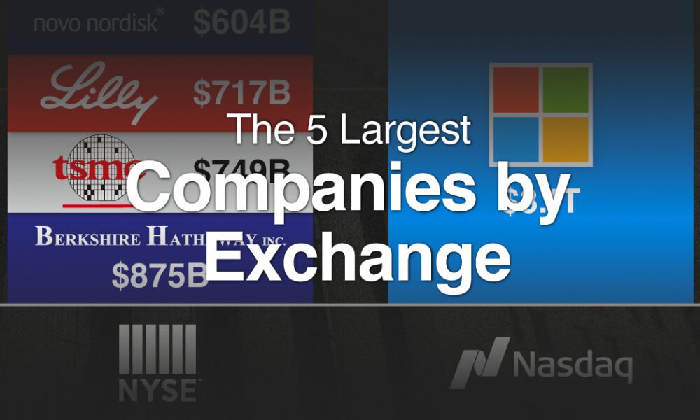
With trillion dollar valuations becoming more common, we've compared the five biggest companies by stock exchange.

We visualize the recent performance of the Magnificent Seven stocks, uncovering a clear divergence between the group's top and bottom names.


This graphic illustrates the size of the top 20 Chinese stocks, along with their 1-year return as of March 2024.

This graphic illustrates the biggest stock markets by country, providing a unique breakdown of $110 trillion in valuation.
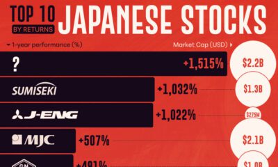

With the Nikkei 225 hitting its first all-time high since 1989, we've ranked the top 10 Japanese stocks by their 1-yr return.
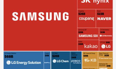

South Korea's most valuable companies are familiar names: large conglomerates with diverse holdings in different parts of the economy.
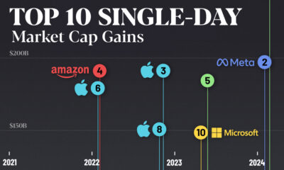

Nvidia broke the record for the largest single-day market cap gains after adding nearly $250B on Feb. 22, 2024.
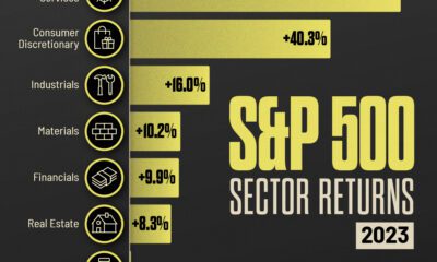

Companies benefitting from the AI train and strong retail demand helped their individual S&P 500 sector performance in 2023.
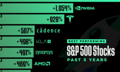

In this graphic, we've ranked the top S&P 500 stocks based on their 5-year total returns, as of November 2023.


Which stocks are the most talked about online? Here are the top 10 stocks on Instagram and TikTok by content created about their shares.