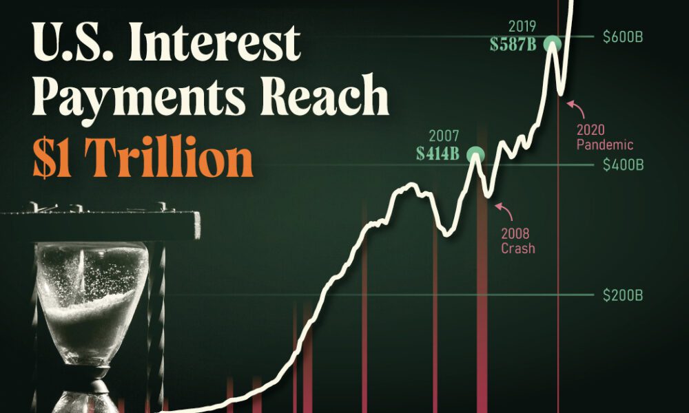
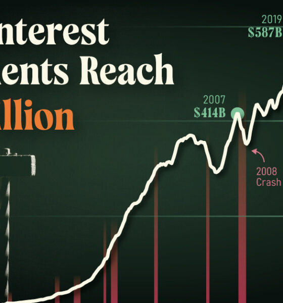
U.S. debt interest payments have surged past the $1 trillion dollar mark, amid high interest rates and an ever-expanding debt...
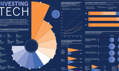

Visualizing the Rise of Investment Tech For the high resolution version of this infographic, click here. Investors and wealth managers are always looking to capitalize on...
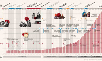

How did China go from agrarian economy to global superpower? This timeline covers the key events and policies that shaped the PRC over its 70-year history.
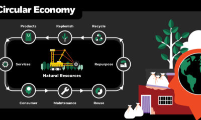

Our modern world was designed for mass consumption and waste. Choosing to build a circular economy will be integral to the future of our planet.
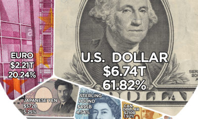

Here are the reserve currencies that the world's central banks hold onto for a rainy day.
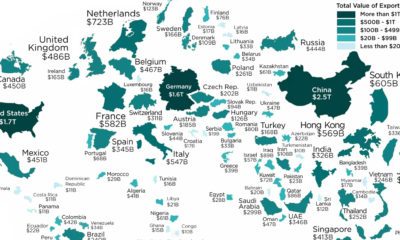

These are the largest international trade powerhouses of the world, resized on the map based on their annual exports in 2018.


After adjusting GDP for purchasing power parity (PPP), here is how the composition of the world economy breaks down by country.
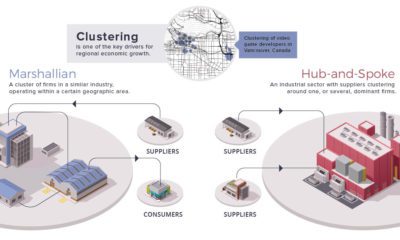

Economies create distinct spatial patterns. This week's chart visualizes the relationships businesses and industry imprint on the urban environment.
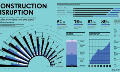

Emerging technologies are disrupting the construction industry, and having a major impact on the industry's processes and bottom line.
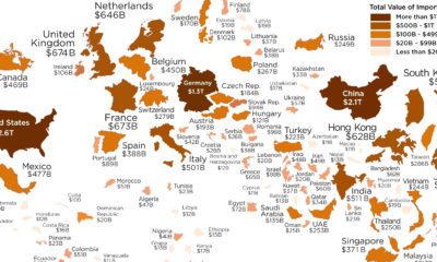

Which economies are the world's biggest importers of goods? See for yourself in this visualization, which resizes countries based on the value of imports.
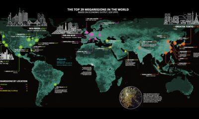

Today’s stunning map ranks the world’s most powerful megaregions — together, they contribute a whopping $28 trillion to the global economy.


