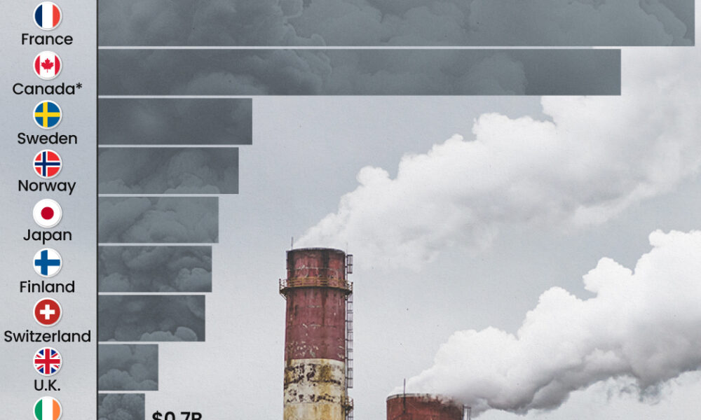
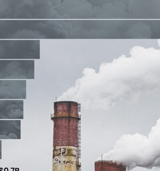
This graphic highlights France and Canada as the global leaders when it comes to generating carbon tax revenue.
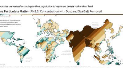

This population-weighted cartogram shows the countries with the worst air pollution, based on fine particulate matter (PM2.5) concentration.
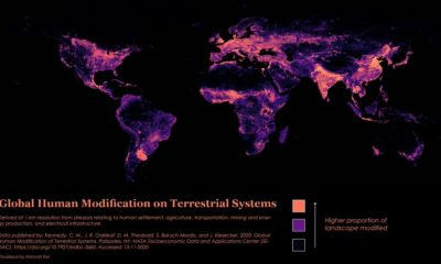

Nearly 95% of the Earth’s surface shows some form of human modification, with 85% bearing evidence of multiple forms of human impact.
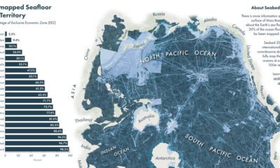

We know more about the surface of Mars than we do on the ocean floor. Which countries are mapping the ocean floor, and what's still unknown?
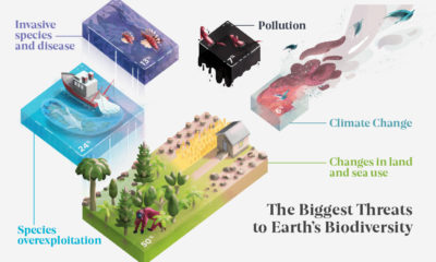

Earth’s biodiversity has seen a massive decrease over the years. What's driving this loss, and which regions have been impacted the most?
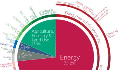

World emissions have reached almost 50 billion tonnes of greenhouse gases (GHGs) and counting. Which major sectors do they originate from?
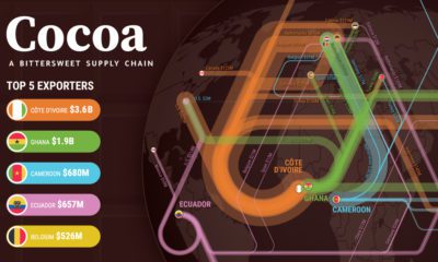

The cocoa supply chain is a bittersweet one. While chocolate is a beloved sweet treat globally, many cocoa farmers are living a bitter reality.
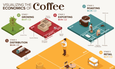

What makes your cup of coffee possible, and how much does it really cost? Here’s how the $200B coffee supply chain breaks down economically.
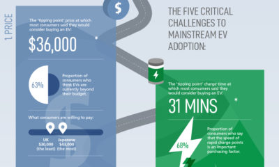

The pace of mainstream EV adoption has been slow, but is expected to accelerate as automakers overcome these five critical challenges.
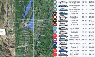

We visualize how far popular EV models will take you on real-world routes between major cities, and which are the most cost effective.
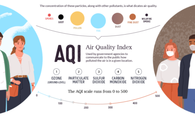

This graphic breaks down how the air quality index is measured, and looks at which regions are hardest hit by atmospheric pollution and wildfires.


