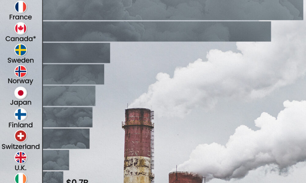
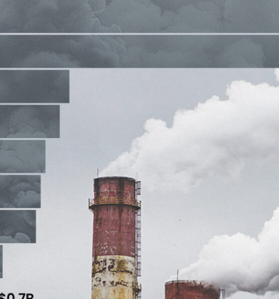
This graphic highlights France and Canada as the global leaders when it comes to generating carbon tax revenue.
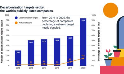

More companies are declaring net-zero emissions targets, but where can they start? Find out the steps companies and investors can take.
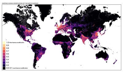

This detailed map looks at where humans have (and haven't) modified Earth's terrestrial environment. See human impact in incredible detail.
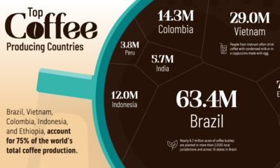

Coffee is the third most consumed beverage globally. Here we visualize the countries that have the highest coffee production in the world.
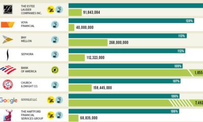

Which U.S. companies use the most green energy as a percentage of total energy used? Here are the 50 highest ranked companies according to the EPA.
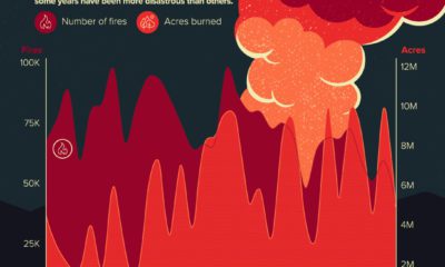

Here’s a look at the number of wildfires in America that have occurred each year since 1990, and the acres of forest land scorched during that...
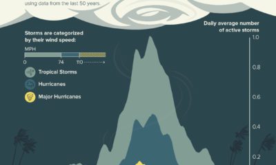

While the Atlantic hurricane season runs from June to late November, about 85% of activity happens between August, September, and October.


This unique map graphic uses the Great Lakes region as a point of comparison for the top 25 largest lakes in the world.
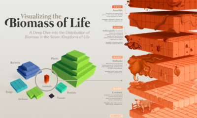

Our planet supports nearly 8.7 million species. We break down the total composition of the living world in terms of its biomass.
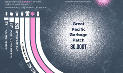

1.6 billion face masks entered our oceans in 2020, representing 5,500 tons of plastic pollution.
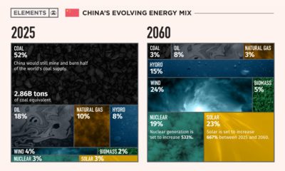

This infographic takes a look at what China's energy transition plans are to make its energy mix carbon neutral by 2060.


