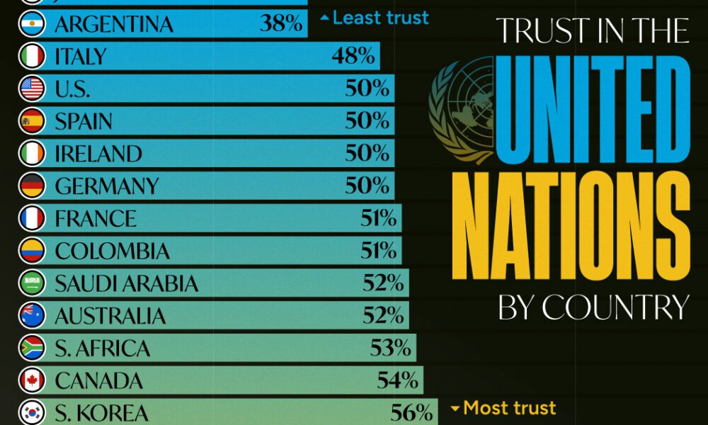
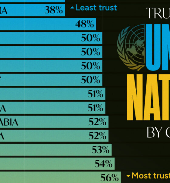
Which countries trust the United Nations to do the right thing the most, and the least?
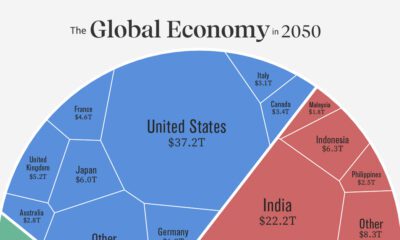

Asia is expected to represent the world's largest share of real GDP in 2050. See how this all breaks down in one chart.
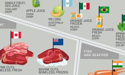

This infographic shows the top exporting countries for U.S. food imports, ranging from exotic fruits to meat, oils, spices, and more.
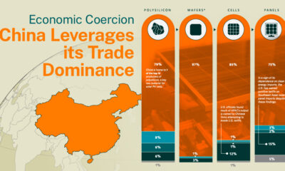

The Hinrich Foundation explores China's use of economic coercion and the implications of its control over the solar energy sector.
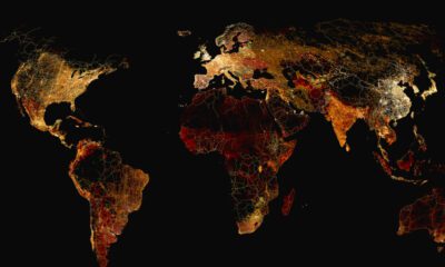

What does a road map of the world look like? Here’s a deep view of roads visualized by type across countries and continents.
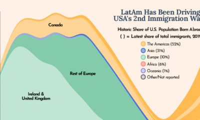

The U.S. is built on immigration and this chart shows how Latin America has been one of the biggest drivers of U.S. immigration in the last...
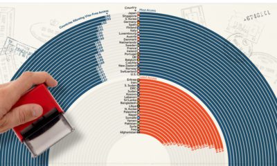

How strong is your passport? This ranking showcases the most and least powerful passports based on their ease of access to countries globally.
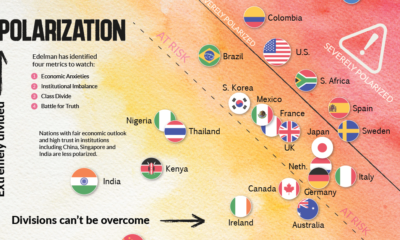

This chart plots polarization for various countries based on the Edelman Trust Institute's annual survey of 32,000+ people.
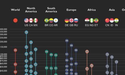

This graphic shows income distributions in 16 different countries around the world, using data from the World Inequality Database.
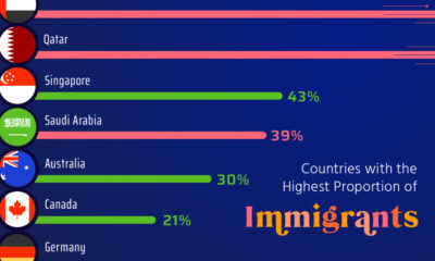

Here, we highlight countries that are magnets for immigration, such as UAE and Qatar, as well as nations with very few foreign born residents.
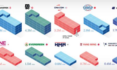

In this infographic, we rank the world's 10 largest maritime shipping companies by container capacity and fleet size.


 Creator Program