

China has grown its nuclear capacity over the last decade, now ranking second on the list of top nuclear energy...
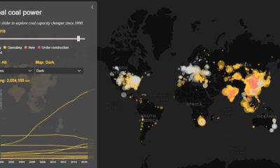

Today’s interactive map shows all of the world's coal power plants, plotted by capacity and carbon emissions from 2000 until 2018.
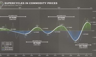

The prices of energy, agriculture, livestock and metals tell the story of human development. Learn about the commodity super cycle in this infographic.
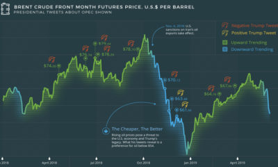

What goes through the head of a U.S. president? The tweets of U.S. President Donald Trump reveal a contentious relationship with the price of oil and...
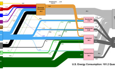

This interesting diagram breaks down all U.S. energy use by both source and industry, and everything that happens in between.
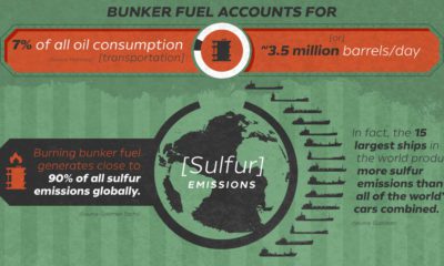

IMO 2020, which sets ambitious emissions limits, is about to shake up maritime shipping. Today's graphic covers the environmental and economic impacts
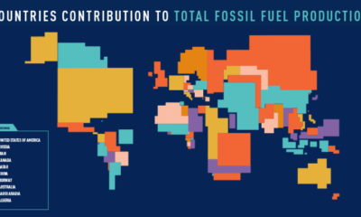

These four animated cartograms show the nations leading the world in fossil fuel production, in terms of oil, gas, coal, and total hydrocarbons.
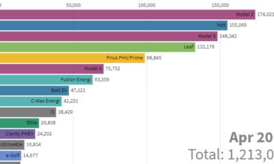

This stunning animation visualizes the last nine years of U.S. electric vehicle sales. We also look at who will lead the race in the coming years.
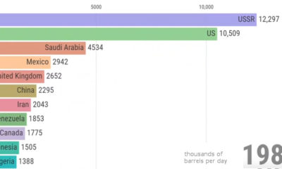

View how the ranking of the world's largest producers of crude oil changes over a 50 year period, from the Cold War until today.
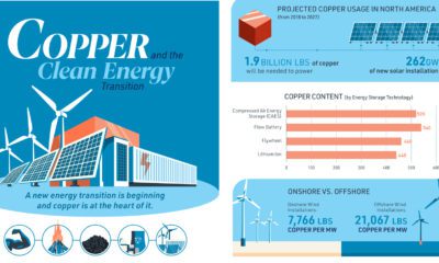

A clean energy transition is underway as wind, solar, and batteries take center stage. Here's how copper plays the critical role in these technologies.
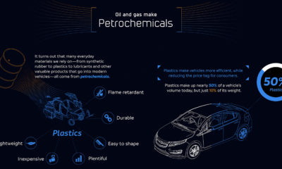

It is counterintuitive, but electric vehicles are not possible without oil - these petrochemicals bring down the weight of cars to make EVs possible.


