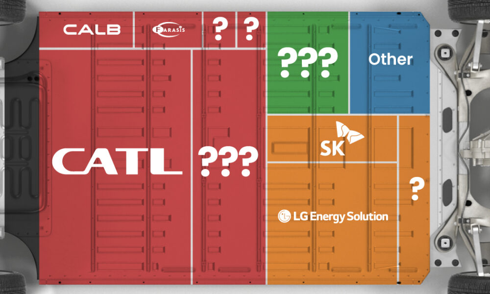
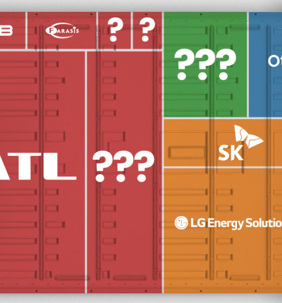
Asia dominates this ranking of the world's largest EV battery manufacturers in 2023.
Global energy transition investment hit $755 billion in 2021. This chart ranks the top 10 countries by energy transition investment.
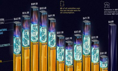

Governments pour nearly $500 billion into fossil fuel subsidies annually. This chart breaks down fossil fuel subsidies between 2010 and 2021.
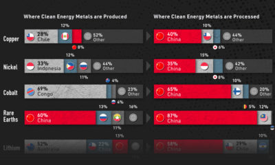

Despite being the world's biggest carbon emitter, China is also a key producer of most of the critical minerals for the green revolution.
Nuclear power accounted for 10% of global electricity generated in 2020. Here's a look at the largest nuclear power producers.
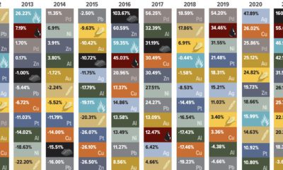

Energy fuels led the way as commodity prices surged in 2021, with only precious metals providing negative returns.
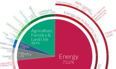

A Global Breakdown of Greenhouse Gas Emissions by Sector In a few decades, greenhouse gases (GHGs)—chiefly in the form of CO₂ emissions—have risen at unprecedented rates...
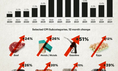

The U.S. inflation rate has seen its fastest annual increase in over 30 years. Which consumer spending categories have been hit the hardest?

In 2020, solar power saw its largest-ever annual capacity expansion at 127 gigawatts. Here's a snapshot of solar power capacity by country.
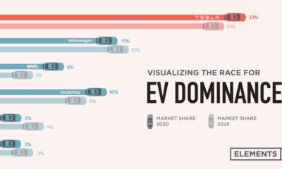

Tesla was the first automaker to hit a $1 trillion market cap, but other electric car companies have plans to unseat the dominant EV maker.
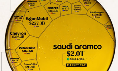

Oil still makes up the largest share of the global energy mix. Here are the largest oil and gas companies by market cap in 2021.


 Creator Program